The RPI Engineers athletics team is renowned for its excellence in collegiate sports. Owned by Rensselaer Polytechnic Institute, the team competes in various athletic events across the United States, showcasing their skills and dedication to sportsmanship.
Meaning and history
The RPI Engineers athletics team was established by the Rensselaer Polytechnic Institute (RPI) in 1824, making it one of the oldest collegiate athletic programs in the United States. Over the years, the team has achieved remarkable accomplishments in various sports, including ice hockey, football, basketball, and soccer. The RPI Engineers have won numerous conference championships and have had successful appearances in national tournaments. Currently, the team continues to thrive and compete at a high level within their respective leagues, maintaining their position as a prominent force in collegiate athletics.
What is RPI Engineers?
The RPI Engineers athletics team is a collegiate sports team representing Rensselaer Polytechnic Institute (RPI). They compete in various sports and are affiliated with the National Collegiate Athletic Association (NCAA) Division III.
1995 – 2005
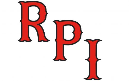
While the RPI Engineers logo has a pronounced retro feel about it, in fact, the emblem was only introduced in 2006. It features the letters “R,” “P,” and “I” going down in a diagonal line. The letters are red with black trim. The sharp and curvy “thorns” make the glyphs unique.
The previous version (1995-2005) sported a red eagle in flight. The bird had its wings spread wide and was holding a board housing the lettering “Engineers” in its claws. There was a triangle on the background.
2006 – Today
The logo showcases a trio of characters, “RPI,” depicted in a bold and assertive red font with elegant black outlines that add depth and contrast. The font style is reminiscent of classic college lettering, often seen in varsity jackets and university emblems, conveying a sense of tradition and academic excellence. Each letter is crafted with strong serifs and varying line weights, creating a dynamic visual rhythm that captures attention. The red color is vibrant and assertive, symbolizing passion, energy, and action, qualities that an educational or athletic institution might seek to embody. The letter “P” stands at the center, slightly overlapping the “R” and “I,” suggesting a community or connection between different elements or departments within the institution.


