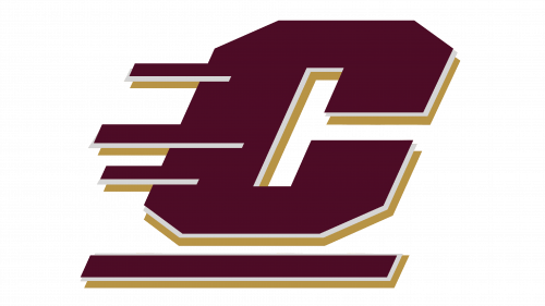
 Central Michigan Chippewas Logo PNG
Central Michigan Chippewas are the name of an athletic program of Central Michigan University which was established in 1892 and is based in Mount Pleasant. The program consists of 16 men’s and women’s athletic teams in various kinds of sports. The program competes in the first division of the National Collegiate Athletic Association.
Meaning and history
Central Michigan Chippewas, competing in Division I of the NCAA, is also a member of the West Division of the Mid-American Conference, and its women’s lacrosse team is a part of the Southern Conference. Throughout the years, the teams of the Central Michigan University athletic program have been staying in the middle of the competition charts, not showing any extraordinary results, but being stable.
What is Central Michigan Chippewas?
Central Michigan Chippewas are the collegiate athletic program from Central Michigan University, which competes in the first division of the NCAA and consists of 16 men‘s and women’s teams, competing in such sports as Wrestling, Lacrosse, Cross Country, Gymnastics, and several others.
As for the visual identity, Central Michigan Chippewas have celebrated the origins of its names for years, but at the end of the 1990s, all the extra graphical symbols were removed from the logo, and just a slight abstract resemblance to the initial badges have left. The Chippewas got its name in honor of the Native American people, and on the early badges of the athletic program, there has always been a graphical depiction of this affiliation. As for today, it only stayed in the burgundy and yellow color palette, and three horizontal lines, resembling a feathery headpiece on the head of the Native American man.
1997 – Today
The Central Michigan Chippewas logo, introduced in 1997, is composed of an extra-bold square letter “C”, slightly slanted and underlined. The letter has three horizontal lines of different thicknesses and lengths, Ming, out of it to the left. This is an abstract representation of the Native American roots of the program’s name. The letter is set in dark burgundy, with thin white and bolder red outlines, and each of the additional geometric elements of tel the logo features the same color scheme. No framing or full-length wordmark are present on the logo.


