Royal Crown Company Inc. originally named Union Bottling Works was born in Columbus Georgia in 1905. The history of the famous RC Crown brand began with a beverage called Chero Cola, and this period was quite long.
Meaning and history
In 1905, Pharmacist Claude Hatcher began creating soft drinks in the basement of his own home. The first drink was called Chero Cola. It was produced until the early 1930s. In 1934, Hatcher was succeeded as president by Mott (H. R. Mott).
Mott concluded that the company needed a different, improved product. He invited chemist Rufas Kamm to the company and asked him to take on such a project. Six months later, Kamm’s new concentrate was sent out to selected bottlers for marketing samples. It was a real triumph! And it was decided to give this new product the name of Hatcher’s first creation, the upbeat name Royal Crown. And consumers, who bought the new Coke as the ultimate compliment, shortened the drink’s name from Royal Crown to “RC”. This designation still exists today.
Today, Royal Crown Cola is the third largest soft drink manufacturer in the United States. When producing the drink, the original recipe is followed, and the quality control is monitored by accredited specialists from the USA. Coke is fully compliant with American standards.
The visual identity of Royal Crown has had several redesigns throughout the brand’s history, which had two main periods — the beginning of the company, which started in 1905, and the second, the RC Cola period, from 1989 until today.
1905 – 1930
The very first logo, created for Royal Crown Cola, was introduced in 1905 and fea-tured a rectangular badge, horizontally divided into red and yellow parts, with a black square in the middle. The upper part comprised arched yellow “Royal Crown” inscription in a narrowed sans-serif, while the bottom part had the “Cola” lettering in it. It was written in a bolder and sharper sans-serif, in red. The black square was a background for a yellow “RC” monogram.
1930 – 1969
In 1939 the logo was redrawn. Now it was a white inscription with a delicate white emblem, placed inside a solid red rhombus, which was slightly horizontally stretched. The wordmark in a title case was executed in a very simple and clean sans-serif font, and the geometrically-sharp crown with several triangular peaks perfectly balanced the rounded letters of the nameplate.
1969 – 1989
The new logo was designed in 1969 and boasted a completely different style. This badge became a basis for all the following emblems. Two bold and sleek “RC” let-ters in scarlet-red were placed inside a thick blue oval frame and had a delicate sans-serif “Royal Crown Cola” inscription in all capitals above it. The thickness of the lines and softened angles made the logo look professional and friendly, show-ing the company’s fundamental approach and loyalty.
1982 – 1985

The 1982 logo uses the same ‘RC’ emblem from before. In this version, it’s skewed and given a turquoise-blue trail sticking out of its left end. In addition, there’s ‘Royal Crown Cola’ written in blue thin letters alongside the red emblem’s top.
1989 – 1998
The brand was renamed to RC Cola in 1989, and the new logo was introduced in the same year. It was a custom “RC” lettering in a sharp and modern font, executed in bright red color with a distinct white outline. The lettering was underlined by a thick red element and placed on a blue background. Under the emblem, a thin cur-sive “Cola” in white was located. The most patriotic American color combination worked as an eye-catcher.
1998 – 2009
The redesign of 1998 made the “RC” wordmark sharper and more modern. It also changed its color to gradient white, which added volume and energy. The red un-derline became smoother and had its sharp peak pointing to the right resembling an arrow. The blue of the background became a bit calmer, which created a stronger contrast between all the elements of the visual identity.
2009 – Today
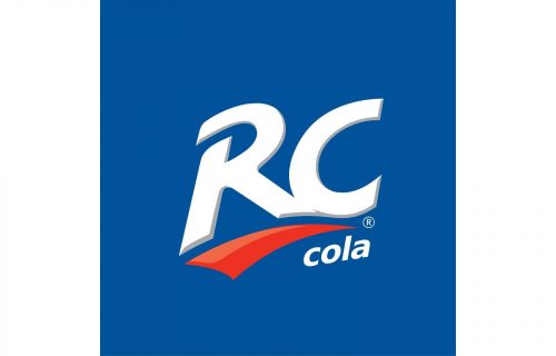
The RC Cola logo we all can see today was introduced in 2009 and I based on the previous version, but with some visible modifications. The typeface became wider and bolder, and its lines — cleaner and more geometric, white the underline got its contouring removed, yet its body was now executed in two shades of red. The “Co-la” tagline was again added to the logo, but now it was written in a bold lowercase sans-serif.
2018 – Today (secondary)
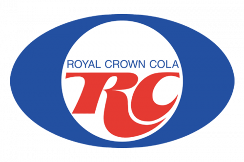
The 2018 logo uses a lot from the old 1982 design, including the emblem and the full name written in blue above it. This one, however, has no trail, isn’t skewed and instead put inside a white circle. For its part, it sits in a middle of a dark blue oval.
Font and color
The main element of the logo, the RC monogram, is written in a designer graphical font, which doesn’t have any commercial analogs, unlike the lowercase “Cola” tagline; which is set in a slanted sans-serif typeface, looking quite similar to such fonts as Belle Sans, or Unitexxtrade.
As for the color palette of the Royal Crown Cola, it is based on a classy combination of bright blue, red, and white, the very patriotic American palette, which always looks confident and strong.


