Club Roma was formed by the merger of 3 previously existing soccer clubs in Rome – Roman, Alba-Audace, and Fortitudo. The goal of the merger, according to the thought of the then-fascist dictator Mussolini, was to win over the stronger northern clubs. The first significant achievement of the team was the second place in the Italian Championship in 1930, where Roma lost to Juventus.
Meaning and history
While Associazione Sportiva Roma has gone through a whole succession of logotypes, you can definitely pick out recurrent elements and themes. For instance, the wolf theme and the shield shape, both of which have been present in the majority of the logotypes the football club has had so far.
Why are there two babies and a wolf on the shield? The babies are Romulus and Remus, the two twins from the famous Italian legend describing how Rome was founded. The boys, who were kidnapped from their mother, were raised by a wolf and, after multiple adventures, decided to found a city. They couldn’t agree, though, how to call it, so they started fighting and fought so savagely that Romulus eventually killed his brother.
The Roma logo apparently depicts La Lupa Capitolina (“the Capitoline Wolf”), the famous bronze sculpture of the mythical she-wolf suckling Romulus and Remus.
1927 – 1930
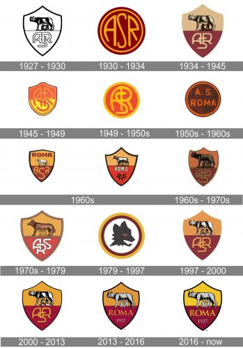
 The very first football club logo, which was adopted in 1927, comprised the depiction of the statue with the monogram “ASR” (Associazione Sportiva Roma) below. The symbol was placed inside a shield shape.
1930 – 1934
 Three years later, a simpler roundel emblem was introduced, where only the letters could be seen. The legendary Roma symbol made a return, though, in 1934. Back were the shield shape and the wolf.
1934 – 1945

The original aroma crest was first drawn in colors in 1934. This is when the beige and burgundy color palette was adopted for the football club’s visual identity. The upper part of the crest featured a soft beige gold background, with the wolf drawn over it in black lines. While the bottom part was colored in calm and deep burgundy with the beige monogram on it.
1945 – 1949
In 1945, the club returned to the monogram logo, although it now looked differently – the interlacing letters were surrounded with a shield shape divided into two fields, red and yellow.
1949 – 1950s

The yellow and red “ASR” crest emblem turned into a circular medallion in 1949. The letters kept their shapes, but now “A” and “R” we’re sharing one vertical bar, which made the whole composition look different. Also, the new rounded shape of the badge added some progressiveness and motion to a classy crest-like insignia.
1950s – 1960s
The circular shape remained untouched, but everything else was changed at the beginning of the 1950s — the yellow and Ted color palette was switched to dark brown and orange, and the lettering was split into two levels, with lots of space between the symbols and straighter and more traditional shapes of the letters. Now it was “A. S.” Placed above the uppercase “Roma” in the same color and same rounded and bold sans-serif typeface.
1960s

Two new badges were created for the Roma football club in the 1960s. Both were based on the classy crest from 1934, but with some differences. The first one featured a more intense color palette, with deep yellow and burgundy shades and a large yellow monogram on the bottom part. As for the second logo, it was more elegant and strict, in a bold black outline, with a two-leveled inscription in white and black.

1960s – 1970s

The next Roma badge, created in the 1960s, featured a darker color palette and larger size of the black elements, which made the overall mood of the visual identity more solid, confident, and even dangerous. The wolf was enlarged and drawn in black and brown shades, while the monogram under it was written in small letters, using dark gold shade, which was almost invisible on a burgundy background.
1970s – 1979

In the next version of the Roma FC logo the color palette became brighter and more uplifting — both yellow and red were used in their light shades now, and the framing of the crest turned medium-gold, as well as the body of the football club’s mascot. The intertwined “ASR” inscription from the bottom part of the logo was now executed in bold white lines and looked fresh, adding a sense of progress and movement to the whole badge.
1979 – 1997

A completely different logo was used by the Italian football club in the 1980s. The badge, created in 1979, featured a stylized abstract portrait of the animal, drawn in solid dark gray and placed on a white background of a circular medallion in a double yellow and burgundy frame. There was no lettering on this badge and the only bright element was the wolf’s red-eye, which made the animal look like Dan refocused and wild.
1997 – 2000

In 1997 the club decides to come back to its roots and starts using the classy two-colored crest as the official logo again. The framing was now gone and the clean lines and contours of a smooth gold and burgundy shield were balanced by the sharp black stricken of the wolf’s image on top and shadowed stylized monogram in gold on the bottom.
2000 – 2013
The colors got more intense after the Roma badge redesign of 2000. It was also outlined in black for a stronger contrast and distinction. The lettering became thinner and more elegant but haven’t lost their strength, getting the delicate shadow darker than on the previous version of the badge. As for the iconic wolf, it was also refined and drawn with more black accents now.
2013 – 2016
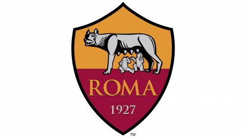
The redesign of 2013 made the Roma logo look smoother due to the use of gray shade for the elements that were colored white on the previous badge. The wolf was enlarged and the number of black lines on its body was reduced, so now the animal was visible much better. Another important thing about that redesign was a complete remake of the bottom part of the crest. The monogram was replaced by the classy “Roma” in the uppercase, underlined by a sliver-gray “1927” datemark in a smaller size.
2016 – Today
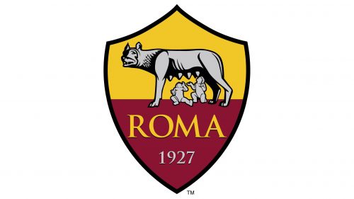 The 2016 Roma logo depicts the legendary wolf statue with the lettering “ROMA” and the date 1927 below. Again, the shield is divided into yellow and red fields. The overall look of the emblem reminds the original one.
Font
The sans serif font featured on the Roma logo has a traditional feel. It may look even old-fashioned, yet, taking into consideration the overall style of the logo and the way it emphasizes the history of the club, this choice doesn’t seem out of place at all.
Color
The primary colors of the logo are imperial purple and golden yellow. The palette actually coincides with the colors of Rome – it is also featured on the official seal of the Comune di Roma. Both the colors are supposed to symbolize Roman imperial dignity.
Roma Colors
GIALLO ROMA
PANTONE: PMS 130 C
HEX COLOR: #F0BC42;
RGB: (240, 188, 66)
CMYK: (6, 26, 86, 0)
ROSSO ROMA
PANTONE: PMS 202 C
HEX COLOR: #8E1F2F;
RGB: (134, 38, 51)
CMYK: (9, 100, 64, 48)
GRAY
PANTONE: PMS COOL GRAY 3 C
HEX COLOR: #CACACC;
RGB: (202, 202, 204)
CMYK: (20, 16, 15, 0)
BLACK
PANTONE: PMS BLACK 6 C
HEX COLOR: #000000;
RGB: (0, 0, 0)
CMYK: (0, 0, 0, 100)


