

![]() Inter Milan Logo PNG
Inter Milan Logo PNG
As one of Italy’s oldest football clubs, Football Club Internazionale Milano (Inter Milan) has had its logo modified more than 15 times. Interestingly enough, the current version looks very much like the original one.
Meaning and history
![]()
Inter Milan is one of the most famous European football clubs, which history dates back to the beginning of the 20th century. And since its first days, the club has been using two main symbols for its visual identity, a circular monogram, and a snake, which have been refined and modernized throughout more than ten redesigns of the team’s logo.
1908 — 1928
![]()
The initial logo for Inter Milan was introduced in 1908 and stays with the club until now. It was a circular medallion with a calm gold background and a double-thick outline in black and blue. The stylish and strong “IMFC” monogram was drawn in white on a gold background. The letters “F” and “M” were overlapping and placed inside the enlarged “C”, which repeated the contours of the emblem’s border. The “I”, standing for “Inter” intertwined horizontal bars of the “F”, looking like piercing the monogram.
1928 — 1929
![]()
The redesign of 1928 had a different approach to design — the new emblem featured a circular badge, vertically divided by a wide gold column. On the left, from it, there was a smaller crest with a green serpent on it and a silver crown, and on the right — a sharp shiny ax and a crest with a Red Cross. It was a badge, composed of the Milan heraldic symbols, and it gave birth to numerous future logos, used by the club in the 1960s and 1980s.
1929 — 1931
![]()
The logo from 1929 used another style, with a geometric pattern and distinct color contrast. The new badge also features a rounded shape, though this was the only similarity to the previous versions. The rhomboid crest in the middle of the emblem was colored in blue and black vertical stripes, outlined in gold, and the frame of the figure was split into eight black and white segments. On two whites there were “A” and “S” letters in gold. The black horizontal banner with gold “Ambrosiana” wordmark was set on the bottom part of the circle.
1931 — 1945
![]()
The logo changes its major shape from circle to rhombus in 1931, keeping the striped blue and black patterns from the previous version. Now there was a light beige or gold football placed in the center of the emblem, and all the lettering was located on the frame, along the borders of the badge. The inscription in gold sans-serif was composed of “Associaz Sportiva Ambrosiana Inter”.
1945 — 1960
![]()
In 1945 the club returns its original emblem, drawing it in reverse colors, with the framing still in black and blue, but the inner circle became white, while the iconic intertwined monogram became light gold. This version of the logo stayed with Inter Milan for fifteen years.
1960 — 1963
![]()
The logo, introduced in 1960 featured a traditional crest, which was vertically split into two equal parts, with the left one in blue and black, and the right one in white with the blue serpent and a gold football image on it.
1961 — 1963
![]()
The version of the emblem from 1961 comprised a vertically striped oval in blue and burgundy colors, with the gold snake in the middle and the “Inter” inscription placed on the horizontal banner on the top part of the badge. Later, in 1962, the oval was placed on a crest and changed its colors to blue and black.
1963 — 1966
![]()
The circular medallion with the monogram returns in 1963 in its original color scheme, but with the additional version created. On the second variant of the badge, the calm beige-gold was changed to a bright yellow.
1966 — 1978
![]()
The redesign of 1966 switched the classy sans-serif typeface of the letters into a sharp and sleek serif one, and refined the colors of the badge, making it more delightful and airy.
1978 — 1988
![]()
The new design concept was adopted by the club in 1978. The traditional strict crest featured a diagonal pattern, consisting of white, blue, and black stripes, and a white serpent placed in the middle. The gold five-pointed Star was placed on the top left white segment of the badge. There was also a logo version with the black capitalized “Inter” inscription on the upper part of the shield.
1988 — 1998
![]()
The original logo comes back to the club’s visual identity in 1988, being slightly refined, and with its lettering still in a sharp serif font. The gold five-pointed Star was now placed above the circle, and sometimes the whole composition was enclosed into an oval frame and set on a striped blue and black background.
1998 — 2007
![]()
The redesign of 1988 switched the color palette of the logo by setting the gold monogram on a black background and placing it inside a bigger blue circle with the white “Inter” lettering arched on the top and the “1908” datemark in the bottom.
2007 — 2014
![]()
The logo from 1966 is back in the renewed color scheme, with the beige-gold internal circle and a star, white lettering, and black and blue framing. For the 100th anniversary of the Inter Milan club, the medallion was outlined with a thin gold line and additional lettering placed around the badge’s perimeter.
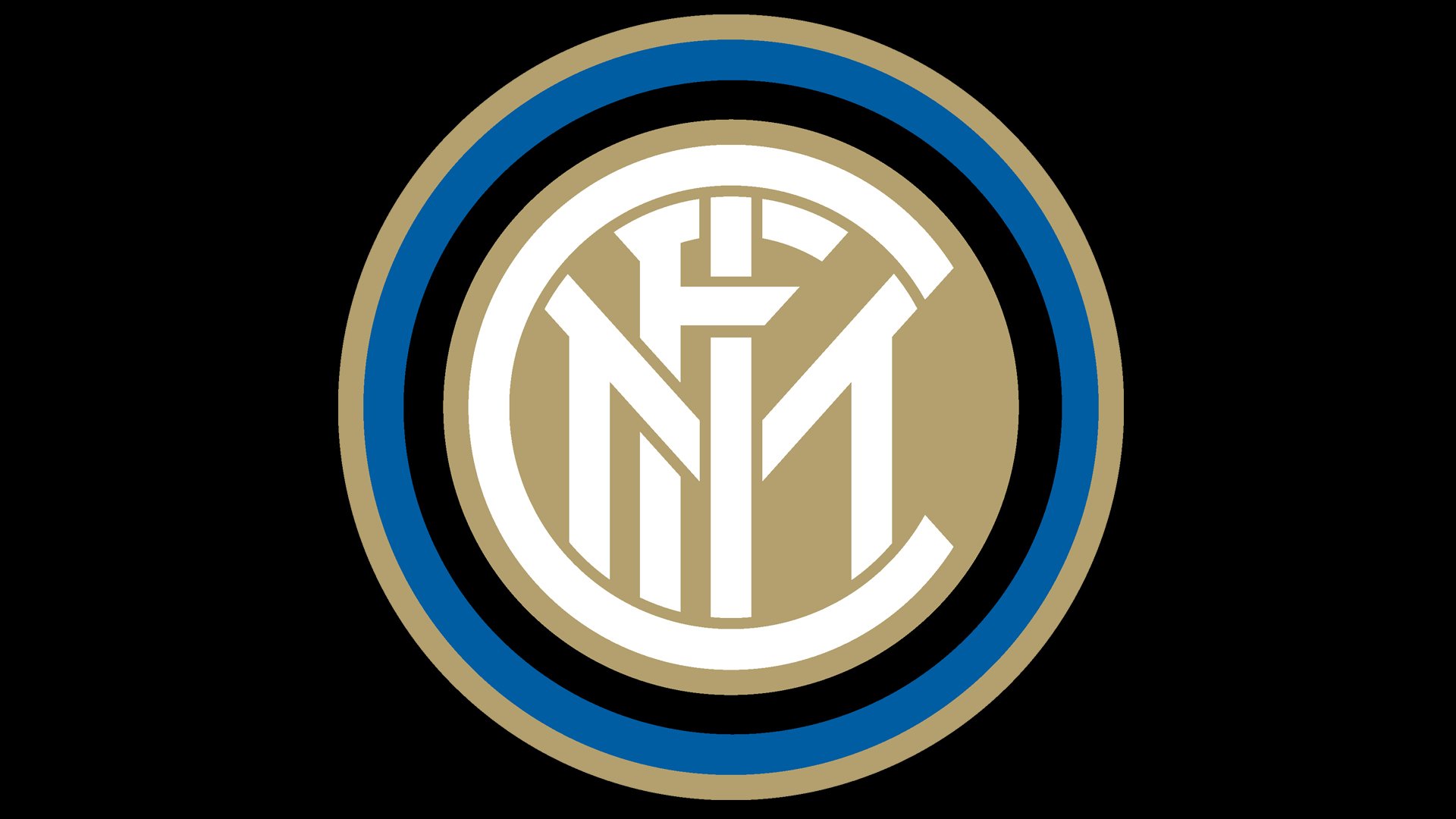
2014 — 2021
![]()
The current logo version of the Italian football club was introduced in 2014 and featured the original design with refined and strengthened contours. The fancy lettering in an art-deco style is drawn in white on a sand-gold circle, which is enclosed in a triple black, blue, and gold frame.
2021 — Today
![]()
The Inter Milan logo was refined in 2021, with the color palette switched to a bright blue, white and black, and the contours of all elements emboldened and cleaned up. The “FCIM” monogram from all previous versions was simplified and replaced by the two overlapping letters “IM”, enclosed into a white circular frame, drawn in the line of the same thickness as the bars of the characters.
Symbol
Some of the crests introduced later in the club’s history had nothing in common with the logo FC Internazionale Milano adopted in its first days. For instance, the three logotypes used in 1928-1945 were not based on the interlacing “FCIM.” The same was true about the emblems unveiled in 1960, 1961, and 1978.
Current emblem
And yet, the club has been returning to its original logo again and again until eventually in 2014 it introduced a roundel emblem where the iconic interlacing initials were placed inside three rings – black, blue, and gold.
Colors
![]()
The noble gold hue dominating the Internazionale logo looks very eye-pleasing when paired with the muted shade of blue. White and black elements provide the finishing touch.
![]()
Inter Milan Colors
BLACK
PANTONE: PMS BLACK 6 C
HEX COLOR: #000000;
RGB: (0, 0, 0)
CMYK: (0, 0, 0, 100)
BLUE
PANTONE: PMS 286 C
HEX COLOR: #010E80;
RGB: (1, 14, 128)
CMYK: (100, 70, 0, 25)


