Gent is the name of a Belgian football club, which was established in 1864. Being one of the oldest European clubs, Gent successfully perfumes in the Belgian Premier League. Today the club, nicknamed The Buffalos, is managed by Laszlo Boloni.
Meaning and history
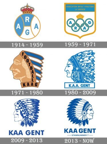
The visual identity history of the football club from Belgium can be split into two pe-riods — the first part, from the club’s foundation and until the beginning of the 1970s, and the modern era, which started in 1971 and continues today.
1914 — 1959
The badges the team used in its early years were pretty simple and had the crown as its main symbol, as the club was called “Association Royale Athletique la Gantoise”, or simply ARAG.
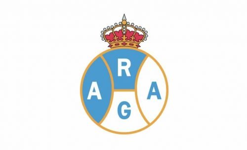
The logo, designed in 1914 was composed of a circular badge, divided into four segments — two blue and two white ones. Each segment was outlined in gold and contained one of four letters of the club’s name. The ornate red crown was set on top of the crest.
1959 — 1971
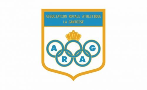
With the redesign of 1959, the club got a more modest and professional logo, which consisted of a white shield in a thick gold outline with a wide blue banner on top. Five Olympic Rings in blue were placed on a white background. Four of the rings had blue “ARAG” letters inside, and the fifth one, in the middle — the golden crown. The full wordmark of the club was written in thin gold letters on a blue banner.
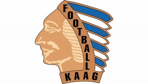
1971 — 1980
A completely new style comes to the club’s visual identity in 1971. The Native American man portrait in the profile is now the only element of the logo. The image was executed in gold, blue, and white and featured a black “Football KAAG” lettering placed along the frame of the feather headpiece and under the neck of the man.
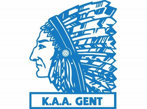
1980 — 2009
In 1980 the gold shade is removed from the logo and the Indian man is redrawn in a more detailed manner. The “K. A. A. Gent” inscription is now placed in an outlines rectangle under the portrait.
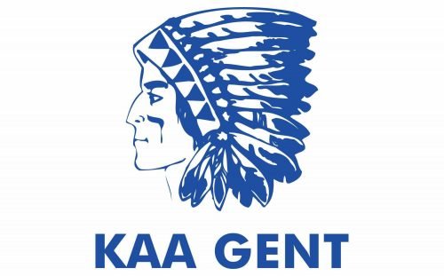
2009 — 2013
The portrait is being redesigned again in 2009. Executed in sharper and more con-fident lines, the Native American man, facing left is now complemented by enlarged lettering with no outline.
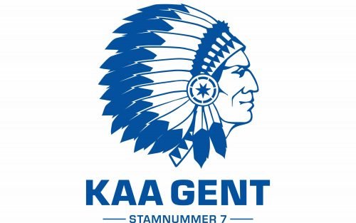
2013 — Today
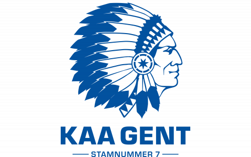
The Indian got a more powerful look and changed his direction to the right in 2012. The wordmark was also redrawn, and now it is executed in a modern sans-serif typeface with clean straight letter lines. Under the nameplate, there is a “Stamnummer 7” tagline with two horizontal lines from both sides.


