Rolls-Royce is a British brand of the world’s most luxury car manufacturing company, which was founded in 1904 and incorporated in 2011. The brand’s name is widely known all over the world as a mark of quality and luxury.
Meaning and history
The world’s most prestigious automobile company was founded in 1904 and got its official name in 1906. Named after its founders, Henry Royce and Charles Rolls, the brand became synonymous with luxury and elegance.
Unlike many other car manufacturers, Rolls-Royce remains loyal to its heritage and roots and still uses the logo, created in 1907.
There were a few redesigns held by the brand’s visual identity, but the style and font are still the same.
Is Rolls-Royce a company?
Rolls-Royce is a British company, which was established in 1906, and today is owned by the German BMW Group. Apart from the company, Rolls-Royce is the brand, and its trademarked, with all rights owned by its parent company, BMW.
1906 – 1934
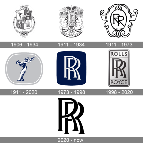
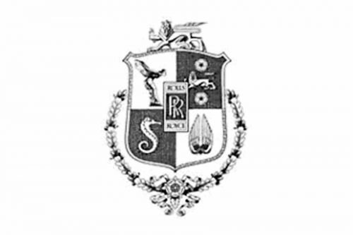
The first Rolls-Royce logo was composed of the brand’s iconic emblem, placed on an ornate coat of arms. The color palette of the earliest company’s visual identity was mainly red, which was a reflection of the Rolls-Royce passion and power.
The famous typeface was designed in the early years and was a perfect representative of its time’s style and sophistication.
1911 – 1934
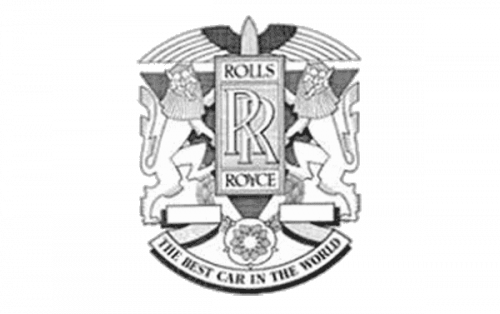
In the same 1911 year, another badge was created, and it stayed for longer. A classy heraldic badge with a rectangular monogram badge in the center and two rampant lions on the sides looked royal and luxurious, executed in a light silver palette with thin yet clean and confident lines.
1911 – 1973
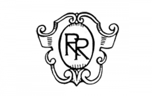
From the 1930s Rolls-Royce started using a simplified logo — the coat of arms is gone and only the iconic symbol stays. The color palette was switched to monochrome, showing the brand’s professionalism and authority. The Rolls-Royce logo is a symbol of elegance and height quality in everything.
During the years, the logo got some silver shades and more refined and sharpened lines, but the original style and heritage are still there.
1911 – 2020
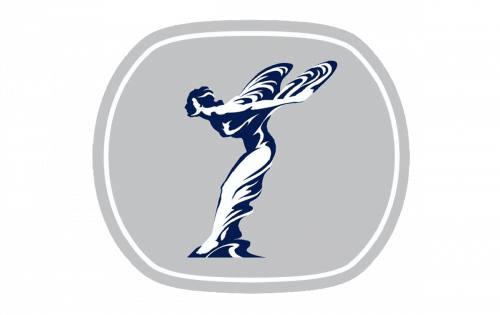
The logo, created for the iconic brand in 1911, became iconic as well. Despite the fact, that it has only been in official use for a bit less than nine years, the Spirit of Ecstasy figure, depicted on it, became an inevitable part of the luxury label’s visual identity. The badge was executed in light gray, dark blue, and white color palette, a combination evoking a sense of chic and sophistication.
1973 – 1998
With the redesign of 1973, a contemporary minimalistic badge came to the visual identity concept of Rolls Royce. It was a softened solid blue square (with the sides arched from the center and rounded corners), with a silver and white “RR” monogram in a recognizable iconic typeface with slightly flared ends of the lines. The colors contrast and the elegance of the lines made this simple badge look exquisite and unique.
1998 – 2020
The silver and black plate from the earliest logos has been in use by Rolls Royce from 1998 until 2020. It was a vertically oriented rectangle with rounded angles, a bold black RR monogram in the center, a thin black outline, and the brand’s name written along the top and bottom parts of the logo, in the modern medium-weight sans-serif uppercase.
2020 – Today
With the redesign of 2020 the Rolls Royce logo became even more elegant. The iconic monogram is still written in a sleek serif font, adopted by the company years ago, but now the double “R” with sharp fancy serifs on the ends of the lines, and flared bars, are drawn in plain black against a simple white background, with no additional elements. The minimalistic approach has elevated the legendary brand, which has been a synonym for chic and luxury for years.
The Emblem
The iconic Rolls-Royce emblem is composed of a vertically located rectangular with rounded angles, the wordmark, and the brand’s monogram.
The wordmark in capital letters is split into two parts, with the “Rolls” on the top and “Royce” on the bottom of it. The “RR” monogram is executed in a custom Art-Deco typeface with sleek sophisticated lines.
The rounded angles of the rectangular are balanced by the inner outline, which makes it even more smooth and elegant.
The color palette of the Rolls-Royce logo was the main issue of the brand’s redesigns throughout history.
Font
Why Rolls-Royce symbol is so expensive?
Rolls-Royce is a brand, synonymous with luxury and chic. Everything about this company is extremely prestigious and expensive, and so is the emblem of the brand, which can be seen on the bonnet of each Rolls Royce car. The Spirit of Ecstasy is usually made of precious metals and often encrusted with diamonds and gems.
What is the cheapest Rolls-Royce?
The cheapest car model of the Rolls-Royce brand is Rolls-Royce Phantom, which price on the second-hand market can be around 60-70 thousand USD. The older models of Phantom can be found even less.
How much is a Rolls-Royce logo worth?
The most expensive part of the Rolls-Royce visual identity is, of course, the emblem, known as the spirit of Ecstasy. Depending on the material it is made of and the additional design features, the price can vary from 1,5 thousand USD to 200 thousand USD. Although, there is no upper limit.
Do Rolls-Royce break down?
Of course, Rolls-Royce is at the top of the world’s automobile industry, but it is still a car, not a spaceship, and it is made by people, so of course, the vehicles of this iconic British brand can break down. Even though it happens pretty rarely, it happens.


