Rold Gold, owned by the multinational snack food giant Frito-Lay, specializes in producing pretzels in a variety of shapes and sizes. Frito-Lay itself is a division of PepsiCo, one of the largest food and beverage companies globally. Rold Gold operates primarily in the United States, where it has established itself as a leading brand in the pretzel market, leveraging the extensive distribution network of its parent company to reach consumers across the country.
Meaning and history
Rold Gold was founded by the American Pretzel Company in 1917, establishing its roots in a rich tradition of pretzel making. Over the decades, Rold Gold has become synonymous with quality pretzels, consistently maintaining high standards in its production processes. One of its significant achievements was the successful national distribution strategy it implemented in the mid-20th century, which allowed it to expand beyond its initial regional market. This growth was further accelerated after being acquired by Frito-Lay in 1961, which enabled Rold Gold to leverage Frito-Lay’s extensive distribution and marketing capabilities. Today, Rold Gold continues to be a dominant player in the pretzel market, known for its wide variety of pretzel styles, including traditional twists, rods, and braided shapes. The brand remains a favorite for consumers looking for both classic and innovative pretzel snacks, maintaining its reputation for quality while continuously adapting to new market trends and consumer preferences.
What is Rold Gold?
Rold Gold is a prominent pretzel brand owned by Frito-Lay. Known for its quality and variety, the brand offers an array of pretzel shapes and sizes, catering to diverse consumer tastes and preferences. Rold Gold continues to thrive in the snack industry, bolstered by strong branding and widespread availability.
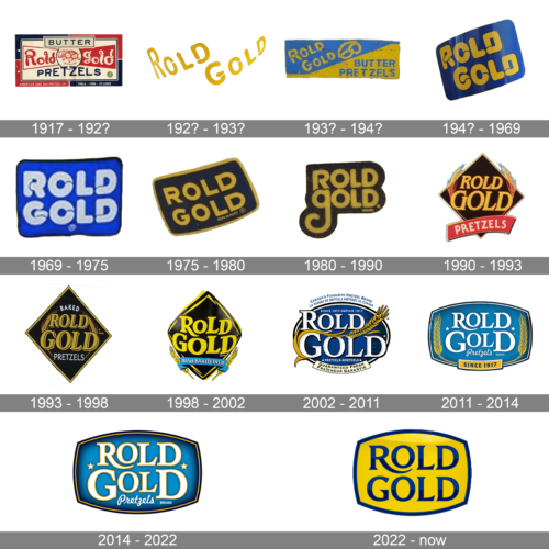
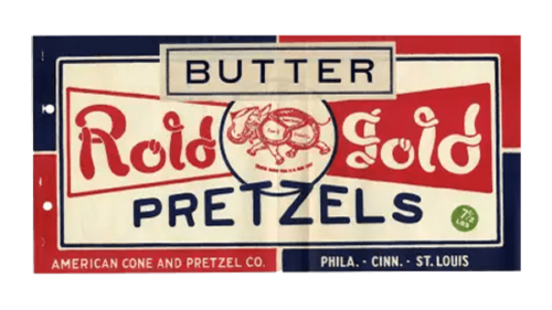
1917 – 192?
This logo features a bold and vibrant design with a nostalgic charm. The “Rold Gold” text is presented in a lively red color with a playful, cursive font that gives it an old-fashioned yet energetic feel. The word “BUTTER” is prominently displayed in a rectangular box above the brand name, emphasizing the product’s key ingredient. The logo also includes an image of a pretzel in the center, surrounded by a blue circle, reinforcing the brand’s core product. The background is a mix of red, blue, and white, giving it a patriotic and eye-catching appearance, indicative of early 20th-century American branding.
192? – 193?
This design is simplistic yet visually striking, with “Rold Gold” written in a unique, yellow font that appears to be playful and engaging. The letters are arranged in a slightly curved manner, creating a dynamic flow across the logo. The bright yellow color stands out against the white background, making the brand name easily recognizable. This minimalistic approach focuses solely on the brand name without any additional elements, reflecting a straightforward and confident brand identity.
193? – 194?
This logo utilizes a more structured and geometric design. The brand name “Rold Gold” is displayed in a bold, yellow font against a blue and yellow diagonal background. The text is complemented by an illustration of a pretzel, reinforcing the product focus. The combination of yellow and blue creates a vibrant contrast, making the logo visually appealing and memorable. The emphasis on “BUTTER PRETZELS” highlights the product’s key feature, catering to consumers’ tastes during that era.
194? – 1969
This design adopts a more modern and streamlined look. The brand name “Rold Gold” is presented in a bold, yellow font with rounded edges, set against a dark blue background. The letters are large and evenly spaced, creating a sense of stability and reliability. The logo’s simplicity and clarity make it easy to recognize and remember, reflecting the brand’s established presence in the market during the 1940s.
1969 – 1975
This logo embodies the vibrant and experimental spirit of the late 1960s. The brand name “Rold Gold” is displayed in a bright blue font with a bold, retro style. The background is a vivid blue, making the yellow letters pop. The playful and unconventional font style captures the era’s cultural shift towards more expressive and creative designs, appealing to the younger, more adventurous consumer base of the time.
1975 – 1980
The 1975 logo maintains the brand’s recognizable color scheme but introduces a more contemporary font. The brand name “Rold Gold” is written in a yellow font against a dark blue background, with the letters slightly overlapping each other. This design choice adds a sense of unity and cohesion, while the rounded font style gives it a friendly and approachable feel. The logo’s simplicity ensures it is easily identifiable, staying true to the brand’s consistent image.
1980 – 1990
This design continues the evolution towards a more modern look. The brand name “Rold Gold” is displayed in a bold, yellow font with a sleek, contemporary style. The logo features a black background that enhances the visibility of the yellow text. The clean lines and straightforward design reflect the brand’s confidence and reliability, appealing to a broad audience while maintaining a strong, professional image.
1990 – 1993
The 1990 logo introduces a dynamic and innovative design. The brand name “Rold Gold” is written in a bold, yellow font with a slightly italicized style, giving it a sense of movement and energy. The background features a diamond shape in black with a red ribbon below, emphasizing the brand’s premium quality. The addition of wheat stalks flanking the logo highlights the natural ingredients and wholesome nature of the product. This design combines traditional elements with a modern twist, appealing to both loyal customers and new audiences.
1993 – 1998
This logo features a sophisticated design with a black diamond shape as the backdrop. The brand name “Rold Gold” is presented in a bold, gold font, emphasizing a premium feel. The word “BAKED” is placed above the brand name, while “PRETZELS” is below, both in white font for contrast. The inclusion of wheat stalks flanking the logo highlights the natural and wholesome ingredients. The overall design conveys a sense of tradition and quality, appealing to consumers who value authenticity in their snacks.
1998 – 2002
This logo exudes a fresh and modern vibe. The brand name “Rold Gold” is showcased in a bold, yellow font set against a black diamond shape, creating a striking contrast. A blue ribbon below the brand name features the phrase “FRESH BAKED TASTE,” emphasizing the product’s quality and freshness. The wheat stalks on either side of the ribbon reinforce the natural ingredients. The dynamic design aims to attract health-conscious consumers who seek fresh and tasty snack options.
2002 – 2011
This design reflects a blend of heritage and modernity. The brand name “Rold Gold” is written in a bold, white font with a yellow outline, set against a blue circular background. The logo includes a golden wheat stalk, symbolizing the natural ingredients. The phrases “CANADA’S FAVOURITE PRETZEL BRAND” and “GUARANTEED FRESH” in both English and French highlight the brand’s popularity and quality assurance in the Canadian market. This bilingual and detailed design aims to appeal to a broad audience while emphasizing the brand’s commitment to quality.
2011 – 2014
This logo features a contemporary design with a blue oval background and white font. The brand name “Rold Gold” is prominently displayed in bold letters, flanked by golden wheat stalks. The phrase “SINCE 1917” below the brand name emphasizes the brand’s long-standing history and tradition of quality. The use of blue and gold colors creates a visually appealing contrast, reflecting both reliability and premium quality.
2014 – 2022
This design modernizes the brand’s image with a vibrant blue background and a clean, white font. The brand name “Rold Gold” is flanked by a golden line. The inclusion of stars adds a touch of elegance and premium quality. The overall design is sleek and contemporary, appealing to modern consumers who appreciate both tradition and innovation in their snack choices.
2022 – Today
The current logo features a simple yet impactful design with a yellow background and blue font. The brand name “Rold Gold” is displayed in a bold, modern font, emphasizing clarity and readability. The minimalistic approach, combined with the bright color scheme, ensures the logo is easily recognizable and memorable. This design reflects a focus on freshness and quality, appealing to a wide range of consumers looking for a reliable and tasty snack option.


