Resident Evil has been in the international video-gaming market for more than twenty years, and throughout its whole history, the game has never lost its popularity. On the contrary, with each new release, Resident Evil was getting more and more fans from all over the world.
Meaning and history
Capcom, the company, which developed Resident Evil, was initially planning to call the new game “Biohazard”. But in 1996 on the American market the game with the same name already existed, so Capcom had to abruptly come up with some other name for the American market, and settled on Resident Evil, remembering their 1989 game Sweet Home. It’s also a horror game about a house of horrors, and one of the characters advises the other one – you must escape this house of residing evil. Meaning the very same mansion where the action of the game takes place. So it turns out that the name was changed to Resident Evil.
In terms of the plot, it is a pretty interesting horror survivor. It is set in the late 1990s in the fictional city of Raccoon City, where the zombie virus first appears as a threat to humanity. It all began when the local Raccoon City newspaper, The Raccoon Times, published an article on July 9, 1998, about the increasing number of disappearances. More and more bodies were being discovered that had been mutilated. But the killers could not be found, so a special S.T.A.R.S. team was brought in.
The Resident Evil releases in chronological order:
- Resident Evil (1996).T.A.R.S. Alpha Special Forces agents Chris Redfield and Jill Valentine go on a rescue mission to find their fellow Bravo squad members who failed to report back on their mission to investigate what happened near Raccoon City. Jill and Chris are led to a mansion teeming with zombies and other indescribable creatures.
- Resident Evil 3: Nemesis (First Half) (1998). Nemesis enters the story 24 hours before Resident Evil 2 begins. Although there are some obvious plot connections to the second game in these early segments, the first half is a side story designed to shed light on what happened to Jill Valentine after the events of Resident Evil.
- Resident Evil 2 (1998). Police rookie Leon Kennedy and Claire Redfield are stranded in Raccoon City during a virus outbreak and must survive the oncoming zombie hordes and track down Claire’s brother Chris.
- Resident Evil 3: Nemesis (Second Half) (1999). The second half of Resident Evil 3 unfolds two days after the events of Resident Evil 2, which technically requires a split on the timeline.
- Resident Evil Survivor (2000). This installment is set on a small island where the Umbrella facility is located, and the game served as an early indication that the corporation’s experiments cannot be contained despite the measures taken.
- Resident Evil Code: Veronica (2000). This game finally reunited Claire Redfield with her brother Chris. It is also the game that showed what Chris Redfield was doing after the events of the first Resident. More importantly, it brought Albert Wesker back into the game and confirmed that he had acquired superhuman abilities.
- Resident Evil Zero (2002). Story Zero tells the story of Officer Rebecca Chambers and convict Billy Cohen exploring an abandoned training facility for employees of the pharmaceutical company Umbrella.
- Resident Evil 4 (2005). In Resident Evil 4 you play as Leon again, this time on a mission to rescue the president’s daughter Ashley from a mysterious cult in Spain. This game was a major turning point for the series, as it relied more on action mechanics than survival horror.
- Resident Evil 5 (2009). Continuing to turn horror into action, the developers of Resident Evil 5 introduced a story in which Chris Redfield pursues a bioterrorist named Ricardo Irving.
- Resident Evil 6 (2012). Resident Evil 6 focuses on the C-virus and various attempts to spread it. The game has four campaigns in which you can play Chris Redfield, Leon Kennedy, Jake Mueller (Wesker’s son), and Ada Wong, and for the most part, they seem unique, as all the characters have their style of play.
- Resident Evil 7: Biohazard (2017). Resident Evil 7: Biohazard is the game that rebooted the series, something the franchise so desperately needed. The new hero, Ethan Winters, goes to an abandoned plantation in search of his long-missing and declared-dead wife Mia.
- Resident Evil Village (2021). A direct sequel to the previous game. The story begins with a quiet evening at the Winters’ house. As Ethan and Mia are having dinner, gunshots ring out in the darkness and the girl is killed by Chris Redfield right in front of her husband.
Apart from the original games, there are also several remakes and anime projects, created under the same franchise.
What is Resident Evil?
Resident Evil is the name of an iconic survivor horror video game, which was released by Capcom in 1996, and by 2023 has already released several remakes. The popular shooter today is available for various gaming platforms, including Nintendo, Xbox, PlayStation, Android, and iOS.
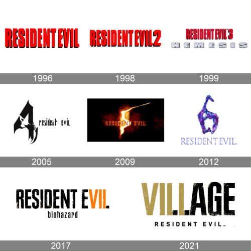
In terms of visual identity, the logo of the iconic video game Resident Evil was refined with each new release. Some of them featured the same style and concept, while others look completely different.
1996
The very first Resident Evil logo was designed in 1996, and stayed untouched for two years, being a basis for several consecutive badges. It was a bright red uppercase inscription in a narrowed geometric sans-serif typeface with flat distinctive characters boasting clean black shadows. This logo is still used by the franchise as the primary one.
1998
For the release of the second version of the game, the original Resident Evil logo was slightly refined. There was just one change — the digit “2” was added on the right of the logotype. It was set in the same style and color but featured a slightly more extended shape.
1999
For the Nemesis version of the Resident Evil game, the logo was introduced in 1999. The main logotype got a bit darker, and the “2” was replaced by the “3”. The new element on the badge was the heavy and stylized “Nemesis” written in all capitals under the red wordmark, in voluminous square letters with a gray texture and thin black shadow.
2005
Another redesign of the Resident Evil logo happened in 2005, with the release of the newer version of the game. It was a completely different concept, with the lowercase lettering set on the right from the enlarged stylized “4”, with sharp ends of the lines, and torn contours, which add a dramatic touch to the logo. This feeling is enhanced by the new, black-and-white, color palette of the badge.
2009
In 2009 the logo was completely remade again. The three-dimensional badge has a background with a flame ornament on it and the voluminous red and orange lettering in the uppercase of an elegant serif typeface. The flame part of the logo is placed in the center of a cold white-to-gray element, making up the “fire and ice” concept. The digit “5” can be seen in the middle of the flame.
2012
The redesign of 2012 has introduced a sleek and futuristic version of the Resident Evil visual identity, with a stylized voluminous “6” placed above the elegant serif lettering in gradient purple. The digit has a purple surface glossy and resembles a lacquer or plastic.
2017
For the Biohazard version of the Resident Evil game, the new logo was created in 2017. It was a stylized uppercase lettering in black and orange, with the typeface resembling the one from the original versions, with no shadow, and with the contours slightly softened and erased in some parts. The logotype was placed above the lowercase “Biohazard”, written in plain black letters of a smaller size.
2021
With the release of Resident Evil: Village, the new logo was introduced in 2021. Here the concept got slightly changed, with the “Village” part of the name set in stylized capitals above the small “Resident Evil” in modern sans-serif. The upper line of the badge is executed in a black and sand-beige shade.
Font and color
The primary Resident Evil wordmark is set in a stylized sans-serif typeface with bold and narrowed characters. The closest fonts to the one, used in this insignia, are, probably, Plak Pro Black Extra Condensed, or Cooperative Dirty Bold, with some minor modifications.
As for the color palette of the Resident Evil visual identity, there are several options — from the very dramatic and spooky red-and-black, traditional and brutal black-and-white, and stylish and unusual beige-and-black. All three look confident and distinctive.


