Remind is a privately owned American company, a leader in the field of mobile messaging for schools. The offices are located in Polo Alto, California. Their product is a social platform, on which they offer the parents, teachers, as well as principals of the school to communicate with each other. Their main market is the United States, although there are also representatives in other countries. The system is available in 80+ languages on PCs, IOS, and Android. By now, around a half of U.S. schools use the Remind software in their operations.
Meaning and history
The platform was launched in 2011 as a project carried by two brothers, Brett and David Kopf. They were inspired by the task to downsize the communication gap in the U.S. schools. The name of the soft derives from the history of its creation: while being at school, Brett Kopf was diagnosed with attention deficit disorder, accompanied by dyslexia. To help him, his brother developed a system meant to remind Brett about a test coming up. In 2011, the two have got the intention to create a company via Imagine K-12 a business accelerator helping educational startups.
What is Remind?
Remind is a startup which appeared in 2011 and was headquartered in the US. The company is focused on providing the best possible way to communicate for the school teachers, students, principals, and parents. Their product is a social media system available on all the main operational systems in 86 languages. Although there are branches in other countries, the most success was achieved in the United States, where nearly a half of schools use the Remind software in the educational process.
2011 – 2013
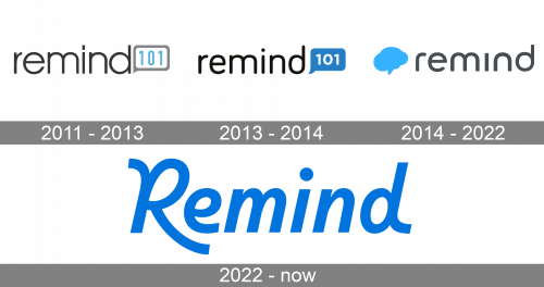
The initial logotype of the software depicted its initial name remind101. The word had a light sans-serif typeface with small intervals between the dark gray characters. In a brighter gray rectangular frame to the right, they placed a blue ‘101’ number.
2013 – 2014
The redesign of their brand logotype was made to mark the growing of the company. They changed the name font to a bolder one, and also painted it black. The rectangle with ‘101’ number became full, not empty. The number itself became white, and the shape blue.
2014 – 2022
When they changed the name to just Remind, the logotype was renewed as well. It featured just the black nameplate and a blue text bubble to the left.
2022 – today
Then, they refreshed the logotype’s conception. They deleted any images, and left only the name.
Font
Its typeface is made elegant and stylish: the initial ‘r’ character with a long lower tail covering the next ‘e’ from below, and the last ‘d’ character with a small back tail form a distinguished and bright appearance for the whole logo. The rest of the letters have rather a typical sans-serif appearance. However, there are other scripts in the history of Remind’s brand identity. For example, the 2014 nameplate had a minimalistic sans-serif typeface with all letters lowercase.
Color
Why do they use bright blue as the general shade for the 2022 logo? Because it symbolizes clearness, openness, and simplicity. These features are needed for and required from Remind, a mobile massaging app which unites thousands of random people from around the United States or even the world. However, there are other variations of the logotype black, for example. They’re used in various situations and backgrounds.


