Starting from 1938, the Philips logo has been using the same visual metaphor, and basically has been staying very much the same.
Meaning and history
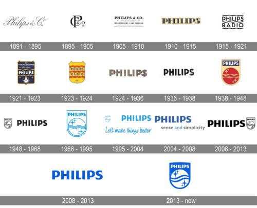
Philips is one of the world’s large companies that are very loyal to its roots and do not like experiments with its identity. The worldwide known brand has had only two redesigns of its logo throughout the years, keeping the style and character of the company.
1891 – 1895
The very first Philips badge was created at the beginning of the 1890s and stayed in use for the first four years of the company. It was a very elegant cursive inscription in a classy italicized handwritten font, with the black “Philips & Co” set against a plain white background.
1895 – 1905
The badge was redesigned in 1895, with the sophisticated wordmark replaced by a laconic graphical monogram. The “P” was overlapping the “Co”, and the small ampersand was placed inside the arch of the “C”. The composition was accompanied by a delicate equalizer sign in the bottom right corner.
1905 – 1910
The redesign of 1905 has replaced a monogram with stable uppercase lettering in the bold serif font, with the main wordmark enlarged and accompanied by several lines of additional text in small caps, executed in different typefaces.
1910 – 1915
The Philips logo, designed in 1910, featured a heavy uppercase “Philips” inscription in a geometric serif font, with the black characters accompanied by thin white strokes and outlined in yellow. It was a very confident and bright logo, which stayed with the company for another five years.
1915 – 1921
Another redesign was held by Philips in 1915 and resulted in a friendly two-leveled wordmark with each level underlined by a wavy line. All elements were set in black, with the same thickness, and the inscription was set in a modern sans-serif.
1921 – 1923
In 1921 the company has introduced a colorful badge, with white lettering written across the solid deep-blue rectangular banner in a yellow outline. The “Phillips” wordmark was enclosed between two yellow wavy lines, which divided the banner into three parts. The upper part featured a white additional lettering, while the bottom — a white light bulb with short and sharp rays coming out of it.
1923 – 1924
The redesign of 1923 has switched the color of the crest to bright yellow, rounded up its bottom part, and replaced all elements on the banner with just the two-leveled “Philips Radio” inscription in the uppercase of a bold sans-serif font. The muted blue words were enclosed between three bold red waves. The bottom of the crest was decorated by a thin and sharp four-pointed Star in the same shade of blue as the characters of the inscription.
1924 – 1936
In 1924 the company has adopted a minimalistic badge with just the heavy uppercase logotype in a grayish color palette with thin yellow stripes on the characters. The lettering was set in an extra-bold geometric sans-serif typeface with each letter stable and strong.
1936 -1938
The redesign of 1936 has rewritten the Philips logotype in a more elegant sans-serif font, with the inscription set in solid black and the letter “S” diagonally overlapped by a white decorative element. This version of the logo was only used for a couple of years.
1938 – 1968
The original Philips logo was introduced in 1938 and featured a sleek golden crest with its bottom line rounded. Inside the crest, there was a dark red circle with three horizontal wavy lines and four four-pointed stars — two in the upper left part of the circle, and two in the bottom right one. Above the red part of the logo, there was a blue horizontally stretched rectangular with a white wordmark located. The inscription in all capitals was executed in a narrowed yet bold sans serif typeface, where tall letters looked neat yet confident and modern.
1948 – 1968
With the redesign of 1948 the Philips crest, created ten years earlier, was redrawn in a monochrome color scheme and placed on the left from a bold uppercase logotype in a modern geometric sans-serif typeface. The font of the wordmark was repeating the font of the inscription of the crest.
1968 – 1995
The redesign of 1968 brought a new image to the brand, and the logo, which became a predecessor of today’s one, was introduced. The bold blue wordmark in all capitals of a strong yet simple sans-serif typeface was placed on a white background without any additional and graphical elements. The typeface of the inscription was very close to such fonts as Town 50 Chic Black and Dazzle Unicase Bold.
1995 – 2004
In 1995 the blue and white crest got accompanied by an enlarged logotype in the same shade of blue. The imposition was underlined by the “Let’s make things better” tagline in a cool cursive font with sharp contours of the characters. The tagline was using the same color as the two main elements.
2004 – 2008
The redesign of 2004 has removed the crest from the official version of the logo, and rewritten the logotype in a bolder style, with the characters set in a smoother and darker shade of blue. The logotype was underlined by a lowercase “Sense and Simplicity” tagline in gray and blue.
2008 – 2013
Another redesign, held by the company in 2008, has brought back the crest and placed it on the right from the uppercase logotype. Both elements were set in monochrome. This version of the logo was used by the famous brand for five years.
2008 – 2013
In 2008 the logo was refined, by elevating its blue color to a brighter and more intense shade and by modifying lines of the letters. The symbols became shorter and bolder, and the horizontal bar of the letter “L” gained a delicate diagonal cut. The typeface of the nee Philips logotype is similar to such fonts as Achates Heavy and Tanseek Sans Pro Regular.
2013 – Today
In 2013 the company came back to its iconic crest, slightly enhancing its color palette and using blue for the background of the main banner, with the inscription and the sphere set in white. The shade of blue was taken from the previous version of the logo.
Font
The wordmark sports uniform all-cap characters in a sans-serif typeface. The insignia formed in its present form as far back as the 1920s, and only subtle modifications have been made since then.
Color
The emblem has been featuring blue since 2008, with minor shifts of the shade.


