The Sony logo went through several amendments to its shape and proportions, yet, on the whole, it has always been what it is now – a simple typographic wordmark without any images.
Meaning and history
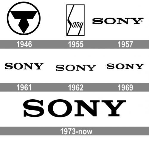
The history of the Sony visual identity has been pretty intense, if you count the number of the redesigns — six, though only the first two versions of the emblems were somehow different from the iconic logotype the whole world knows today.
What is Sony?
Sony is the name of a Japanese technology corporation, which was established in Tokyo in 1946. Today the products of the brand, such as consumer electronics, computers and accessories, video games, and even robots, are being sold all over the globe, making Sony one of the largest and most valuable companies in the world.
1946 – 1957
The very first logo for Sony was created in 1946 and stayed with the brand for more than ten years. It was a monochrome circular badge with an abstract geometric figure drawn in black and placed on a white background. The figure was formed by a trapezoid with its base up, and a rhombus, connected to its bottom part. The composition resembled a chic car badge and looked ashy and modern.
1955 – 1957
The first redesign of the Sony logo was held in 1955, and this is when the sharp and strong emblem was replaced by a smooth yet contemporary and stylish wordmark, enclosed into a vertically oriented rectangular frame. The handwritten inscription had the lines of the “S” elongated both up and down, and the tail of the “Y” touching the frame.
1957 – 1961
The predecessor of the current logotype was introduced by the Sony brand in 1957. It was a bold black inscription in a modern rounded serif typeface with the capital letters stretched. The massive serifs were elongated and rounded on their ends, adding unique character and individuality to the logotype.
1961 – 1962
In 1961 the logotype was refined — the letters became taller and gained more space and air between each other. The serifs became smaller but still were smooth and very visible.
1962 – 1969
The typeface of the logotype was changed again in 1962, by straightening the horizontal lines and serif of the letters and making them sharper and stronger. The contours became a bit thinner and more elegant, adding a timeless chic to the whole emblem, working great with a monochrome color palette, which has never left the visual identity of the brand.
1969 – 1973
The letters got slightly stretched again in 1969, and the serifs became rounded corners just like in the first version of the logotypes introduced in 1957, just a bit shorter. This wordmark was more balanced and harmonized than all the previous ones, evoking a sense of professionalism and confidence.
1973 – Today
The redesign of 1973 brought a modernized and refined version of the logotype to the Sony visual identity. The serifs on the letters are straight and clean again, and all the bold contours in the wordmark are neat and solid. The Sony logo, introduced in 1973 uses the Clarendon Medium font.
Symbol
Although the first insignia looked unique, the manufacturer decided to get rid of it, and as soon as in 1957 another logo was introduced. It was very close to the one the company has today: just a simple, traditional wordmark. The author of the logo was the Japanese designer Yasuo Kuroki.
Four year later the company updated its insignia, making it more solid. However, the following year the typeface was changed to a clearer, more transparent one.
The following updates took place in 1969 and 1973. The alterations were so subtle that they were hardly visible for someone who was not a professional, so the majority of consumers probably did not even notice any changes.
Current emblem
The latest version of the Sony logo was unveiled in 1973. Although afterwards the company considered changing its logo more than once, it has never actually dared do it. In 1982 an alternative emblem was created, which was supposed to benefit the corporate identity.
Font
The closest typeface is called Clarendon. However the Sony insignia does not just copy it, the characters have been slightly modified.
Color
The simple combination of black and white featured in the Sony logo looks clean, elegant and never goes out of fashion.


