The Refinery29 logo introduced in 2013 may look confusing, yet it has a hidden meaning appealing to a new group of readers.
Meaning and history
The women’s digital media and entertainment company was established in 2005 by four co-founders. The brand claims its mission is to help people discover and refine their personal style (hence the name “Refinery”). Today, it has over 500 million users across platforms.
2005 – 2013
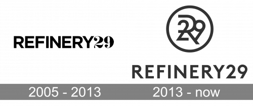
The original logo was a black wordmark using two typefaces: the word “Refinery” in capitals was given in a simple sans serif font, while “29” featured a more “script-y” type making it look a bit like a house number.
2013 – Today
The monogram logotype adopted in 2013 was created by the New York office of the brand consultancy Wolff Olins.
Interestingly enough, if you take a closer look, you may notice that, in addition to “29”, one more number – “30” – can be seen there, formed by the letter “R” and the circle. This goes perfectly well with the words “pretty next-level,” with which the brand itself describes its logotype. In fact, it can be a tribute to the thirtysomethings who loved Refinery29 in their twenties, and still do, and also a way to attract attention of the age group.
Quite a few people find the 2013 emblem jumbled as it takes a few seconds to realize whom it belongs to. Yet, taking into consideration the hidden message, it is not that easy to decide whether the more legible earlier logo was actually better.
Font
The typeface featured on the Refinery29 logo is minimalistic and elegant. Even the publication’s official Internet resource features custom font families probably designed for Refinery29. This approach certainly reinforces the overall brand.
Color
The publication sticks to the simple black-and-white scheme, like many fashion brands it writes about. Even on the company website, the use of color is minimal. When anything other than black or white is used, it is most often just a way to highlight article categories.


