

![]() USPS Logo PNG
USPS Logo PNG
The United States Postal Service (USPS) has used several different seals and logos during its almost two-hundred-year history. The eagle, in one form or another, has been part of the USPS logo since 1970.
Meaning and history
![]()
The USPS is the national postal service of the United States, with a history dating back to 1775. Today, this independent agency is one of the largest organizations in the world with more than 800,000 employees worldwide. Also, USPS is a full member of UPU, the Universal Postal Union. Thus, cooperation with other national postal services is achieved and today the mail sent from the U.S. through USPS can be delivered almost anywhere in the world.
USPS tries to keep up with the times and offers new and modern services to its customers. within the U.S., USPS guarantees delivery of express mail the day after it is sent. Other types of mail are also usually delivered as quickly as possible.
The Postal Service is not funded by the U.S. budget, as it earns money from the sale of mail delivery services, stamps, and other goods.
What is USPS?
USPS is an abbreviation, standing for The United States Postal Service, the main operator of postal services in the USA. It is an independent agency of the U.S. Federal Government and today USPS is one of the largest organizations in the world. The USPS employs about 800 thousand people. The official history of the service begins in 1775.
1829
![]()
The original postal seal showcased Mercury, who was the messenger of the gods in the mythology of Ancient Rome.
1837
![]()
The seal was redrawn from scratch. Instead of Mercury, it now depicted a horse and rider. While today the connection of this picture with postal services might be not obvious, it was not this way in 1837. In the earliest days of mail delivery, horses were used very often. Horse transportation on land was the main instrument for the United States Post Office since its start in 1775, as well as in the colonial era.
1970
![]()
The United States Postal Service was formed out of the Post Office Department, according to the Postal Reorganization Act. Almost immediately, the organization adopted a new visual brand identity.
The so-called Standing Eagle logo was introduced featuring the side view of the bird in blue and white. Below, there was the lettering “U.S. Mail” squeezed between two horizontal red bars. The writing “United States Postal Service” formed a border from both sides of the eagle and above it. Below, there was a succession of nine stars. The emblem can still be seen at a handful of locations.
According to the USPS blog, the eagle was used to reflect the organization’s spirit as it is “powerful, stately, determined, and undeniably American.”
1993
![]()
The so-called “Sonic” eagle was adopted. It has brought the eagle’s head into the focus of attention, which made the design more emotional. Also, this version of the United States Postal Service logo is more dynamic and “strong.” While in the previous version, the eagle was standing, the current one may suggest that it is flying. At least, the white elements above the eagle’s head look like the air being slashed by the flying creature.
Next to the emblem, there is the writing “United States Postal Service” in blue. It is given in two lines separated by a red horizontal bar. There is also a version featuring the word “USPS.com” next to the emblem.
Icon
The Icon of the United States Postal Service looks powerful and extremely stylish. Executed in a blue and white color palette, these graphical elements represent trustworthiness and protection, reliability and value of the clients’ confidence and calmness.![]()
The USPS Icon is composed of a stylized white silhouette of the hawk’s head in profile, facing to the right. The bird’s contour is set on a calm yet intense blue background.![]()
![]()
The bird here symbolized speed and strength, perfectly accompanying the professional and strict color palette of the icon.
![]()
Font
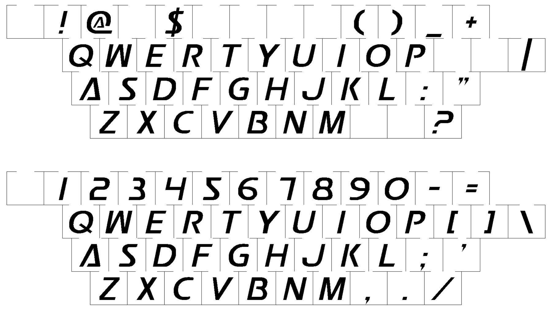
Both the USPS logo with the name of the website and the full name of the organization feature the same type. Its most obvious feature is the dynamism resulting partly from the italics and partly from the sleek shape without the serifs. Also, you can notice a couple of distinctive details (for instance, the gaps on the “P” and “A,” as well as the lowered horizontal bar on the “A”).
Company overview
The United States Postal Service is an independent agency, part of the US federal government, offering postal service in the US. USPS is headquartered in Washington, D.C. Back in 2018, it had over 620,000 employees.
The roots of the agency can be traced back to 1775, while it was founded in its current form only in 1971. Quite a few challenges the agency has faced over the last decades result from the need to compete against private package delivery services.
Is it illegal to use the USPS logo?
The USPS logo can only be used with the official permission of the trademark’s owners, and in the case of this particular badge, it is almost impossible, as the USPS trademark is owned by the government of the United States. Although anyone can try and ask permission to use the icon of the United States Postal Service, by contacting the local post office.
Is USPS a trademark?
Ues, USPS is a trademark, which is owned by an executive branch of the Government of the United States. USPS is a governmental agency, so the violation of rights will be a serious thing.
Who designed the United States Postal Service logo?
The logo of the United States Postal Service was designed by the Young & Rubicam design bureaux, more specifically, by its subsidiary named CYB Yashumura Design. The agency offered not just one, and not even a dozen of logo options to choose from, but 300.


