Red Kap is a brand of workwear manufacturer from the USA. The company was established in 1923 under the name “Central Overall Manufacturing”. Today is it one of the country’s leading companies in its segment. Red Kap is an official uniform provider of such huge companies as Honda and GM Company.
Meaning and history
Red Kapwas established in the United States at the beginning of the 1920s, for the production of overalls for men and boys. The current name of the brand appeared only in 1939, and before that the company was named Central Overall Manufacturing, which was directly pointing to its specialization.
In the middle of the 1940s, Red Kap started the production of high-quality uniforms, and in the 1960s, the company opened its first laboratory, which specialized in the research of industry apparel.
Today Red Kap is one of the leaders in work-related clothing, with technological fabrics and practical design of its garments.
What is Red Kap?
Red Kap is the name of an American company, that specializes in the production of uniforms and work clothing. The brand was established in 1923, as Central Overall Manufacturing, and changed its name to Red Kap at the end of the 1930s.
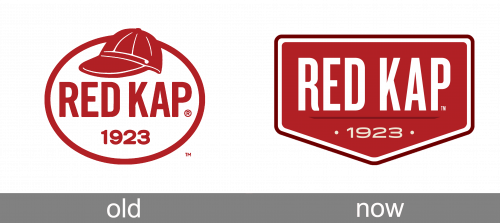
Old

The previous visual identity of the brand was completely different. The circular emblem consisted of a thick outline with a red baseball hat on its top and the wordmark in red.

Today

The Red Kap logo is composed of a traditional badge with a wordmark on it.
The crest-like background is slightly stretched horizontally and depicts lettering and a tagline with the date. The intense red of the emblem is balanced by a thick white outline located around the inside of the perimeter.
The wordmark in all the capital letters is written in a modern and bold sans serif typeface with a slightly curved tail of the letter “R”. Executed in white color, it creates a good contrast with red and looks strong and bright.
The date of the brand’s establishment, 1923, is written underneath the wordmark and featured thin lines and yellow color. It is a delicate and modest tribute to the company’s history and heritage.
The color palette of the Red Kap logo is a reflection of the brand’s name, which is also a confident and power combination. It evokes a sense of energy and progress of a strong company.
Font and Color
The narrowed uppercase lettering from the official Red Kap logo is set in a heavy modern sans-serif font with the thick lines and straight cuts of the characters’ bars. The closest fonts to the one, used in this insignia, are, probably, Parkson Extra Bold, or Milky Bar Normal, with some minor modifications of the letters.
As for the color palette of the Red Kap brand, it is based on a deep and calm shade of red, with the additional elements set in white. Red here stands for passion and power, at the same time representing the name of the company, while white adds up to such qualities of Red Kap as professionalism, reliability and loyalty.


