Real Betis is the name of a Spanish professional football club, which was established in 1907. Today the club founded based in Sevilla, plays in the Spanish La Liga, and is considered to be one of the strongest teams on its list.
Meaning and history
Real Betis was formed in 1907, as a counterbalance to the oldest club of Andalusia, FC Sevilla. Just seven years after its foundation, the club became known as Real Betis, receiving the “Royal” prefix from King Alfonso XIII.
Real Betis has spent most of its history in the top division and has even won the championship, something only nine clubs in Spain can boast. These days, Betis is a strong middleweight in La Liga, which can give battle to any opponent.
The main enemy for Betis is historically Sevilla, and the Andalusian derby is considered one of the fiercest in all of Spain.
What is Real Betis?
Real Betis Balompié is a Spanish professional soccer club from the city of Seville. Champion of Spain in 1935, two-time winner of the Spanish Cup in 1977, and 2005. The only club that participated and became champion in three major Spanish leagues.
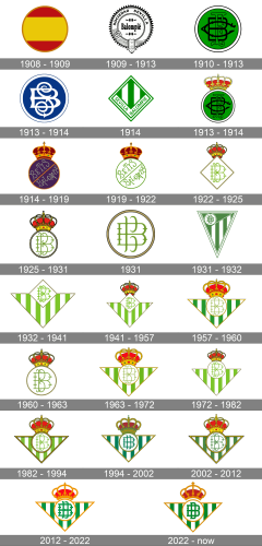
As for the visual identity, Real Betis boasts an impressive number of logo redesigns during the history of the club. All badges designed after 1931, were based on one concept and color palette, while the early experiments with the visual identity featured completely different styles and ideas.
1908 – 1909
The initial badge of the football club from Seville featured a circular shape and the background color in the palette of the Spanish national flag. The three wide stripes in red and yellow were set horizontally, enclosed into a thin golden circular frame. It was bright, it was memorable, and it was patriotic. No lettering was present on the logo, and the badge only stayed active for a few months.
1909 – 1913
The logo became monochrome with the redesign of 1909. Now it is a circle with the bold and narrowed serif “Balompie” inscription, set between two decorative elements from above and under, and enclosed into a wide frame in a gear-like outline. The frame was stylized as a belt and has a bold uppercase “Sociedad Sevilla” lettering written on the bottom part in a modern sans-serif typeface.
1910 – 1913
The logo, introduced in 1910 was executed in green and black, with the solid green background of the circular medallion decorated by an elegant monogram, with three letters, “BFC”, standing for the “Betis Football Club” overlapping each other. The letters were set in different fonts, from the wishbone to gothic outlined ones. The medallion was enclosed into a white circular frame in a black outline from both inside and outside.
1913 – 1914
The club gets a new name, Seville Balompie, and the new logo in 1913. The redesigned circular badge of the football club was executed in a navy-blue and white color palette, where blue was used for the background, and white — for the rounded frame and an elegant wishbone monogram. The monogram was composed of two overlapping letters, “S” and “B” in bold lines; with the curved ends of the “S” hypertrophied.
1914
The second version of the Seville Balompie logo used during those years was a bright green and white rhombus, with a vertically striped background. The rhombus was enclosed into a double white and green frame and had a white banner along its bottom angular part, where the green uppercase logotype in a clean modern sans-serif was written.
1913 – 1914
The green logo with a black monogram, designed in 1910, comes back to the football club’s visual identity in 1913, but this time a massive gold and red crown were set on top of it, to celebrate the “Royal” status, granted to the Betis football club by King Alfonso XIII.
1914 – 1919
The redesign of 1914 kept the “circle under the crown” concept, but redrew both elements, changing the color palette as well. The medallion was now executed in dark purple and featured a gold and red outline, and a diagonal line in the same colors, which was dividing the circle into two parts. The “Betis Balompie” lettering was handwritten diagonally on the badge, with the first letter above the yellow and red line, and the second — under it. The inscription was set in a custom font with the tails of come vertical bars forked and a bit curved. The crown got more solid and dark, getting its red shade darkened to burgundy.
1919 – 1922
The concept of the logo remained the same as on the previous badge, but the color palette of the circular medallion changed to white and green, where white was for the background, and green — for the outline, diagonal separating line and the lettering, written over the roundel.
1922 – 1925
The crown was redrawn in a more elegant style, and the circle was replaced by a rhombus in 1922. The rhombus was colored white, and had a medium-thick khaki outline, while the elegant lightweight “BB” monogram in its center was executed in a bright shade of green, close to lime-green. The two capital letters “B” were executed in different styles: one was extended and had short horizontal lines on both sides, while the second one was narrow and tall, formed by several curved lines.
1925 – 1931
The crown got enlarged, and the rhombus turned back into a circle in 1925. The lime-green monogram got darker and more professional, and the khaki outline was replaced by a double black outline with a thin yellow line in the middle. The new badge stayed in use by the football club from Andalucía for more than five years.
1931
The political situation in Spain was not slowing the use of Royal symbols on any logos or signs, so the crown was removed from the badge of the football club. The roundel was refined and got all of its contours cleaned and emboldened — the frame turned to gold, and got outlined in black, while the “BB” monogram in its new shade of green, became more modern and sleek, having some of the elements softened.
1931 – 1932
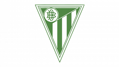
The redesign of 1931 introduced the first version of the triangular Real Betis badge, which has become a basis for numerous following redesigns, leading to the iconic badge we all can see today. It was a triangle pointing down, in a white frame with numerous green lines forming triangles. The body of the crest featured a pattern of several green and white vertical stripes, with the solid green triangle placed on top and making a background for a white circle with a green monogram on it.
1932 – 1941
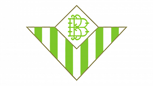
The striped triangle became wider and shorter and got a white rhombus with a green monogram placed on its top. The green on the new logo was light and vivid, creating an airy and fresh feeling, and making the sharp geometric logo look friendly and energetic.
1941 – 1957
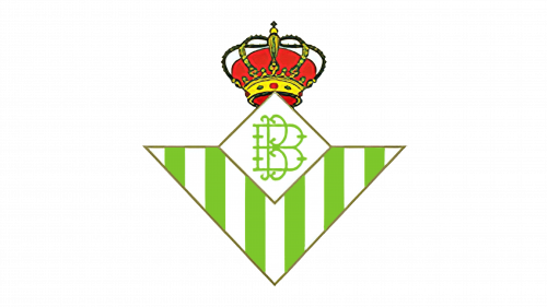
In the beginning of the 1940s after the Civil War in Spain has come to an end, it was again allowed to use the Royal symbols, so Royal Betis got the sleek red and gold crown back, and placed it on a white rhombus with the green monogram. As for the design of the main badge, both the triangular and rhomboid parts of it remained untouched.
1957 – 1960
The redesign of 1957 darkened the green color of the Royal Betis Badge, and refined the contours of the elements, outlining the triangle in gold lines, enlarging the crown, and turning the white rhombus into a white circle. The monogram on a circle featured a lighter shade of green, and this difference in colors made the logo more interesting and vivid.
1960 – 1963
In 1960 the Royal Betis logo was simplified, with the striped triangle being completely removed from the composition. Now the logo was composed of a white circle in a dark gold outline, with a green monogram placed in the center. The monogram was still the same and used a medium-dark shade of calm green color. On top of the circle, there was still a red and gold crown, which was a bit larger than on the previous version, to better balance the enlarged circular medallion.
1963 – 1972
The triangle with vertical striped in lime-green and white came back to the logo in 1963. The crown was redrawn in a lighter color palette, with the contours a bit refined. The letters in the monogram were now set in thin smooth lines in the same shade of green as the striped on the triangular shield. They looked fresh and sophisticated, supporting the smooth gold details on the massive crown on top of the badge.
1972 – 1982
With the redesign of 1972, the white circle was moved a bit higher on a triangular crest, and the crown became smaller and darker. Another change was made to the outline of the whole logo, it was simplified to just one thin dark gold line, so the badge started looking more modern and professional.
1982 – 1994
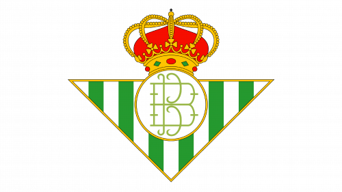
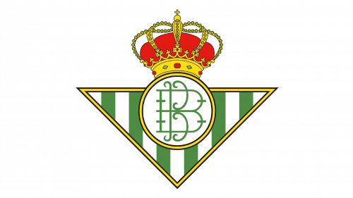
The refreshed badge from 1982 featured a smaller triangle, and an enlarged circle, which moved back down. The crown was also enlarged again, and all elements of the badge looked very well balanced. Both the triangle and the circle got a thin gold framing, with a delicate black outline, from for inside and outside, which made the look of the badge more confident and strong. The black outline also made it possible to place the logo on the various backgrounds without being lost or muted.
1994 – 2002
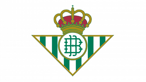
In 1994 the colors, used for the Royal Betis logo were as dark as never before. The deep green, dark gold, and red turning purple, all these new shades created a dramatic and powerful look. The monogram on the white circle was rewritten in bolder lines with more angles, but the ends rounded. The narrow “B” was now set in two parallel lines with curved ends. It was something quite progressive and cool.
2002 – 2012
The badge from 1982 came back to the Royal Betis visual identity in 2002, but a new color palette. Actually, it was not very new, just darker than the badge used in the 1980s, but much lighter than the one from 1994. All of the elements were preserved in their original state. The badge looked elegant and timeless, being a brilliant representation of how the club values its history and a great tribute to its roots.
2012 – 2022
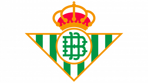
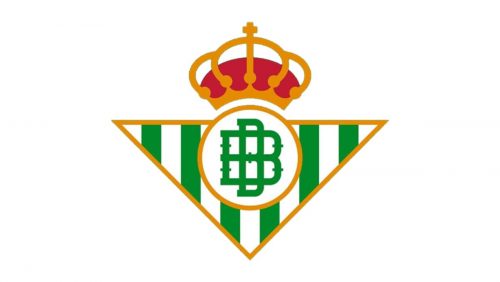
In 2012 the logo gets bold and modern — all the lines on the badge became thick and smooth, with all small details removed, and just solid massive shapes left. As for the colors, they are now intense and bright, evoking all the energy and fighting spirit the club has.


