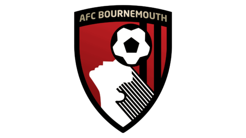
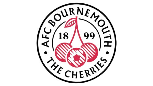
Although the logo of the UK football club AFC Bournemouth has gone through quite a few modifications since the team was established around 120 years ago, it has always been consistent in its use of red as the dominant color.
Meaning and history
AFC Bournemouth, a renowned football club in England, was founded in 1899 by the Boscombe St. John’s Institute. Initially established as Boscombe Football Club, it underwent several name changes before adopting its current name in 1972. The club’s history is marked by a series of significant achievements and challenges. A pivotal moment in their history came in 2015 when they were promoted to the Premier League for the first time, marking a remarkable rise from the brink of financial ruin and near relegation from the Football League a few years prior. This promotion is often cited as one of their greatest achievements, reflecting a remarkable turnaround under the management of Eddie Howe. In recent years, AFC Bournemouth has continued to compete at a high level, though they have faced relegations and promotions, reflecting the competitive nature of English football. As of now, AFC Bournemouth holds a respectable position in the English football hierarchy, competing in the English Football League Championship, the second tier of English football, and aiming to secure a return to the Premier League.
What is AFC Bournemouth?
AFC Bournemouth is an English professional football club, primarily competing in the English Football League Championship. Known for its resilience and spirited performances, the club has a storied history marked by significant achievements, including a remarkable promotion to the Premier League.
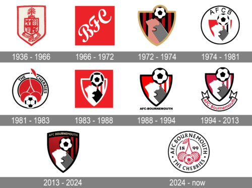
1936 – 1966
One of the earliest logos, the one adopted in 1936, featured two shield shapes, one inside the other, incorporating a variety of symbols, like a medieval shield.
1966 – 1972
The 1966 AFC Bournemouth logo looked utterly different featuring only the letters “BFC.”
1972 – 1974
It was in 1972 that a player’s head and a football appeared on the crest.
1974 – 1981
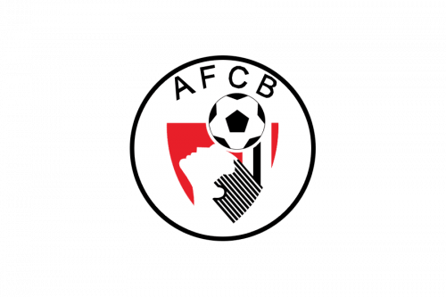
The logo from 1974 looked modern and cool. It was a light and bright circular badge with the stylized geometric red black and white background and an image of the man with a football, executed in monochrome. The whole emblem was outlined in black and had a lot of white insides. The “AFCB” in black capitals was arched above the graphical part of the logo, inside the black frame.
1981 – 1983

In 1981 the new logo was designed — a solid red square had a wide white circular outline on it. The white element was teamed in black and had a black “The Cherries” lettering on it. Inside the circle, on a Ted background, there was an enlarged stylized image of two cherries and a black-and-white football in the middle.
1983 – 1988

The logo from 1974 came back in 1983, having its contours defined and emboldened. Now the striped elements got solid texture and the whole image was placed on a bright red background, being outlined in white crest shape. The football was enlarged and the lettering was removed from this logo version.
1988 – 1994
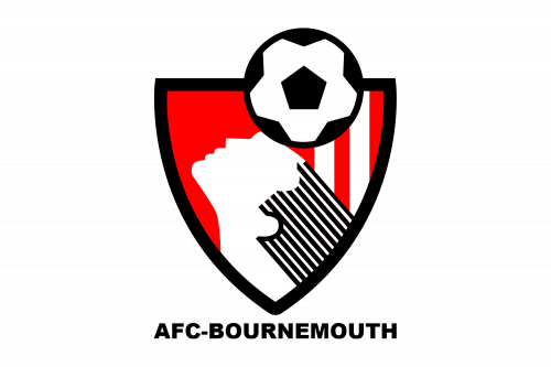
In 1988 the crest got a black outline and a white background, the inner elements of the badge got refined again and the hair of the man was drawn in numerous black and white diagonal stripes, just like on the version from 1974. The “AFC — Bournemouth” wordmark in black capitals was set under the crest in a strong and am confident sans-serif typeface.
1994 – 2013

In 1994 the scarlet red color of the badge was changed to a calmer one, and the straight modern lettering under the crest was replaced by a wide arched ribbon with the red inscription on it. The “Bournemouth” was now set in the title case and looked more traditional and simple.
2013 – 2024
It was in 1972 that a player’s head and a football appeared on the crest. This emblem, with slight modifications, has been the core of the logo ever since. Also, almost all the logotypes that have been introduced since then featured the three colors – red, white, and black. In addition to them, the current one also includes gold for the lettering.
2024 – Today
The new logo for AFC Bournemouth presents a fresh yet classic design that pays tribute to the club’s history and nickname. Enclosed within a circular badge, the central motif features two cherries linked by a stem, set against a football-patterned background, symbolizing the club’s deep-rooted connection to the sport. The black and red color scheme remains true to the team’s traditional colors, while the date of establishment, “1899,” anchors the logo in tradition. The bold lettering of “AFC Bournemouth” and “The Cherries” around the perimeter completes the design, ensuring instant recognition and fostering a sense of pride and unity among fans and players alike.
AFC Bournemouth Colors
RED
PANTONE: PMS 485 C
HEX COLOR: #DA291C;
RGB: (218,41,28)
CMYK: (0,95,100,0)
DARK RED
HEX COLOR: #B50E12;
RGB: (181,14,18)
CMYK: (20,100,100,12)
BLACK
PANTONE: PMS PROCESS BLACK
HEX CODE: #000000;
RGB: (0,0,0);
CMYK: (75,68,67,90)
LIGHT GOLD
PANTONE: PMS 7506 C
HEX CODE: #EFDBB2;
RGB: (239,219,178);
CMYK: (0,7,25,1)
DARK GOLD
PANTONE: PMS 7506 C
HEX CODE: #A89968;
RGB: (168,153,104);
CMYK: (10,15,50,29)


