In the heart of Verona, Italy, lies Hellas Verona, a football club with a rich history dating back to 1903. Known for its passionate fan base and storied rivalries, Hellas Verona has made its mark in Italian football. With a home stadium at the Stadio Marc’Antonio Bentegodi, the club has experienced periods of both success and struggle throughout its existence. Despite challenges, Hellas Verona continues to compete in Serie A, showcasing the enduring spirit of the team and its supporters.
Meaning and history
Hellas Verona, founded in 1903 by a group of local enthusiasts, emerged as a prominent football club in Italy. Over the years, the team has achieved significant milestones, including winning the Serie A title in the 1984-1985 season under the guidance of coach Osvaldo Bagnoli. This triumph remains a crowning achievement in the club’s history, cementing its place among Italy’s football elite.
Throughout its journey, Hellas Verona has navigated through various divisions, experiencing both highs and lows. The club’s ability to bounce back from setbacks demonstrates its resilience and determination. Currently competing in Serie A, Hellas Verona continues to strive for success, drawing on its rich heritage and passionate fan base for inspiration.
What is Hellas Verona?
Hellas Verona is a renowned football club based in Verona, Italy. With a history dating back to 1903, it has established itself as a formidable presence in Italian football. Known for its passionate supporters and competitive spirit, Hellas Verona competes in Serie A, embodying the essence of determination and tradition in the sport.
1903 — 1945
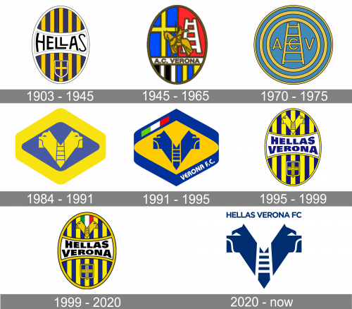
The original logo was a vertical oval with blue and yellow stripes. It was outlined with white, and there was also a white plaque in the middle that was sort of arches from the sides. This bit included the team’s name in black. The only other bit was a little blue shield with a yellow cross in the bottom.
1945 — 1965
The following logo was also an emblem that included several Veronese symbols (in different sections). It included a blue with a yellow cross, a red one with a white ladder, a bronze knight, a richly striped bit below and a white line with the team’s name on it near the bottom.
1970 — 1975
One of the earliest logos was just a blue ring with a yellow outline and two concentric yellow rings inside. In the smallest circle, you could see the letters “A C V” and a ladder in yellow.
1984 — 1991

The following logo included a wide rhomb shape with a blue core and a yellow frame. Inside, there was a peculiar symbol that depicted two dog heads side-by-side. These were fully yellow, except for a little blue section in the middle in the shape of a ladder.
1991 — 1995
 The next version was a rhomboid with two of its corners cut. The two mastiffs were borrowed from the coat of arms of the Scala family.
1995 — 1999

The concept from 1958 was brought back after the redesign of 1995 but got a few changes. First of all both blue and yellow shades of the oval badge were brightened up. Secondly, the wordmark was changed to “Hellas Verona” and switched its typeface for a bolder one, with the uppercase sans-serif letters slightly arched, repeating the concave shape of the white banner with a thin blue outline. Apart from a blue and yellow crest with a cross, placed under the wordmark banner, one more graphical element was added to the insignia — a two-headed creature in a thin outline, drawn above the white banner.
1999 — 2020

The redesign of 1999 strengthened and cleaned the contours of the Hellas Verona medallion, and added the Italian flag to the image, placing it between the head of the creature, drawn above the banner with a refined wordmark. The inscription changed its color to black, which elevated the look of the badge and made it look more powerful and stylish.
2020 — Today

For the logo, introduced in 2020 only one symbol was taken from the previous badge — the yellow image of the two-headed dog, a mastiff, the mascot of Hellas Verona football club. It was executed in bright yellow and placed on a white background without any outline. The emblem was accompanied by a yellow uppercase inscription in a bold sans-serif typeface written above the heads of the dogs.
Font
The bold sans serif type would have looked pretty minimalistic if not for the slightly distorted proportions.
Colors
The Italian word “gialloblu” used to describe the club’s official palette means “yellow-blue” in English. In addition to the two colors, the Hellas Verona logo also features white, red, and green (the colors of the Italian flag), as well as black.
Hellas Verona Colors
BLUE
PANTONE: 2945 C
HEX COLOR: #005395;
RGB: (0, 83, 149)
CMYK: (99, 74, 13, 2))
YELLOW
PANTONE: P 1-7 C
HEX COLOR: #FFE74A;
RGB: (255, 231, 74)
CMYK: (2, 4, 82, 0)
DARK YELLOW
PANTONE: P 10-7 C
HEX COLOR: #F6C245;
RGB: (246, 194, 69)
CMYK: (3, 24, 85, 0)
GOLD
PANTONE: 7407 C
HEX COLOR: #C49E46;
RGB: (196, 158, 70)
CMYK: (24, 36, 87, 2)
WHITE
PANTONE: P 1-1 C
HEX COLOR: #FFFFFF;
RGB: (255, 255, 255)
CMYK: (0, 0, 0, 0)
BLACK
PANTONE: 426 XGC
HEX COLOR: #221F20;
RGB: (34, 31, 32)
CMYK: (71, 67, 64, 74)


