Avril Lavigne is the name of the famous punk singer, who was born in 1984 in Canada and became popular across the globe after the release of her debut album in 2002. By today the singer has sold millions of copies of her six studio albums and participated in more than 10 different tv projects as the guest star.
Meaning and history
Avril Lavigne is a Canadian singer, songwriter, actress, and designer. The girl was born in the city of Belville, located in the Canadian province of Ontario. The star was born on September 27, 1984. Avril from childhood was a rebel, and this is fully reflected in her musical creativity.
In 2000, American music producer Antonio Reid offered the girl a contract to release two albums. Avril dropped out of high school and went straight into creative endeavors. The premiere of the debut album “Let Go” took place in 2002. It reached the second place on the Billboard 200 chart. By the end of the year, the record became four times platinum in the United States, and Lavigne became the best-selling female artist.
Over the years on the big stage, Avril Lavigne has released seven albums, starred in several movies, and won many prestigious music awards. Lavigne’s seventh album is titled “Love Sux”. It was released in February 2022. The record debuted at No. 9 on the Billboard 200 and reached the top 10 in Australia, Canada, Japan, Germany, and the United Kingdom.
Avril Lavigne was imitated by teenage girls, and the singer was dreamed of by guys. Now the songs of the singer continue to be listened to by millions of teenagers and representatives of the adult generation. Over the years, Avril’s talent has not faded, she still pleases millions of fans with a stunning voice and deep content of songs.
2002 — 2004
The very first logo was introduced in 2002 and featured a punk-rock style handwritten inscription, which looked like it was written with a black gel pen, with lots of lines and hatches.
2004 — 2007
In 2014 the logo was changed to a bolder and a more interesting one, where the thick black capitals were diluted with some smaller letters, and looked like a puzzle, made up of the newspaper articles.
2007 — 2011
In 2007 the logo becomes simple and classy — the all-caps inscription a is executed in a bold serif typeface, where the contours of the letters are slightly blurred, adding a mysterious feeling and showing the singer’s creativity and style.
2011 — 2013
Another example of elegance was introduced in 2011 — the black cursive lettering with elongated and delicately curved tails was executed with tenderness and sophistication, being a reflection of true beauty.
2013 — 2018
The logo, designed for Avril Lavigne is 2013 featured a lightweight sans-serif stencil font, where all capital letters of the inscription were placed very close to each other, but still looked fresh and delicate.
2018 — 2021
In 2018 two different logos were created — a black handwritten wordmark with thin yet powerful and solid lines and elongated contours, and a smooth curved cursive inscription in powder-pink, which was placed on a black background. Two different styles, moods, and concepts, one singer and her colorful and emotional music.
2021 — Today
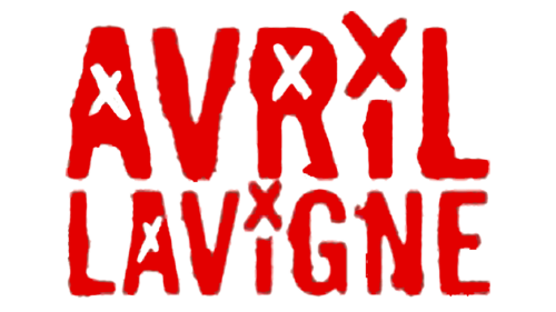
The 2021 logo consists of grainy red capital letters with X-marks above «i» characters and in the inner spaces of some letters. The whole inscription is made in two lines, one a bit bigger than the other.
2021 — Today
For the seventh album of Avril Lavigne, Love Sux, the new logo was introduced in 2021. The name of the singer is written inside of a hand-drawn heart. Both dots above the letters “I” are replaced by playful crosses. The heart is placed above the name of the album, written in one line, in the same custom typeface as “Avril Lavigne”, but in a slightly smaller size.


