Quest Diagnostics is a clinical laboratory headquartered in Secaucus, New Jersey, US. It is a Fortune 500 company with 47,000 employees (2020).
Meaning and history
The company started working in New York City in 1967 under the name of Metropolitan Pathology Laboratory, Inc. It went through several names before becoming Quest Diagnostics.
1967 — 2015
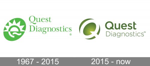
The old Quest Diagnostics logo is by far more cluttered than the following one. And yet, they share the same structure: an oval paired with a double-lined wordmark.
The oval is on the left. In the old logo, it is tilted and houses a stylized depiction of the rising sun in white. The lower part of the emblem is rather abstract and is drawn in such a way that it conjures up a laboratory feel and also echoes the shape of the letter “Q” (its “tail,” to be precise).
The name of the brand on the right is set in a traditional serif type with slight variations in the thickness of the glyphs.
2015 — present
This version is more unique and meaningful and also is slightly cleaner.
The unique touch appears due to the color – this yellowish shade of green is rarer than the one on the previous version. Also, it is closer to the natural color of plants.
The oval on the left represents the letter “Q” and also is a stylized depiction of a laboratory test (you can make out a kind of laboratory rod and the top of a test tube). So, the design becomes more meaningful in spite of being simpler.
Font
The type in the 2015 logo looks cleaner due to the disappearance of the serifs. Also, the variation in the thickness of the strokes is less pronounced. The bolder type emphasizes the core word “Quest,” while the explanatory word “Diagnostics” is set in a lighter font.
Colors
The Quest Diagnostics logo is based on the green color introducing the “natural” theme, which is crucial for any organization dealing with medicine.


