The Mallards franchise whose logo we are going to describe played in the Quad Cities, Illinois and Iowa, from 2009 to 2018. To their fans’ disappointment they ceased operations in 2018 when the season was over.
There used to be one more team with the same name, a member of the UHL from 1995 to 2007. The Mallards hockey team that appeared in 2009 as a member of the IHL was named as its predecessor.
Meaning and history
The Quad City Mallards, founded by Howard Cornfield in 1995, emerged as a professional ice hockey team in the United States. This club, initially part of the Colonial Hockey League, which later became the United Hockey League (UHL), quickly gained prominence in the realm of minor league hockey. The Mallards, known for their distinctive green, black, and white uniforms, carved a niche in the Quad Cities area, encompassing parts of Iowa and Illinois.
In their illustrious history, the Quad City Mallards achieved several milestones, making them a celebrated team in the UHL. They won the Colonial Cup Championship three times, in 1997, 1998, and 2001, marking them as a dominant force in the league. Their success was not just limited to championships; the team also enjoyed a strong fan base and consistent performance on the ice. They were renowned for their competitive spirit and entertaining style of play, which garnered a loyal following.
As of the current period, the Quad City Mallards have undergone significant changes. After several league transitions and ownership changes, they eventually ceased operations in 2018. Despite no longer being active in the professional hockey circuit, the legacy of the Quad City Mallards lives on. Their impact on the community and the world of minor league hockey remains a testament to their historical significance and the memories they created for their fans.
What is Quad City Mallards?
Quad City Mallards was a professional ice hockey team, known for its significant achievements in minor league hockey, especially in the UHL, where they won multiple championships.
1995 — 2001
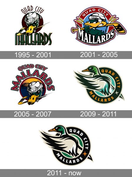
The original logo of the Quad City Mallards hockey club was created in 1995. It was a dark green image of a wild duck (mallard) in a white hockey helmet, and with a yellow and green hockey stick in its yellow beak. The drawing was placed on a solid burgundy circle and accompanied by two wordmarks in different styles. The “Quad-City” in thin and elegant sans-serif capitals was arched above the badge in burgundy color, while the bold emerald “Mallards” was written in a straight line under the duck’s head.
2001 — 2005
The redesign of 2001 introduced a more friendly and caricaturish version of the logo for the Quad City Mallards. It was almost the same color palette, with just an addition of light blue and white, but the duck was redrawn and the lettering was placed on the framing of the badge — from the top part. As for the bottom line, it changed its color to white and its typeface to a sharper and cleaner one.
2005 — 2007
It was a confident and professionally executed badge with a wild duck in a hockey helmet and a stick in its beak placed on a yellow and blue circular background with the bridge on it: the background was outlined in red, and balanced by a red and gray arched inscription, placed above the badge. The inscription was executed in a clean and bold sans-serif typeface, with the letters of “Quad-City” featuring a smaller size than the “Mallards” ones.
2009 — 2011
The concept of the Mallards visual identity was changed again in 2009. A more contemporary and abstract approach was brought to the badge by the designers. The sack was now drawn in smooth lines in several shades of green, white, and orange. The bird was coming out of the green circular frame with the bold orange lettering around its perimeter. The clean lines and new color palette made the logo look progressive and vivid.
2011 — Today
In 2011 the franchise decided to refresh their logo. They used the color scheme of the previous Mallards brand but simplified it. There is only one shade of green in their logo and no blue. The result is a simple color palette (just black, white, green and a bit of orange) which is compensated by a conspicuous design.
Though it is a new logo, its main characteristic is a strong brand identity. Alongside with the color scheme the new Mallards franchise incorporated Mo Mallard, the mascot. But instead of a front-and-center placed duck we see an orange-billed mallard with a black face, a green head and black and white wings flying out of a black circle. There are two wordmarks written in white on the black background ‒ “Quad City” (above) and “Mallards” (below).


