

![]() PSV Logo PNG
PSV Logo PNG
PSV is the short name of Philips Sport Vereeniging, a famous football club from the Netherlands, which was established in 1913 in Eindhoven. Today the club, nicknamed Peasants (“Boeren” in Dutch) is managed by Toon Gerbrands and has Roger Schmidt as the head coach.
Meaning and history
![]()
The PSV Eindhoven emblem hasn’t changed much during the history. It has always been a horizontal oval medallion with an Eindhoven flag pattern and a white sail. The contours and lettering were, of course, modified many times, but the concept has been kept from the beginning till the end.
1913 — 1917
![]()
The 1913 emblem is a circle design with several letters inside. Namely, there’s a ‘P’, an ‘H’ beneath it and a big, rotated ‘C’ surrounding both of these. There’s also the word ‘Sport’ written inside the letter ‘P’. Everything in the logo is black.
1917 — 1933
![]()
They updated the logo by giving it a lot of strange patterns. It’s basically the same logo, except the outer space is now very ornamental, the letter ‘P’ is extended into the word ‘Phillips’, and the word ‘Sport’ is floating somewhere above.
1933 — 1937
![]()
The 1933 logo is an oval with white and red stripes. In front of it, the designed placed a triangular flag of mostly white cloth with a small red oval in the middle. That’s where they’ve written the new acronym – ‘P.S.V.’ – in thin black letters.
1937 — 1948
![]()
In 1937, the big oval and the stripes in it became outlined in yellow. The flag, for its part, turned completely black-and-white. Besides that, nothing else changed.
1948 — 1953
![]()
The 1948 logo has a new shape – a shield with a round bottom. Much of it is covered in vertical stripes of red and white. The very top has some white space with the familiar old acronym, but without the dots in-between.
1953 — 1960
![]()
The following logo largely carries on the old flag design, except without the yellow outlines and a slightly different banner.
1960 — 1974
![]()
In 1960, they reintroduced the yellow (supposed to be gold) outlines all over the logo with new force. Now even the flagpole and on the flag are thoroughly yellow.
1974 — 1982
![]()
The next redesign uses the same logo, but with a brighter yellow hue. Before, it was more of an ocher. Now – a shade of orange.
1982 — 1990
![]()
The logo, designed for PSV in 1982 was composed of a flat and sleek oval with a thick gold outline and horizontal red and white stripes. Each of the stripes was also outlined in gold.
In the left part of the badge the flag’s handle was placed, and the flag itself was drawn crossing the whole medallion from left to right. Its triangular shape resembles an arrow, pointing into the future.
The white flag was outlined in gold and comprised a golden “P.S.V.” Lettering is enclosed in an oval frame.
1991 — 1996
![]()
In 1991, they basically reversed the colors by making the flag mostly black and the oval outlines largely orange.
1996 — 2013
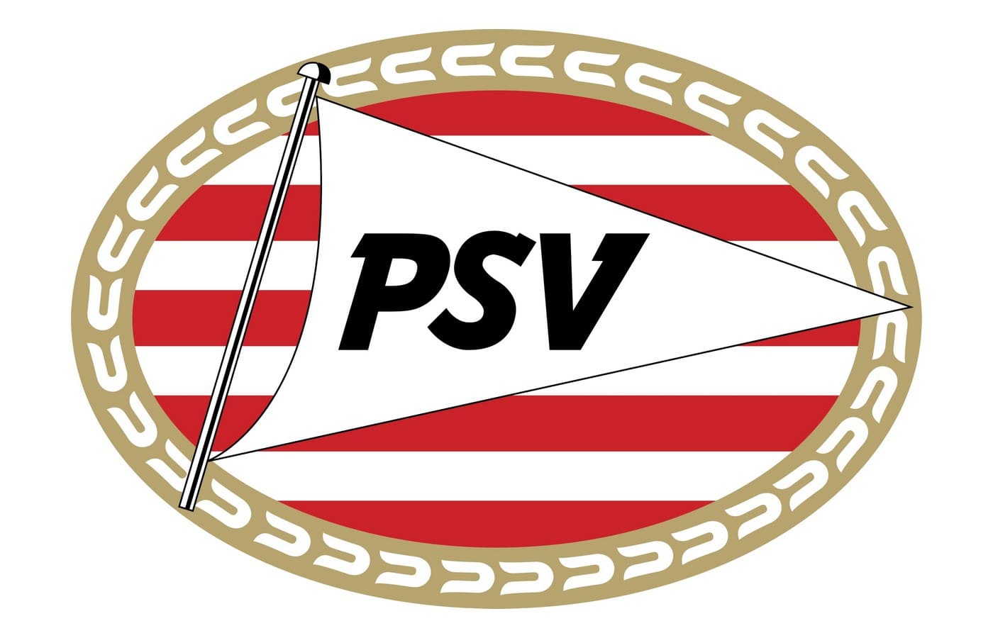
In 1996 the logo was modified. The golden frame now had a pattern resembling numerous horseshoes in white, white the golden handle of the flag turned silver, and the “PSV” inscription became black. The oval outline was gone, as well as the dots.
The wordmark now featured an ExtraBold italicized font with sharp and massive serifs, which looked strong and modern.
2013 — 2014
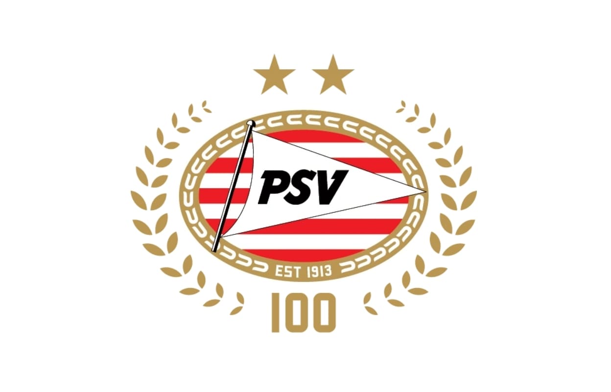
The badge was modernized in 2013 to celebrate the 100th anniversary of the club. It was composed of a badge from 1996, enclosed in a gold laurel wreath, with the number “100” written at the bottom. The white “Est 1913” inscription was added to the oval frame of the medallion.
2014 — 2016

In 2013 the team keeps using the medallion with the “EST 1913” addition but removes the anniversary wreath. The logo is clean and distinct, showing the club’s heritage and value of its roots.
2016 — Today
![]()
The redesign of 2016 brought lightness and elegance to the PSV visual identity, by adding a double white outline to its golden frame. The letters on the flag have also been refined and now look more elegant and confident, not overloading the badge with its massiveness and dark color.
The PSV logo is simple yet very patriotic. Its traditional shapes and colors are balanced by some modern and strong details, such as wordmark and the shape of the sail. It is a combination of old and new, of history and future.


