Stade de Reims is the name of a French football club, which is also known under the nickname “Les rouges et Blancs” (translates as “Red and Whites”). The club was established in 1931 and played in Ligue 2 until 2017. Today it is a successful team, which has David Guion as the head coach.
Meaning and history
The football club, based in the French Champagne region, has a pretty interesting visual identity history. There was even a 6-years timeline when the team had no logo at all, because of some law restrictions.
1931 — 1991
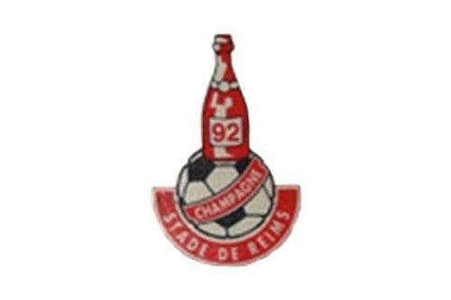
The very first logo for Stade de Reims was designed in 1931 and featured an image of the football with a green and gold bottle of champagne on it. The diagonal red ribbon was placed on the ball, another ribbon in gold outline was arched under it.
The wordmark of the club was executed in gold capitals of a clean and simple sans-serif typeface with bold straight lines.
The logo was definitely unique and stood out in the list of all the club’s competitors. Its composition was pretty simple and not overloaded, but the bottle of champagne made it remarkable and bright.
1991 — 1992
The club’s name was changed to Stade de Reims Champagne in 1991, and the logo was redrawn in the same year. The structure remained untouched, but the bottle became red and white, and the wordmark was changed according to the new name.
The football was also redrawn and now featured a classic black and white pattern, which looked strong and distinct with red ribbon on and around it.
1992 — 1999
According to the new law, accepted at the end of 1991, the use of any symbols connected to alcohol was prohibited. The club didn’t try to create a new logo but just stopped using any. So from 1992 to 1999, the Stade de Reims Champagne played without any badges and emblems.
1999 — 2020
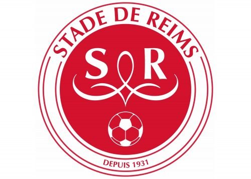
The club changed its name back to Stade de Reims in 1999, and finally, the new logo was created in the same year. It was a very elegant and simple circular badge in red and white.
The red emblem was enclosed in a white rounded frame where the red “Stade de Reims” lettering was written in the elegant sleek font. The bottom part of the frame comprised the “Depuis 1931” inscription, celebrating the club’s establishment.
On the main, red, part of the logo there were two letters “S” and “R” placed around a sophisticated white vignette. The white and red football was placed under the letters.
2020 — Today
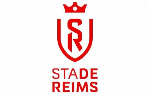
A completely new chic visual identity was designed for the club in 2020z a modern and sleek crest is composed of a red outline with a stylized red crown on top. The “SR” monogram in red is placed vertically in the shield, executed in a custom bold sans-serif with sharp pointed ends of the letter lines.
Under the emblem, the modern “Stade Reims” wordmark is located. The last two letters of the “Stade” and the whole “Reims” is written in bolder lines, but the whole inscription featured the same red custom sans-serif.


