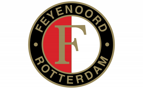
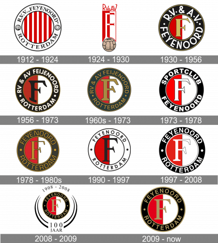
The history of the club started back in 1908. It was established as Wilhelmina and renamed SC Feijenoord four years later. The version “SC Feyenoord” was adopted in 1974, while the current name, Feyenoord Rotterdam, was taken in 1978.
Meaning and history
While the Dutch football club Feyenoord Rotterdam has a long and illustrious history, you can’t say the same about its logotype. Although it was updated more than once, it has still stayed comparatively consistent in its core imagery, which preserved unchanged for more than 100 years.
What is Feyenoord?
Feyenoord is the name of a professional football club from the Netherlands, which was established in 1908. Today Feyenoord is one of the strongest clubs in the Eredivisie, the top-tier football league in the country. The club has De Kuip as its home arena and Arne Slot as the head coach.
1912 — 1924
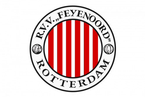
The original logo was a white ring frame with a red-striped core. The former was also outlined in black and had the club’s full name written along its top half. The other half held the word ‘Rotterdam’ in the same black letters. The two were divided by twin footballs on the sides.
1924 — 1930
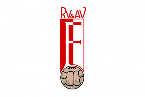
The following logo instead used a tall rectangular shape. It held a bit letter ‘F’ with corresponding proportions. Both elements were half-red, half-white (but in different ways as to not be confusing). The bottom of this emblem also featured a brown football, while the top had red letters ‘RV&AV’ written on it.
1930 — 1956
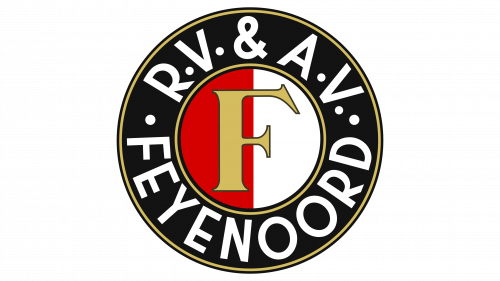
1930 saw them introduce a new design, one they kept using since. It was a red-white circle with a thick black frame around it. The former featured a big golden ‘F’, while the outer layer had ‘RV&AV’ written along its top, and the club’s name written below – both in white letters.
1956 — 1973
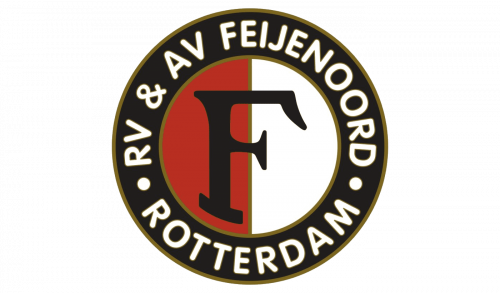
The 1956 logo was pretty much the same, except the central letter was now black, the black frame was also given the word ‘Rotterdam’, and the golden outlines here and there became dark brown.
1960s — 1973
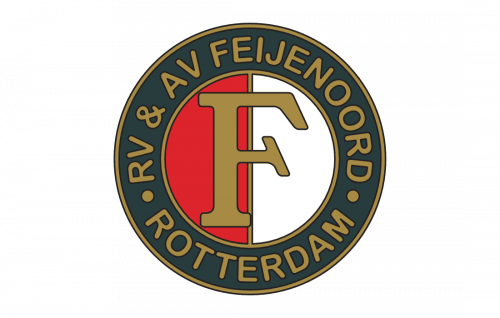
In this version, they painted both the big letter and the words on the outside fully bronze. The outlines became the same color, as well as way more visible.
1973 — 1978

In the 70s, they decided to make the logo white in many places, including the big letter, the outlines and the text on the outside. Moreover, the latter was just ‘Sportclub Feyenoord’ now.
1978 — 1980s
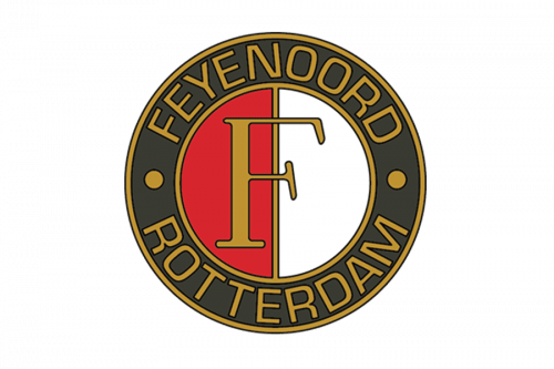
The following logo was very similar the 60s one, but with ‘Feyenoord Rotterdam’ written on the outside instead.
1990 — 1997
The following logo decided to turn the central letter, the outlines and the text black. The frame itself became white.
1997 — 2008
 The first Feyenoord logo was unveiled in 1912. It was a circle filled with vertical white and red stripes. The outer ring was white, with the text “R.V.V. Feyenoord” in black placed inside. The letters “R.V.V.” stood for “Rotterdamsche Voetbal Vereeniging” (Rotterdam Football Club).
2008 — 2009
 While the iconic red stripes could still be seen on the 1997 logo, now the design was different. The authors of the emblem decided to replace multiple lines with just two (one of each color) and place them inside a circle. So, eventually, the logo featured a ring broken down into two parts, red and white.
On the forefront, there was a large white “F” with a thin black outline. The design was positioned inside a bold black ring with the lettering “Feyenoord Rotterdam” in white.
2009 — Today
 After the anniversary season, the vignette disappeared from the Feyenoord logo, but the gold color stayed. So, in comparison with the 1997 version, the current one has the same shape but features gold details.
Anniversary logo
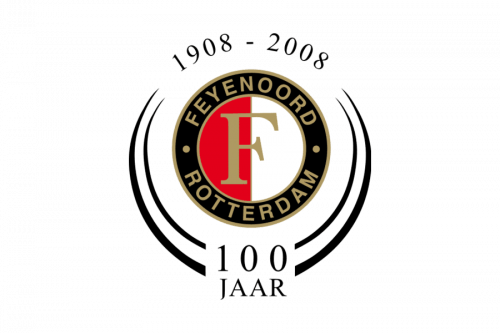
To mark its 100th anniversary in 2008, the club returned the gold color, which was once used on the logo. Now, the “F” and the text were gold. The roundel emblem was placed inside a black vignette with the lettering “1908-2008” and “100 jaar” (“100 years”).
Font
The “F” in the middle of the Feyenoord logo is given in a different type than the rest of the emblem. While the “F” features a serif font, the rest of the text is given in a more modern sans serif typeface. One of the characteristic details making the central “F” recognizable is the unusual diagonal serif on its middle bar.
Colors
While the color scheme was heavily modified during the first four years of the team’s existence, it remained mostly consistent ever after. If you take a look at the 1912 logo and compare it to the 1997 version, for instance, you will notice virtually no difference in terms of the palette. We should still point out one of the comparatively recent innovations, though, the introduction of gold in 2008, which has been used on the logo ever since.


