Brigitte is a German magazine, founded in 1886 as Housewife’s Journal. From the start, their target audience was middle class housewives and working women. They write articles about women’s accessories, fashion clothes, childcare and healthcare products. It’s the most popular magazine in this sphere in Germany, with a regular number of readers about 800,000 and the total audience of 3.6 million.
Meaning and history
What is Brigitte?
Brigitte was first introduced in 1886 as Das Blatt der Hausfrau (meaning Housewife’s Journal in English). They wrote articles about child-rearing and foods rather for middle-class bourgeois housewives. During the World War II, the publishing was ceased. The magazine was relaunched in 1949 and soon renamed Brigitte. They expanded the women themes range and merged with another women magazine called Constanze in 1969. Now, the magazine is published every two weeks by Gruner + Jahr publishing house.
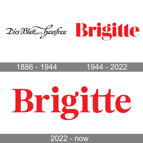
1886 – 1944

The original name of the magazine is seen in this logo. It is printed in a very stylish, delicate font. In fact, all the beautiful curves and varying thicknesses of the strokes suggest that it is a calligraphy font, which resembles Antiquarian Scribe. The logo looks sophisticated and luxurious and is very appropriate for a magazine for women.
1944 – 2022
The earlier Brigitte logo, used by the brand in 1944, featured a sleek and elegant title case logotype in bright red, set against a plain white background. The heavy characters of the inscription looked very balanced due to delicate thin serifs on the bars, and curved lines of the contours. It was a very tender and feminine inscription, but the shade of red, used for it added power and energy, making up a perfect image for the company.
2022 – Today

The logotype appeared approximately in 1949, when the magazine changed its name. The Magazine logotype is the inscription with the name of the brand. It has a heavy typeface with high thin serifs. The letters have a vintage style with bold lines. There are no special details in the nameplate, as it was initially supposed to be printed on magazines’ covers. The color of the word can also vary depending on the background. It can be black or white.
Font and color
The name has a flashy, vintage-looking script with heavy lines. The brand designers used this distinctive and bold type because the brand name is supposed to be located on the covers of the magazine. The white coloring expresses the vintage and abrupt style, which makes the journal cover visible.


