Popeye the Sailor is a fictional cartoon character. He was first drawn by Elzie Crisler Segar and made his first appearance in 1929. Since then, he has made multiple appearances in all kinds of theatrical and TV animated cartoons.
Meaning and history
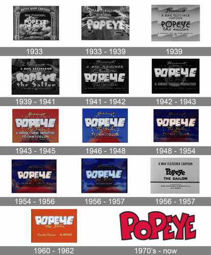
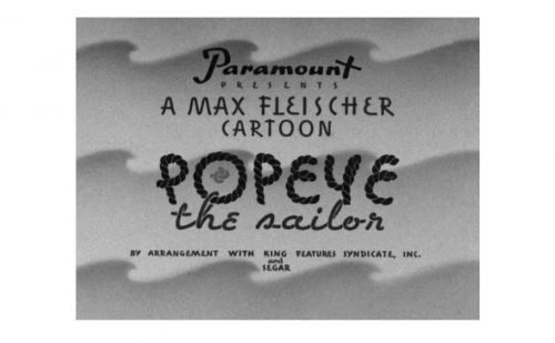
The Popeye logo has gone through innumerable modifications, from slight alterations, to complete overhauls. And yet, it has almost always preserved its heavy weight that perfectly echoes the look of the muscular Popeye himself.
July 1933
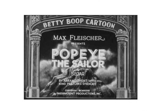
For only a month, the cartoon started with the name of the character written in a light, generic sans serif typeface.
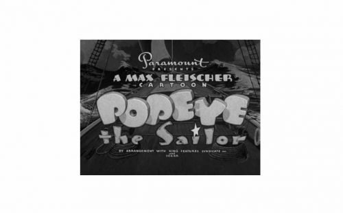
1933 – 1939
The light and “serious” sans was replaced by a plump, rounded, and playful one. The glyphs “danced” – some of them were tilted to the right, others were tilted to the left, while some letters stood straight. This corresponded with the independent character of Popeye the Sailor himself.
1939
Once again, a thin (though irregular) wordmark was used, which was quickly replaced. The strokes in the new version had a great contrast in the width, which reminded, for instance, the contrast between the two parts of Popeye’s hands (upper and lower).
1939 – 1941
One again, the letters played on the contrast between the widths of the strokes. Yet, their shape was smoother, and they looked heavier.
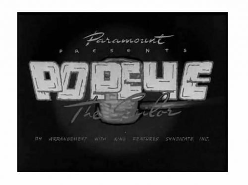
1941 – 1942
The same year, a version with squarish letters was introduced. The angles were still slightly rounded, though.
1942 – 1943
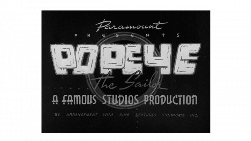
The 1942 emblem was mostly the same, with the exception of an added ‘a famous studios production’ inscription below the show’s wordmark. The inscription was done using all capital letters with a cartoonish appearance.
1943 – 1945
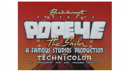
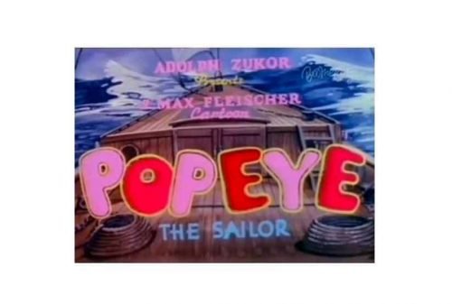
In 1943, they colored their logo into a mostly yellow, red and brown color scheme. That’s also when they added the word ‘technicolor’ below the previous addition.
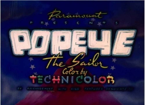
1946 – 1948
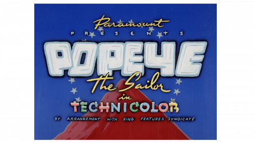
The next edition was again repainted, this time into a mostly red, white and blue color palette. The ‘a famous studios production’ inscription was removed, but most other elements were left unchanged.
1948 – 1954
The style of the lettering remained pretty much the same, with slight tweaks, although the background varied a lot.
1954 – 1956
The picture remained mostly unchanged, save for a darkened color scheme.
1956 – 1957
In 1956, they tweaked the coloring once more – this time, by making it paler.
1956 – 1957
For a brief period, the series of opening titles were based on the wordmark for the 1950s comic books (Fleischer, Famous Studios, and King Features Era). Here, a serif type was used.
1960 – 1962
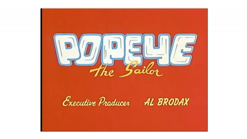
The 1960 logo actually used a lot from the previous designs. It used the words ‘Popeye’ and ‘the Sailor’ in virtually the same appearance. This time, there were no other elements around, save for the mention of the executive producer and the orange background all around.
1970’s – now
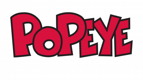
A completely new era started for the Popeye logo. Here, the letters are still pretty “muscular.” The “P’s” and “O” are based on circles, while the “E’s” and “Y” are angular. The angles and ends of the letters are not rounded anymore.
In addition to the better-known red version, there is also a blue logo with an anchor and straight, regular glyphs.


