Pontiac is one of the GMC car brands, which was established in 1926 and discontinued in 2010z the brand was highly popular in the USA and Latin America.
Meaning and history
Both the brand and the city it was created and located in were named after the Native American rebellion leader, Chief Pontiac. And the brand’s visual identity was always based on his legacy.
What is Pontiac?
Pontiac is the name of a discontinued American car manufacturer; which was established in the middle of the 1920s and has been a part of General Motors Company until 2010. The cars of the brand were mainly sold in North and South America.
1926 – 1930
After the brand got its name, the first Pontiac logo was designed. For a few years, the company used a red and blue shield in a gold frame with the “Oakland” wordmark, celebrating its location. It was very colorful and bright, but without individuality at all, so the next logo was a breakthrough for the company.
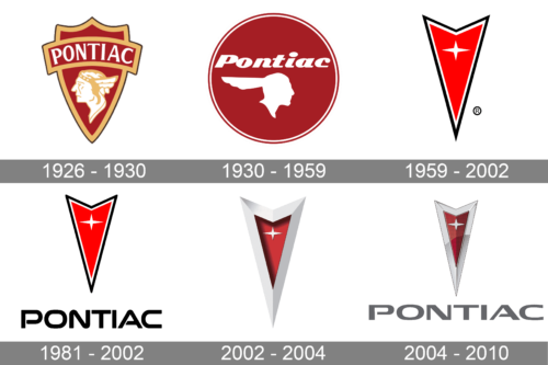
The Pontiac logo from 1926 featured a detailed profile of the Native American man, executed in white with a gold contour, placed on a bright red shield. The nameplate was located above the picture and was executed in a traditional typeface using white capital letters.
1930 – 1959
In the 1930s the brand modified its visual identity and the image of the Native American. It becomes more stylized and modern, with bolder and wider lines.
There are two color palettes the brand switches between — scarlet red and silver. Silver is used for a car emblem when red is the main company’s color for printed documents and advertising.
1959 – 2002
The completely different geometric logo was designed in 1956. The emblem, known as the Dart, features an arrow, pointing south. The arrowhead was red with a thin black frame and an elegant white star on its top.
1981 – 2002
The previous logo version got the brand name added at the bottom. It had a very elegant, sans-serif font with smooth, fluent strokes. The font resembled Nulshock Regular, only with “P” and “A” having the horizontal strokes not reach the vertical ones on one side. The inscription was done in black to go with the black border of the emblem and give the logo a sophisticated, expensive look.
2002 – 2004
In 2002 the Pontiac logo becomes three-dimensional. The frame is thicker now and its color is changed to silver.
2004 – 2010
The latest Pontiac logo redesign featured an emblem’s refinement and a new wordmark. The emblem is more balanced and glossy now. The wordmark in all capital letters is executed in a modern sans-serif font with open “P” and “A” letters.
The Pontiac logo is iconic. A perfect example of how the historical legacy can be shown in a modern and even futuristic way. The brand stayed loyal to its roots and heritage until the very end of its existence.
The silver, red and white color scheme with black lettering is a traditional and timeless reflection of elegance, passion, and power, and that is what the brand was giving to their customers with every vehicle produced.
Font and color
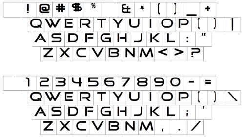
The bold uppercase lettering from the last Pontiac logo was set in a modern sans-serif typeface with clean contours and straight cuts of the lines. The closest fonts to the one, used in the Pontiac insignia, are, probably, Vast XXL Medium and Doublewide Medium, but with slight modifications in the “P” and “A” — their horizontal bars were a bit shortened, to make up stencils.
As for the color palette of the Pontiac visual identity, it is based on a classy traditional combination of red, silver, and black, the scheme, evoking a sense of professionalism and excellence.
Font
What does the Pontiac symbol mean?
The sleek and modern symbol from the last Pontiac logo is a vertically stretched triangular crest, which resembles an arrowhead, with a delicate four-pointed Star drawn on its top part. This symbol reflects the name of the brand, which was given to it as a tribute to the Native American tribe.
What does the Pontiac symbol look like?
The latest Pontiac symbol, used by the company from 2004 to 2010, was based on the logo version, designed for the automaker in 1959. It is a vertically stretched triangular crest with a dark red background, a small silver four-pointed star on top of the crest, and a voluminous silver frame. The top border of the crest has a triangular cut-out, which repeats the direction of the crest, pointing down, adding motion, and making the triangle look more like an arrowhead.
Why was Pontiac discontinued?
Pontiac was established in 1926, and stayed independent for only five years — it was acquired by the General Motors Corporation in 1931 and stayed its subsidiary until the brand’s discontinuation in 2010. The corporation decided to close the production of Pontiac cars because of the financial difficulties and lack of demand for the brand’s vehicles in the market.
What is the Firebird logo called?
Pontiac Firebird is the most popular model of the American car manufacturer, which was produced from 1967 up to 2002. The legendary car had its logo, which was known also as the Firebird.


