Polly Pocket is a toy line including dolls and accessories. It was created and initially sold by Bluebird Toys (starting from 1989). Currently, Mattel is selling the line under the same name but with a dramatically different design.
Meaning and history
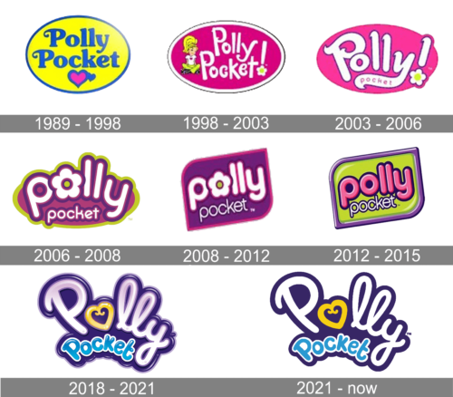
The Polly Pocket logo has gone through not less than seven modifications. Many of them resulted in a total overhaul.
1989
The original design showcased the name of the line in blue inside a yellow oval. The oval had a thin blue trim. There was also a couple of hearts inside the oval, a pink and a blue one.
The typeface was a friendly and rather plump one with rounded corners. Both the “P’s” had a decorative curl.
1998
Only the oval shape remained, while the typography and palette were completely new. The type was now a more casual one and was paired with a flower and a girl with yellow hair.
The letters grew white, while the background was now pink.
2003
The pink oval grew somewhat lighter and lost the trim. The word “Polly” now dominated the logo, while the word “pocket” was so small that it was squeezed inside the extended end of the “y.”
2006
The design grew more compact yet refined. It was based on the combination of olive green with two shades of purple and white.
The letters had a friendly rounded shape. The flower merged with the “o,” which helped to reduce the space without sacrificing the meaning.
2008
The shape was simplified – it was now a rectangle with two of its corners rounded (it resembled a tag). The word “Polly,” which was arched in the previous version, was now straightened.
2012
The design grew even more minimalist losing the flower. The “tag” was colored green, while the word “Polly” turned pink. The updated logo adopted a glittery look.
2018 – 2021
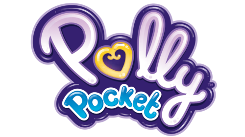
The Polly Pocket logo features a new handwritten cursive script. The first “o” has been replaced by a gold heart. The writing is arched, and there is no more “tag.”
2021 – Today
Compared to the previous design, the 2021 logo differs very little. They’ve essentially scrapped the 3D look and all effects that came with it. The resulting color scheme is a bit darker and brighter than before.
Font
The font used by Polly Pocket for several of their most recent logotypes is a rounded, soft script performed in a cartoonish style. The letters look inflated, and the various twists and loops are a common sight.
Color
Since the beginning of the century, Polly Pocket mostly used various combinations of yellow, pink and purple. The recent designs have also introduced blue, while the entire logotype became a generally darker one.


