POCO is a Chinese brand of smartphones, which first appeared on the market in 2018 when Xiaomi launched it as a sub-brand of the low-cost gadgets class. With this brand, the company entered not only the Chinese market but also the U.S. and European markets. In 2020, Xiaomi announced the separation of the POCO line of premium smartphones into an independent brand.
Meaning and history
POCO appeared in 2018 as a subsidiary brand of Chinese Xiaomi. The company’s name translates from Spanish as “small. The developers point out that it symbolizes the possibility to achieve big dreams, starting with small steps.
Initially, the new division was aimed at the Indian market, but now the company is already working in 35 countries. The most successful product of the brand was the Pocophone F1 smartphone.
In 2020, POCO introduced a new line of smartphones and announced its transformation into an independent manufacturer from Xiaomi. The main difference between POCO smartphones and Xiaomi products is that they are more specialized. They try to focus on a single characteristic, such as performance or battery capacity.
What is POCO?
POCO is the name of a Chinese brand of smartphones, created by Xiaomi Corporation in 2018. By today, POCO entered more than 35 global markets, with a record sale of more than 9 million smartphones worldwide in 2020. For the first two years POCO was a Xiaomi sub-brand, and today it is an independent one.
In terms of visual identity, POCO tries to be closer to the young audience and uses bright colors, minimalistic shapes of the characters, and interesting graphical additions. The brightness of the POCO logo is what makes it stand out in the list of its numerous competitors.
2018 – 2020
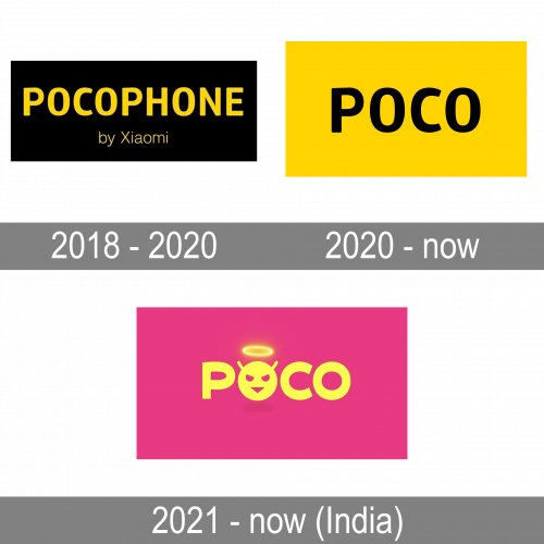
The young smartphone brand was established by Xiaomi in 1018 and for the first two years stayed as its subsidiary, with the logo based on the Pocophone name. The uppercase lettering was written in bold yellow characters against a solid black rectangle. The sans-serif font with modern geometric contours of the letters looked very stable and progressive, enhanced by a rare yellow and black color palette.
2020 – Today
When POCO decided to separate Xiaomi into a self-sufficient brand, a new logo was designed for it in 2020. It was actually as simple as the previous one, with the name of the brand written in the uppercase of a smooth and stable sans-serif font against a contrasting background. But this time the lettering is saying “POCO” and is executed in black, while the background is bright yellow.
2021 – Today (India)
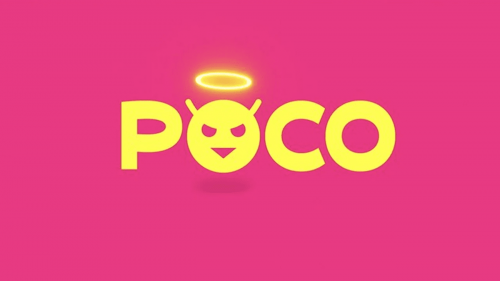
Exclusively for the Indian market POCO has created a new logo in 2021. Today it is used as a secondary one, along with the badge, introduced by the company in 2020. It is also an uppercase logotype, but with the first “O” replaced by a funny emoji with horns and a halo. This badge can be seen in different color palettes, composed of intense acid shades of pink, yellow, black, turquoise, and blue. The emoji from the POCO badge got nicknamed “Made of MAD”.
Font and color
The sleek and heavy uppercase lettering from the primary POCO logo is set in a modern sans-serif typeface with clean contours of the characters. The closest fonts to the one, used in this insignia, are, probably, Glober Extra Bold, or Rambla Oscura, but with some slight modifications of the contours.
As for the color palette of the POCO visual identity, its primary version is executed in yellow and black, a very bright and intense combination, which represents the progressiveness, passion, dynamics, and confidence of the new brand.


