The US basketball team the Philadelphia 76ers has had a long history. Their logo has changed several times over the years. At present the Sixers can boast of having an impressive collection of primary, alternate and secondary logos.
Meaning and history
The visual identity of the Philadelphia 76ers has always been very patriotic and elegant. Based on the main national tricolor, blue, red, and white, all the emblems, created for the team throughout the years reflected its professionalism and value of heritage and roots.
1946 – 1949
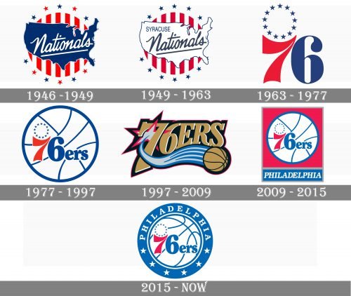
The club was established in 1947 as Syracuse Nationals, and its first logo was designed in the same year. It was a rounded badge with a vertical red and white striped pattern and a blue contour of the United States of America, placed over it and outlined in white. The badge was surrounded by numerous red and blue five-pointed stars and has an elegant cursive and underlined “Nationals” inscription in white placed on a blue background.
1949 – 1963
The color palette of the logo was brightened up in 1949. Both blue and red gained darker shades, while the silhouette of America became white and gained thin blue contouring. The “Syracuse” blue lettering was added to the wordmark, written in small capitals above the main inscription, which was now also bright blue.
1963 – 1977
The club relocates to Philadelphia and changes its name to 76ers in 1963. The new badge for the team was designed in the same year by Mel Richman. It was a bold and smooth “76” in red and blue, with the blue ring, formed by thirteen solid stars placed above the “7”. This version of the logo stayed with the club for more than a decade and became a basis for the logo we all know today.
1977 – 1997
The redesign of 1977 placed the emblem from the previous version on a white basketball with blue details and outline. The “ers” lettering was added to the “76”, executed in bold blue serif typeface with rounded angles and sleek contours.
1997 – 2009
The completely new style of visual identity was adopted by the club in 1997. It was a bold gold lettering placed above an image of a Golden basketball with a smooth trace in two shades of blue. The logo was accompanied by one light blue star in a red outline, placed behind the “7”.
2009 – 2015
The emblem from 1977 comes back in 2009, being placed on a solid red square in a thick gray outline and a narrow blue banner with the “Philadelphia” wordmark under it. The additional lettering in white was executed in all capitals of a traditional serif typeface with bold slightly italicized lines.
2015 – Today
True logo, introduced by the club in 2015 featured the emblem, created in 1977, but in a lighter color palette and with a thick blue outline, where the “Philadelphia” on top is accompanied by six white five-pointed stars on the bottom.
Font
The font of the first logos is a signature-style font. It looks somewhat old-fashioned and resembles the historical handwriting font used in the Declaration of Independence. The typeface for the word “PHILADELPHIA” on the present logo looks like Times New Roman.
Colors
The color palette of the Philadelphia 76ers logo has always included red, blue and white. They convey the patriotic character of the United States because these are the colors of the flag of the country.
BLUE
PANTONE: PMS 293 C
HEX COLOR: #006BB6;
RGB: (0, 107, 182)
CMYK: (100, 56, 0, 0)
RED
PANTONE: PMS 199 C
HEX COLOR: #ED174C;
RGB: (237, 23, 76)
CMYK: (0, 100, 65, 0)
NAVY
PANTONE: PMS 289 C
HEX COLOR: #002B5C;
RGB: (0, 43, 92)
CMYK: (100, 64, 0, 60)
SILVER
PANTONE: PMS 877 C
HEX COLOR: #C4CED4;
RGB: (196, 206, 211)
CMYK: (5, 0, 0, 20)


