

![]() Persil Logo PNG
Persil Logo PNG
Over its more than 110-year history, the Persil logo has gone through around 10 alterations. While some of them were rather notable, most of the designs have had at least one feature in common, the red color.
Meaning and history
![]()
Persil was the first household detergent, produced in 1907 in Germany by Henkel & Co. in Dusseldorf and in Washington in America by Joseph Crosfield in 1909.
After incorporating free oxygen molecules into the powder technology, Crossfield named his new product “The amazing oxygen washer”.
In 1922, they managed to create a popular advertising image of the Persil brand – a lady in white carrying a detergent pack in her left hand. The idea belonged to the Berlin cartoonist and artist Kurt Heilingenstadt.
In 1939, just after the outbreak of World War II, Persil was taken off the consumer market because the German government issued a decree forbidding the manufacture of non-standard detergents such as Persil. After the war was over, the Persil brand returned to all stores. In 1968 Persil launched the first powder for automatic washing machines.
What is Persil?
Persil is a legend among all Henkel detergents because it is the first detergent in the world. Its history began in 1907 and continues to evolve to this day.
Over its long life Persil has always remained an innovator, and thanks to this it has gained an audience of millions. Persil products are now available in such formats as gel, powder and capsules.
1907
![]()
The original logo featured a rather soft and rounded serif type.
1930s
![]()
The type was replaced by a simpler, heavier sans. The word “Persil” grew white. It was placed inside a red circle.
1955
![]()
The name of the brand grew larger. It now spread beyond the red circle. The green background appeared.
1962
![]()
The design grew much simpler. Nothing but the word “Persil” in red was left.
1992
![]()
The lettering adopted an upward direction.
1998
![]()
The word “Persil” returned to the horizontal position and adopted a lighter tone.
![]()
2002
![]()
The color was slightly modified, the end of the “r” grew sharper.
2011
![]()
A green and blue splash appeared behind the wordmark.
2018
![]()
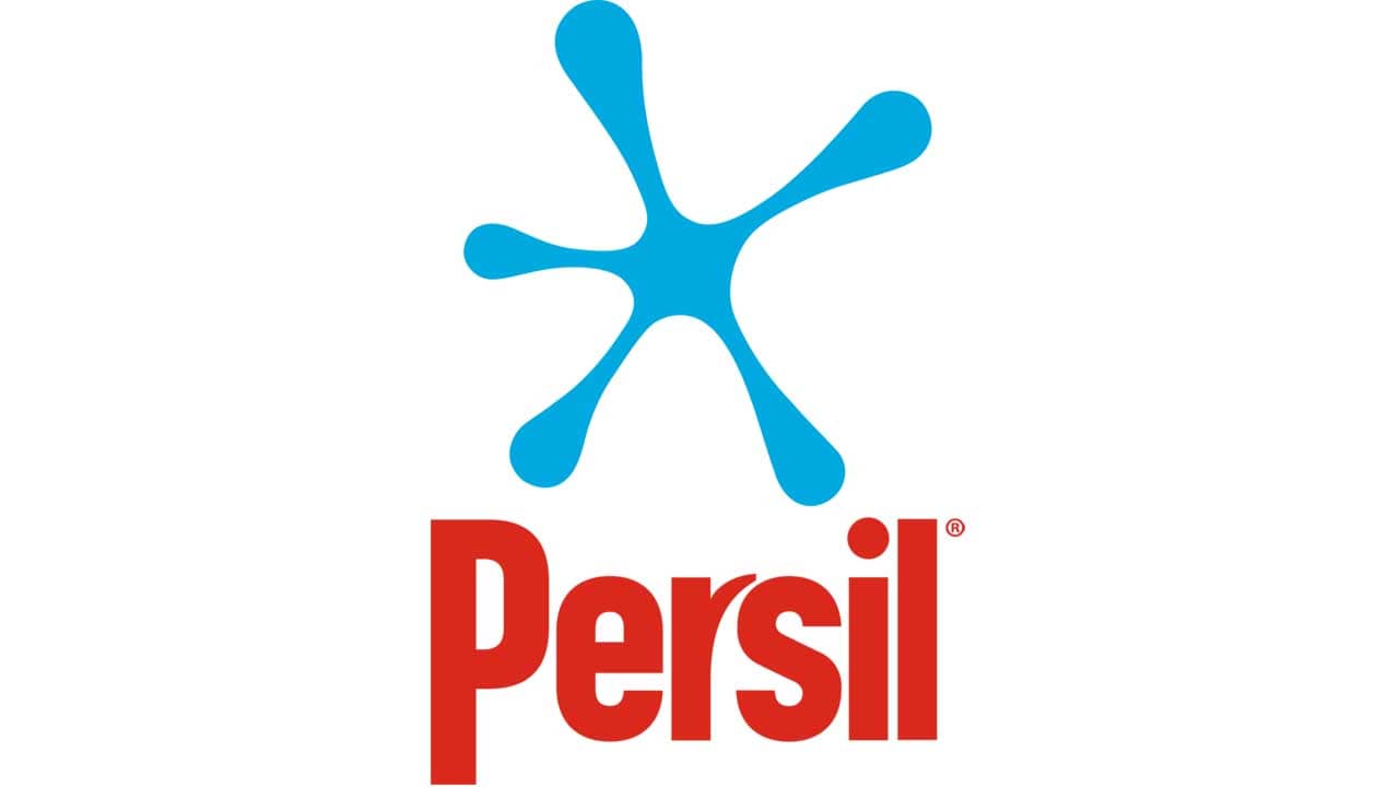
In addition to the previous Persil logo, there is also a version where the splash is completely blue and positioned above the wordmark.
2020 – Today
![]()
Font and Color
The bold title case lettering from the primary Persil logo is set in a heavy sans-serif typeface with the letter “R” customized. The closest fonts to the one, used in this insignia, are, probably, Netraly Regular, or Mensrea Bold, with the contours of the “R” completely modified.
As for the color palette of the Persil visual identity, it is based on a very bright combination of green, blue and red, which represents quality, freshness, and professionalism. Green is here also because of the name of the brand, as from French Persil is translated as “Parsley”.


