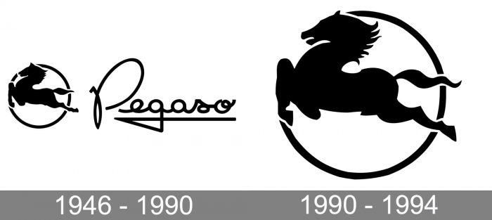
Pegaso is the name of a Spanish automaking brand, which was established in 1946 and was known for manufacturing large commercial vehicles, such as trucks and tractors, but also designed and produces sports cars. The company ceased all operations in 1994, four years after its takeover by Iveco.
Meaning and history
The visual identity of the Spanish automotive brand has been pretty constant throughout its history, and its emblem, created in 1946, has stayed with Pegaso till its very last days, being only slightly modernized in 1990.
1946 – 1990
The original Pegaso logo featured a graphical part placed on the left from the elegant custom logotype, handwritten in a rounded cursive with an elongated tail of the “G”, curved and bent, underlining the whole wordmark. The logo was executed in a monochrome palette, which elevated its look and made the whole combination timeless and sophisticated. As for the emblem, it was a leaping horse silhouette in black, placed on a white background and enclosed into a circular black frame. The horse looked more like it was flying, being a graphical representation of its Pegasus name, a mythological creature with the body of the horse and bird’s wings, though in the emblem of the brand the animal was depicted without any wings.
1990 – 1994
The redesign of 1990 removed the lettering from the official version of the Pegaso logo, though the company kept using its custom recognizable inscription from time to time, depending on the needs. As for the flying horse emblem, it was refined and slightly modified. The contours of the animal were cleaned and gained more sharpness and distinction, while the left part of the drawing stood out from the circular frame, representing freedom, speed, and determination.
From first sight, the graphical emblem looked exactly the same as on the original version, but a couple of small changes made it look more powerful and added some progressive and fighting spirit to the picture, elevating the sense and character of the brand’s identity and accenting on its strongest points.
Font and color
The custom handwritten Pegaso logotype from the original version has no commercial analogs, and its full-shaped rounded letters with fancy curved tails look unique and stylish. The closest available font to the one from the Spanish automaker’s visual identity is probably Nina Bold, but with the lines and contours modified.
As for the color palette, the Pegaso visual identity has always been executed in black-and-white, the most traditional combination, standing for elegance, luxury, and high quality.


