

![]() Jurassic Park Logo PNG
Jurassic Park Logo PNG
The term “Jurassic Park logo” may refer to several emblems featured in the original novel by Michael Crichton, as well as the movies that followed, to say nothing of the brand’s merchandise. Although these logos are not identical, they are built around one and the same base.
Meaning and history
![]()
The Jurassic Park visual identity is still based on the logo, created for the brand in 1993, but the current version of the emblem is a modernized and strengthened badge, which replaced the iconic red and black color palette with a cold metallic combination, evoking a sense of danger and sharpness.
What is Jurassic Park?
Jurassic Park is the name of an iconic franchise, created by Michael Crichton in 1990. The franchise includes novels and short stories, several movies (the first was released by Universal Studios in 1993), animated series, video games, toy brands, and several thematic amusement park attractions.
1993 – 1997
![]()
The very first logo for Jurassic Park was composed of a bloody-red circle in a black and yellow frame, with the dinosaur skeleton drab in black on the left side of the badge. The wide black rectangular banner was crossing the badge on its bottom part, featuring the same framing and having bold white lettering with red lines on it.
1997 – 2001
![]()
In 1997 the logo was redesigned, replacing the inscription on the badge with “The Lost World” and keeping the “Jurassic Park” as a tagline. As for the main part of the visual identity, its emblem, its red structure gained some black accents and a “cracked” texture. The outline of the badge has also been modified, and now featured three circles — two blacks and one thick yellow in the middle.
2001 – 2015
![]()
With the release of the third part of the famous franchise, the logo was changed again, and this time the changes were more dramatic. The black, red, and yellow color palette of the badge was replaced by gray and red, where gray had gradient metallic shades, and red was dark and mysterious. The dinosaur on this version was executed in a silver-gray scheme, and the rectangular badge — dark gray background and white and red inscription, with three diagonal lines, stylized as claw scratches, placed on the right from the wordmark, and standing for the third part of the franchise.
2015 – 2017
![]()
In 2015 the red background of the emblem was changed to a gradient blue, and the badge became three-dimensional now. The “Jurassic World” lettering on the banner gained shadow, as well as the dinosaur skeleton, executed in dark gray. The logo looked dangerous and dramatic, brilliantly representing the plot and main theme of the franchise.
2018
![]()
The redesign of 2018 was about the color palette again, now the dark three-dimensional badge is executed in a monochrome palette with gradient gray and black shades and a white wordmark. In comparison to the original version, the current one looks more confident and professional, though the main symbols and shapes are kept as they were drawn in the very beginning.
2022
![]()
The 2022 movie ‘Jurassic Park: Dominion’ is based off the original movie’s logo. They also used a red-n-yellow circle, but made it smaller. The original skeleton is also present, but in a cut state: only the head and the paws are seen – due to the reduced size of the circle.
The film’s wordmark is written below in much the same style as the original title, except for the ‘Dominion’ part, made from tall and narrow capital letters. The background for both portions was a wide black rectangle.
How did the original emblem appear?
![]()
Chip Kidd explained that the first thing he did having received the brief was to visit the Museum of Natural History and have a look at the bones. Then he bought a book, where dinosaurs were depicted. He took a picture of a dinosaur, placed it in a Photostat machine and began to draw the creature using a piece of tracing paper.
All this seems ridiculously simple: just a book and a piece of tracing paper. And yet, that was how the iconic logo recognizable all around the world was created.
Evolution of the symbol
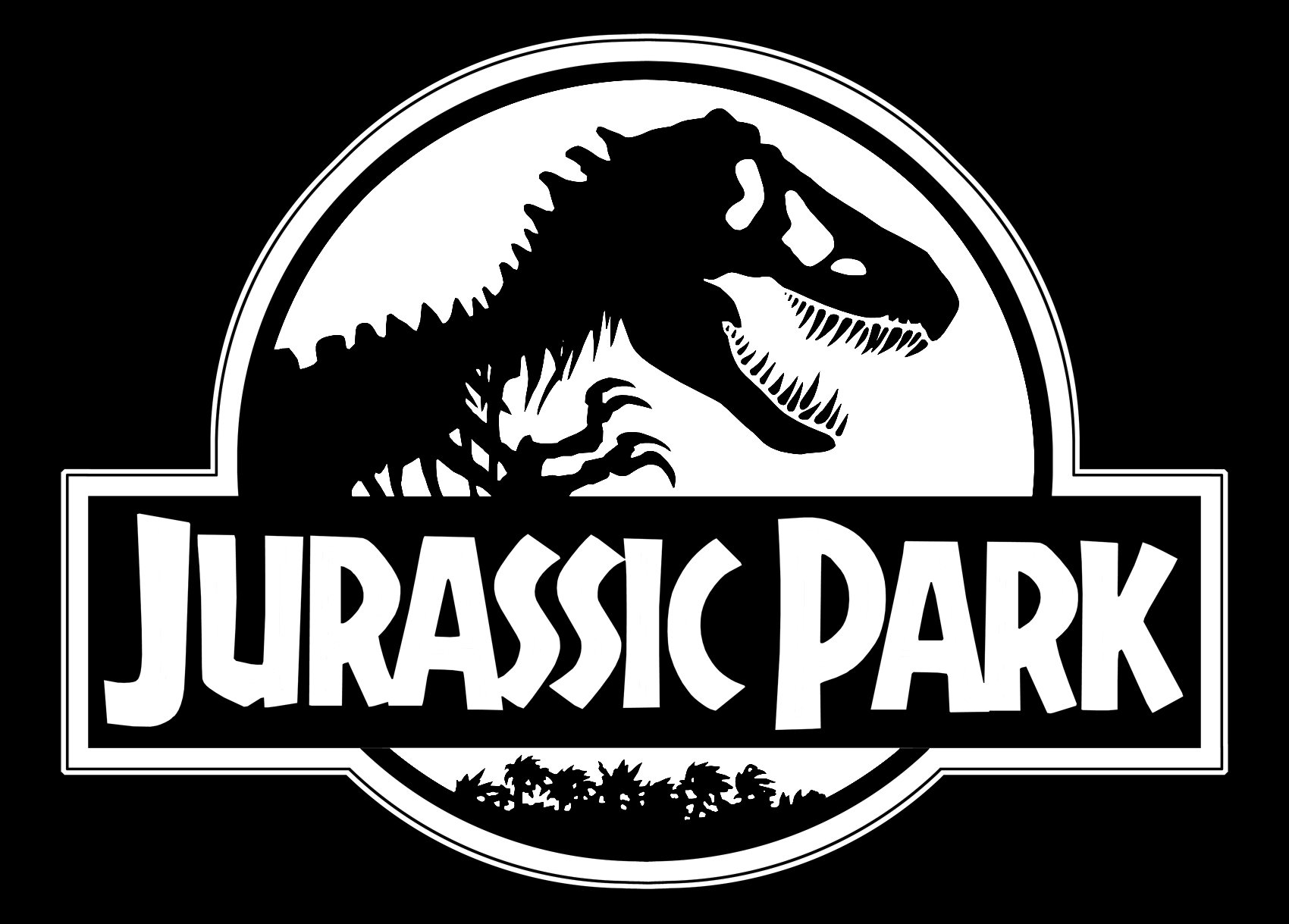
Prior to the movie launch in 1993, Sandy Collora redesigned the logo. Using the Tyrannosaurus Rex skeleton drawn by Chip Kidd as the base, she altered the structure of the bones, making them not so thin and long. Collora put the Tyrannosaurus inside a circle shape and placed the wordmark over it. At last, there was a string of palm trees below the wordmark.
Font
Although the first wordmark was modified, still the typeface bears resemblance to the original font developed for the Michael Crichton’s book. The modified version featured in the original 1993 movie was created by Evangel University adjunct professor Doug Olena.
Color
![]()
The color palette has been altered more than once over almost 30 years since the first version made its debut. Black and red are present in most versions. Other colors seen in the Jurassic Park logo include yellow and its shades, blue, and grey.
When did Chip Kidd make the Jurassic Park logo?
Chip Kidd created the iconic Jurassic Park badge at the end of the 1980s, with its official introduction in 1990. The logo debuted on the cover of the Michael Crichton Book/ as for the movie version of the badge, it was presented in 1993.
Who drew the Jurassic Park logo?
The logo of Jurassic Park was designed by Chip Kidd in 1989. Although; the artist only drew a contour of the dinosaur, enclosed into a circular frame, and the details and texture were added by the Universal Pictures team.
What dinosaur is in the Jurassic Park logo?
Jurassic Park’s visual identity is based on an image of a Tyrannosaurus Rex, one of the largest terrestrial predators of all time. This animal evokes a sense of danger, fear, and aggression, depicting the mood and giving a tip on the plot of the Jurassic Park story.
What are the Jurassic Park colors?
The main colors of the Jurassic Park visual identity are red and black, while yellow and white are used as additional colors, which make the dark and dramatic elements a bit lighter and create a stronger contrast.


