ACTRA is a Canadian labor union including performers in English-language media. The number of members has exceeded 25 thousand people. The abbreviation stands for “the Alliance of Canadian Cinema, Television, and Radio Artists.”
Meaning and history
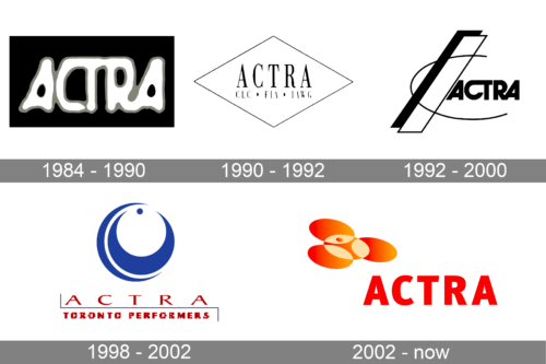
The labor union’s origins can be traced back to RATS (the Radio Artists of Toronto Society), which represented radio performers in Toronto in the 1940s.
1984 – 1990
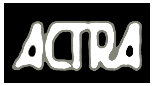
This logo presents the name of the union printed in a very vague manner with the letters having an uneven edge. The letters are done in white with a light gray border and look almost like a ghost. Such an interesting font is explained by the fact that the alliance represented artistic individuals. The black rectangular background gives the logo a defined and strong appearance. Without it, the organization would not be considered serious and worthy of attention.
1990 – 1992
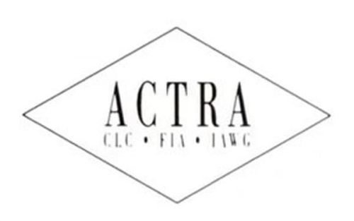
The old ACTRA logo was light and transparent. The name of the organization could be seen in the center. It was given in a traditional serif type where thick and thin serifs were combined according to the rules of calligraphy. The glyphs had an elongated shape.
Below the word “ACTRA,” there were three abbreviations in the same type but smaller letters, including “CLC” and “FIA.”
The writing was placed inside the rhombus standing on its obtuse angle.
1992 – 2000
There was now more motion due to the unfinished oval and the sloped bar. Also, there was more depth due to the black shade behind the bar.
The typography was different, too. The type grew much bolder. It became more unique, due to the unusual links between the “C” and “T” as well as between the “R” and “A.”
1998 – 2002
A dramatically new design was introduced. It was dominated by a dynamic roundel formed by dark blue swirls and a dot. It symbolized the lens of the camera.
The name of the trade union below showcased a light serif type with a modern touch. Below it, there was the lettering “Toronto Performers” in smaller letters. The text was set in a dark, noble shade of red.
2002 – now
The brand returned to the heavy typography of the 1992 wordmark. The type now looked more generic because it lost the connections between the letters. Yet, it was perfectly legible. The boldness of the glyphs was somehow compensated by the elongated proportions and the subtle variations in the widths of the strokes.


