Probably the most notable modification of the Panic at the Disco logo took place in 2008, when the rock band got rid of the exclamation point in its name.
Meaning and history
For most of its history, the band had the signature exclamation point in its name, and it was also the visual centre of its emblem.
2005 – 2008

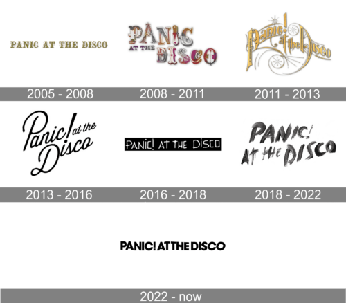
The very first logo of the band featured an uppercase inscription, set in one line. The capital letters of the wordmark were executed in a fancy and ornate wishbone-style typeface with thin curved lines coming out of them. For this logotype, the band used a gold and white color palette, which only elevated the elegant and fine sense.
2008 – 2011
The redesign of 2008 kept the wishbone-style of the lettering but made it more modern and cool. The wordmark was now set in two levels, and the letters were jumping. But the most interesting thing about the refreshed visual identity of the band was the color palette of logotype, which featured a combination of fuchsia, white, blue, and gold.
2011 – 2013
In 2011 the Panic at the Disco logo gets redesigned again. The color palette is back to gold and white by the lettering completely changes its style, making the emblem look like a circus banner, with elongated lines and sophisticated silhouettes of the letters.
2013 – 2016
The band goes monochrome in 2013. The logo is being placed slightly diagonally and is now written in a pretty traditional cursive typeface, with the exclamation sign coming out of the dot above the “I” in “Disco”.
2016 – 2018
In 2016 the Sonic of the Disco logo becomes minimalist and solid. The white inscription is being set in one line on a black background. Its uppercase letters are now executed in a custom handwritten typeface, which resembles accurate kids’ attempt to write “straightly and neatly”.
2018 – 2022
The redesign of 2018 keeps the monochrome color palette of the band’s logo but adds character and structure to it. The wordmark, set in two levels, now looks like it was written with black lipstick, having its gradient lines thick and smooth.
2022 – 2023
The redesign of 2022 has created a very stylish and one of a kind badge, with the minimalistic black and white color palette and pretty simple modern sans-serif font of the uppercase characters. But in the middle of the line the letters start breaking in parts, which creates a very interesting geometric wave with straight lines and squares, detached from the bars.
Font
ThePanic at the Disco band does not require any specific typeface to be used in its wordmark. This fact gives designers complete freedom; they may choose any font that goes well with the visual context.
Color
The black-and-white color scheme is simple yet does not look generic because the colors are reversed: the background is black, while the emblem is white.


