Panathinaikos is the name of the oldest professional football club in Greece, which was established in 1908, and is based in Athens. The original name of the club was founded as the Athens Football Club and got its professional status only 70 years after. Today the club plays in the Greek Super League.
Meaning and history
Panathinaikos, the football club, is a part of the Greek oldest sports club with the same name. The Panathinaikos sports is composed of teams in 24 different disciplines. Panathinaikos Athens is the oldest soccer club in Greece. Moreover, it is PAO (short name of the club) that has become the most successful club of Hellas in Europe, even managing once to reach the finals of the Champions League.
Panathinaikos, established as the Athens Football Club, got its current name in 1926 when the Greek Football Federation was formed and the Greek Football Championship and National Cup were organized.
What is Panathinaikos?
Panathinaikos is a football club from Greece, which was established in 1908, and got its professional status in 1979. Today the club, based in Athens, plays in the Greek Super League, and confidently keeps its position in the upper part of the line-up.
The football club from the Greek capital, Athens, has been using the green shamrock symbol on its badge since 1918, slightly changing the style, and sometimes, the shape of the badges throughout the years. It was the player of the club, Michalis Papazoglou, who came up with the design idea.
1908 – 1909
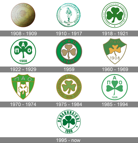
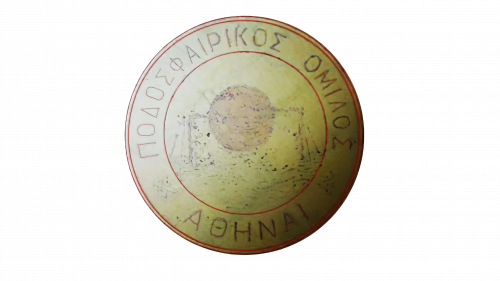
The initial logo of the football club from Athens was introduced in 1908 and stayed with Panathinaikos for just a few months. It was a circular badge in gold with copper outlined and details. The inner part of the logo was decorated with an image of a soccer ball while the outline featured an uppercase inscription with the full name of the football club written in Greek letters.
1910 – 1917
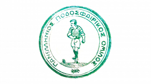
The redesign of 1910 was held after part of the club’s players left, so the team had to start all over again, just two years after its foundation. The new logo was set in a green and white color palette, with the circular medallion in a wide frame, where the uppercase inscription with the club’s name in Greek letters was written around the perimeter. The central part of the logo depicted a football player, contoured in green. The player was wearing a stopper shirt and white shorts.
1918 – 1921
The new era of visual identity design started for the Panathinaikos football club in 1918, with the introduction of the first shamrock badge. It was a solid green image set on a white background and enclosed into a white circular frame in a green outline. The thick lines of the framing were harmonized by the thin straight bars of the lettering, written around the perimeter of the badge in small capitals. The clean contours of the letters and their geometric shapes were accompanied by a large solid dot in green, separating the beginning of the wordmark from its end.
1922 – 1929
The color palette and the circular shape of the logo remained untouched, but the composition of the logo was rethought in 1922. The shamrock got enlarged, while the frame was removed, so the badge now featured just a bold green outline. There was no place for a wordmark anymore, but the white capital letters “ПАО”, standing for Panathinaikos Athlitikos Omilos, the new name of the club, were written on the shamrock’s leaves. The image was accompanied by the bold green “1908” datemark, set under the trefoil.
1959
The green and white color palette of the Panathinaikos visual identity got a gold addition. The badge was redrawn, placing the gold trefoil on the white background in the center of the logo, and enclosing it into a wide green frame with a golden outline. The “ПАО” lettering was written in gold lines on the top part of the frame, while the “1908” — at the bottom, was in the same style. This was one of the most lost lasting logos of the Greek football club, which stayed as a primary badge for almost thirty years.
1960 – 1969
The circular shape of the Panathinaikos logo was changed to an elegant crest in 1960. The upper part of the shield has two of the corners cut out and the sides arched to the center, which made the badge look strong and stable. The logo was executed in a green and white color palette, with a gold outline and lettering. The yellow shamrock was set on a background diagonally split into green and white parts. Above the shamrock; on the green background, the golden “ПАO” was set in straight clean lines, while the “1908” datemark was written on the bottom white part of the new crest.
1970 – 1974
The redesign of 1970 created a brighter image for the Panathinaikos visual identity. It was the same crest shape, but in bright green now, with the thick white vertical stripe on the central part. The white shamrock was placed over it, outlined in gold. The golden outline of the shamrock was balanced by the golden outline of the crest itself. The solid green banner on top of the badge featured a lightweight “ПАО” inscription in custom sans-serif, with the contours of the letters adjusted to the contours of the crest.
1975 – 1984
The circular shape of the logo came back in 1975. The color palette of the new badge was muted compared to all previous versions. It was a calm green shade, close to khaki. The wide frame was outlined in gold from both sides and had bold gold lettering in Greek capitals written around it. The middle part of the logo featured a plain white background with a large green shamrock drawing in a gold outline. The badge stayed as the Panathinaikos primary logo for almost nine years.
1985 – 1994
In 1995 the logo of the football club from Athens gets redesigned again. This time the composition is simplified and all the golden details are removed from the badge. The white circular medallion was outlined in green and had a solid green trefoil image drawn on it. The image was accompanied by a bold strict “ПАО” lettering in stable capitals. Each letter was set right above each of the three shamrock leaves. The symbol was underlined by a delicate “1908” datemark, arched under it with small green digits.
1995 – Today
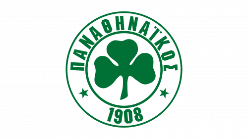
With the redesign of 1995, the color palette of the Panathinaikos visual identity gets enhanced and deepened, and the composition of the badge is being rethought. The wide framing is back, but now it is outlined in thin green lines. As for the inscription, the letters in it got narrowed and emboldened, with square shapes and straight lines. It was separated from the datemark by two solid five-pointed stars in green. As for the main part of the badge, it has just one image on it — a green shamrock.


