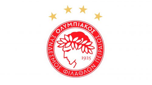
Olympiacos is the name of a professional football club from Greece, which was established in 1925 in Piraeus. Olympiacos is the most titled club of the country, with 46 wins in the national championship and 28 — in the Cup of Greece. The club plays in the Greek Super League.
Meaning and history
Being unsurpassed in the number of victories domestically by a club, Olympiacos is also in the world’s top 10 clubs with the most trophies won by one club. The result of the Greek team is 78 trophies and 9th place. Considering, Olympiacos was established in 1925, it wins national championships with enviable consistency.
What is Olympiacos?
Olympiacos is the lost titles professional football club in green, which was founded in 1925, and based in Piraeus. The club plays in the Greek Premier League, being its leader for many years by now. Olympiacos has most titles than any other football club in the country.
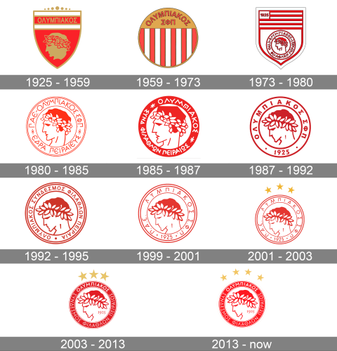
As for the visual identity, it was created by one of the founders of the club, Notis Kamperos, who not only created the logo for Olympiacos but also gave the club its name. The badge of the club has always been executed in a red color palette, and all versions but one featured the produce of the athlete on the Olympic wreath on his head. Since 1980 the logo of the Greek football club was barely changed but still went through more than half a dozen refinements, aiming to find the best balance of elements for the perfect badge.
1925 – 1959
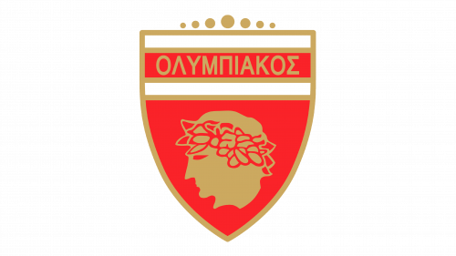
The original Olympiacos logo, designed in 1925, stayed with the Greek football club for two decades. It was a solid red crest with the top banner composed of three horizontal stripes — white and red — in a gold outline. Above the crest, where usually a crown is set on many badges, there was an abstract composition with seven solid circles featuring different sized and making up an arch. The red body of the crest depicted a golden profile of an Olympic athlete in an olive wreath. The name of the club in the Greek alphabet was written in gold capitals over a red stripe on top of the shield.
1959 – 1973
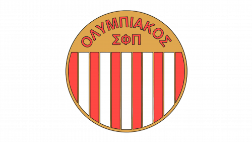
The only logo in the club’s history with no image of an athlete was introduced in 1959 and stayed as the Olympiacos primary badge for more than a decade. It was a circular medallion with a vertically striped pattern in red and white. With each stripe outlined in gold. The top part of the logo featured a solid gold background, with the bold red inscription set on it in two levels. The upper level was arched, while the bottom one, composed of three Greek letters, was set in a straight horizontal line. Each letter of the logotype was outlined in black for better visibility.
1973 – 1980
Another non-typical for the club logo was created in 1973. A crest, drawn in a white and red color palette, had a wide banner on top, composed of five red and four white stripes, with a small white rectangular in the upper left corner, and the red “1925” datemark on it. As for the main part of the logo, it comprised a circular medallion drawn in red lines, with the profile of the athlete enclosed into a double red frame with the Greek lettering written around its perimeter.
1980 – 1985
The circular medallion from the shield, introduced in 1973, became an independent logo in 1980. The contoured profile of the Olympic athlete facing left, with an abstract olive wreath on his red hair, was set on a white background and enclosed into a double red frame with the uppercase logotype in Greek letters written around it. Both the outline of the frame and the lettering were set in thin red lines, with lots of air in between the symbols. The logo was well-balanced and bright, evoking a sense of power and passion for what the club does.
1985 – 1987
With the redesign of 1985, the image of the athlete was enlarged and got its contours emboldened, while the frame became solid red, with no outline. As for the inscription, it was now set in white capitals, with its Greek letters executed in thick lines with straight cuts and sharp angles. The two parts of the lettering were separated from each other by two white stylized six-pointed stars, drawn in three crossed lines.
1987 – 1992
In 1987 the circular badge of the Olympiacos football club goes through another redesign. The portrait of the athlete is being redrawn, the lines of his name are now shortened, and the chin is a little tilted down. The olive wreath on the red hair of the sportsman is enlarged and drawn in a more appropriate shape, so now the oval olive leaves can be distinguished. The lettering on the white frame of the badge has been shortened. And now it was set along the top part of the frame, separated from the “1925” datemark at the bottom by two small solid dots. As for the color palette of the new badge, it was still red and white, but with the shade of red deepened and slightly darkened.
1992 – 1995
The redesign of 1992 switched the color palette of the Olympiacos badge back to the lighter red. The portrait of the athlete kept its style and execution but was moved slightly down, making more white space about his head. Another significant change was made to the framing of the circular emblem — its outer border was now composed of two red and one white stripe when the interior border had just one red. The datemark was removed from the frame, and the full-sized inscription came back, with one solid red dot separating the beginning of the wordmark from its ends
1995 – 2001
The emblem from 1995 was executed in an even lighter red shade, looking more energetic and vivid than ever. All of the elements on the badge were redrawn in thinner lines, which made the logo sharper and stronger, with all the sharp angles distinct and visible. The lettering placed around the perimeter of the frame was shortened again, and the “1925” datemark came back, being separated from the letter part with two small red dots. The badge stayed with the Greek football club for a bit more than five years.
2001 – 2003
Olympiacos, the most titled team in the Greek championship, won its 30th title in 2001 and decided to reflect it on its logo. The badge, which was kept completely untouched since 1995, got complimented by three five-pointed stars in the solid gold shade. The light stars featured the same sizes and were placed in an arch above the red and white logo with the Olympic athlete in an olive wreath.
2003 – 2013
The redesign of 2003 colored the frame of the Olympiacos medallion in solid red, switching the color of the lettering to white again. The inscription got elongated to its full size and had a part of it written in bold lines, with the other part — in thin. There was no more place for the “1925” datemark on the red frame of the badge, so the numerals were moved to the main part of the logo. It was now set in small digits on the right from the athlete’s portrait, right under the wreath. As for the portrait itself, it was redrawn in bolder red lines, so now the badge looked very well-balanced and professional.
2013 – Today
With their redesign of 2013, held after the football club won its 40th league title. The fourth golden star was added to the composition, so now all four stars were redrawn in a smaller size, in solid gold, and placed arched above the red and white badge of the Olympiacos football club. There is enough space between the stars not to make the composition heavy.


