Packard Bell is a brand of personal computers manufacturer, based in the Netherlands and founded in 1986 in the USA. When launched, the brand focused on radio devices production, then changed its specialization to TVs and computers.
Meaning and history
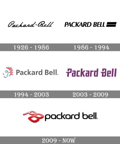
Packard Bell has a rich visual identity history. It’s logo was changed four times since the company’s establishment.
1926 — 1986
For the first 60 years the company was manufacturing radios, and its logo was and elegant retro wordmark representing a handwriting.
1986 — 1994
When the company’s profile changed to production of personal computers, the logo was replaced by a bolder and more technological one, additional tagline “America grew up listening to us. It still does” appeared.
1994 — 2003
Probably the most famous and recognizable logo of the company, the “Face of Technology” was created. It was composed of a modest gray wordmark in fine lines and an iconic emblem. The emblem was an abstract image of a face, executed in separate lines of different colors.
2003 — 2009
The iconic logo was replaced by a strict and strong wordmark on dark purple, which was a reflection of brand’s creativity and confidence.
2009 — Today
The current Packard Bell logo is composed of two parts: a wordmark in all lowercase letters and an emblem.
The color scheme was changed from purple to red and black, which celebrates power and passion, progress and strength.
The new wordmark is executed in a simple and traditional typeface with the rounded and soft lines.
The red emblem is a three-dimensional image of the letters “PB”, which are in caps. It adds volume and dynamics to the logo, makes it modern and memorable.


