 Pacific-12 Conference Logo PNG
The Pacific-12 Conference has had the same logo ever since it got its current name in 2011. This emblem is actually a modified logo of its predecessor, the Pacific-10 Conference.
Meaning and history
In the realm of American college sports, the Pacific-12 Conference, initially founded as the Pacific Coast Conference in 1915, stands as a beacon of athletic excellence and academic prowess. This esteemed alliance was formed by visionary leaders from West Coast universities, aiming to elevate collegiate sports to new heights. Throughout its storied history, the conference has undergone transformations, including expansions and rebrandings, culminating in today’s widely respected Pac-12. Its hallmark has been a rich tapestry of triumphs across diverse sports, notably dominating in track and field, football, and basketball. The conference’s illustrious journey is punctuated by a multitude of national championships, showcasing the extraordinary talents and relentless spirit of its athletes.
Presently, the Pacific-12 Conference continues to uphold its revered stature in the NCAA. This coalition of institutions not only champions athletic feats but also places a strong emphasis on academic distinction among its members. Balancing the rigors of sports with educational aspirations, the Pac-12 serves as a model for integrating athletic endeavors with scholarly pursuits. Its enduring influence and commitment to excellence render it an instrumental entity in shaping the future of collegiate sports in the United States.
What is the Pacific-12 Conference?
The Pacific-12 Conference represents an elite group in NCAA Division I, consisting of twelve distinguished Western U.S. universities. Renowned for melding top-tier athletic competition with scholastic achievement, the conference has become a cornerstone in the American collegiate sports landscape. Its influence extends beyond the field, shaping policies and benchmarks for both athletic and academic success.
2000 – 2010
The original Pacific 10 Conference visual identity was designed in 2000 and stayed unchanged for ten years. It was a bright and confident badge in a simple yet strong blue and white color palette, with the extra-bold “PAC 10” inscription set in two levels on the blue square badge, under the white graphical element — an arched line of several sharp vertically extended triangles pointing up. The image looked like stylized rays of the sun, but also added some sense of fighting spirit and determination to the whole badge.
2010 – 2011
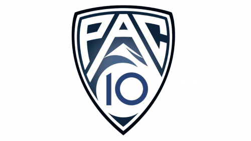
In 1959, the main members of the Pacific Coast Conference, which was dissolved, created the Athletic Association of Western Universities. In 1968, the AAWU changed its name to the Pacific-8, and then, in 1978, to the Pacific-10 Conference. Since 2011, it has been known as the Pac-12 Conference.
2011 – Today
The Pacific-12 Conference logo features the lettering “PAC 12” inside a shield. Below the letter “A,” you can see a snowcapped mountain. The combination of white and dark blue only reinforces the mountain theme.
The letters have a very unusual shape. The “P” and “C” have been modified to fit the rounded sides of the shield. The way the two diagonal lines forming the “A” stretch makes the letter “rhyme” with the mountain shape seen below.


