While the older version of the Otis logo was blue on the white background, the company currently uses a somewhat different approach. The color adapts to fit the visual context. This approach offers various advantages and looks pretty appropriate in our era of adaptable logotypes.
Meaning and history
While the company was established in 1953, in fact, its history started a year earlier. In 1852, Elisha Otis invented the safety elevator, due to which the elevator industry established credibility. Today, the Otis Elevator Company is owned by United Technologies.
What is Otis?
Otis is the name of an American manufacturer of elevators, which was established in 1853, and today operates all over the globe, being the number one company in its segment. Otis is known for its impeccable quality and innovative approach to manufacturing processes.
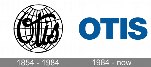
1854 – 1984
The original Otis badge, designed in the middle of the 19th century, stayed with the brand for more than a century and stayed very actual till its last day. It was a black-and-white composition with the fancy and bold cursive inscription overlapping a simple image of a globe, drawn in thin yet distinctive black lines.
1984 – Today
The logo showcases the word “Otis” in an all-cap sans. While the type is simple and unpretentious, it conveys a symbolic message. The minimalist, bold glyphs represent the reliability and safety of the products produced by Otis.
For decades, the company used a blue logo on the white background. The current website does not feature the blue version anymore. Instead, you can see that the word “Otis” changes its color depending on the color of the background. When the background is light, the logo grows black, while when the background is dark, the logo grows white.
Versions of the emblem
You can come across an extended version of the Otis logo featuring the name of the parent company, United Technologies. You can see it under the writing “Otis,” inside a dark blue shape. The American multinational conglomerate United Technologies Corporation has used the same approach for its other brands, too.
Font and Color
The heavy stable lettering of the Otis logotype looks confident and powerful in the uppercase of a geometric sans-serif typeface. The closest fonts to the one, used in this insignia, are, probably, Neue Haas Grotesk Display 95 Black, or Sequel Sans Display Black.
As for the color palette of Otis’s visual identity, it is based on a clean and fresh shade of blue, which looks very vivid and friendly, and at the same time evokes a sense of professionalism and reliability. Blue is also known to represent security and stability.


