Orbitz is the name of an American website, which specializes in tourism and travel. The aggregator lets you find the cheapest and most convenient flight and hotels all over the world. Launched in 2001, today the company is one of the most famous travel service providers in the USA.
Meaning and history

The Orbitz logo is simple yet strong and memorable. Composed of a wordmark, it features a graphical element replacing the first letter “O”, which is also a brand’s signifier.
The Or its wordmark in all capitals is written in an italicized extra bold sans-serif typeface with distinct lines and rounded angles of “R”, “B” and “I”, while the last two letters, “T” and “Z” are sharp and strong. The diagonal cuts of the “Z” horizontal bars make the logo look dynamic and contemporary.
The first “O” of the wordmark, which is also a signifier and the icon of the brand, is composed of two arrows, navy blue, and lighter blue, which symbolize the movement.
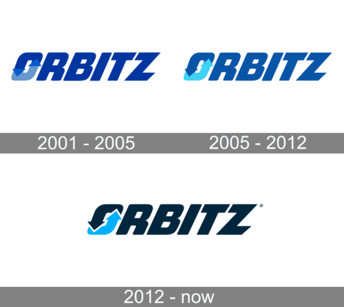
2001 – 2005

If you take a look at the old logo, you’ll notice it looks quite familiar. The dynamic italicized typeface has remained virtually unchanged. Even the “O” in the old logo already had its iconic arrows.
And yet, the brighter blue palette makes the two versions look pretty different. The older one had an icy feel because of it, which hasn’t been preserved in the current one.
2005 – 2012
The Orbitz visual identity redesign, held in 2005, was all about the color palette. The main blue hormone tone is lighter, which added some dynamics and energy to the massive characters, and an arrow in the “O” got a very bright sky-blue shade, with the whole element drawn in a solid color, unlike the arrows from the original version. This made the logo look more stable and distinctive.
2005 – Today
The two shades of the blue color palette of the brand’s logo is a reflection of stability and professionalism, as well as a creative and progressive approach to the services provided by the platform.


