Opel is one of the most famous European car brands, which was established in 1862 in Germany. The brand is highly recognizable across the world and has its offices in more than 60 countries worldwide.
Meaning and history
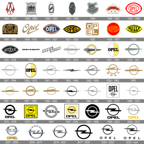
There is definitely no exaggeration in naming Opel the company with one of the most intense visual identity history in the world. The number of its logo redesigns is more than 25, and even after finding its iconic symbol in the 1960s, Opel still kept bringing new and new variations of design and colors.
1862 – 1886
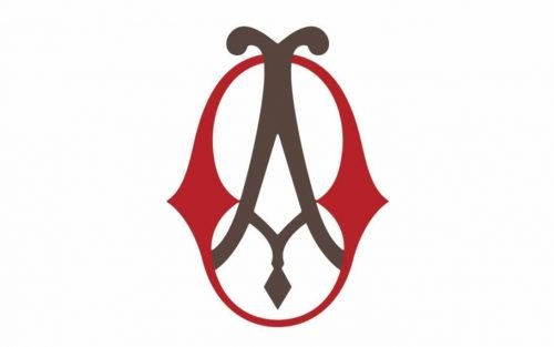
The company, named after its founder, Adam Opel, and specialized in the production of sewing machines, for its first logo designed in 1862. It was an elegant and traditional medallion-type insignia, where these stylized letters, “A” and “O”, were drawn in red and gray. Smooth curves and slightly narrow and elongated shape of the logo made it look sophisticated and sleek.
1888 – 1889
The Opel logo from 1888 looked like a geometric crest in a vertically stretched hexagonal shape with four solid circles in the corners. It was executed in light silver and had a black heraldic image in the center, with a wordmark written above and under it. The image depicted two rampant lions and a crown, and the lettering was composed of “Adam Opel” on top and “Rüsselsheim” on the bottom of the crest.
1889 – 1893
The image was gone from the logo in 1889, and only the lettering stayed. The shape of the badge was changed to an ornate vertical oval, with some sharp elements. The “Adam Opel” inscription was written in black over the upper part of the frame, “Russelsheim” along the bottom, and “Opel” in a bold sans-serif typeface was placed on a gray diagonal element, placed inside the oval framing of the new logo.
1886 – 1899
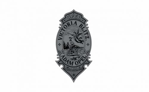
In 1886 the specialization of the company was changed to bicycle production, so the logo was redesigned into a vertically located oval with sharp ornaments on both its top and bottom. Inside the framing with the wordmark, there was an image of a man riding a bicycle and an angel playing above him. It was pretty traditional for its times’ emblem, with a very detailed drawing and elegant serif lettering.
1899
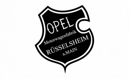
The next redesign was held in 1899 after the Opel Company started the production of cars. The first version of the new logo only stayed with the brand for a few months. It was a black and white stylized shield with a double outline and white lettering, placed diagonally on a black background. The “Opel Motorwagenfabrik Rüsselheim a.Main” inscription was executed in a delicate and strict serif font.
1899 – 1902
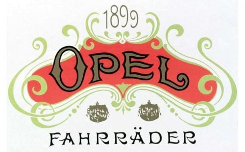
After the experimental monochrome version, Opel designs something completely different — an ornate and colorful insignia with vignettes and curved lettering. The flower-like image in coral red and cream has an arched “Opel” inscription on it, “1899” above and “Fahrräder” under.
1902 – 1906
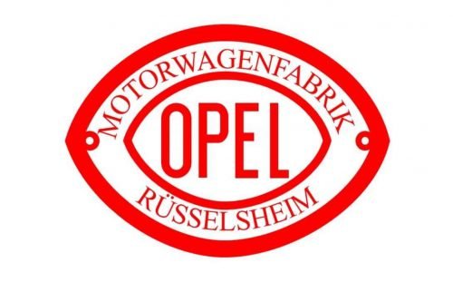
The design from 1902 was something new. A modern badge, repeating the shape of the rugby ball, executed in white with red outlines and lettering. The word “Opel” in red capitals was placed in the middle, closed in a wide triple red and white outline, where the “Motorenwagenfabrik Rüsselheim” lettering was placed around its perimeter.
1906 – 1909
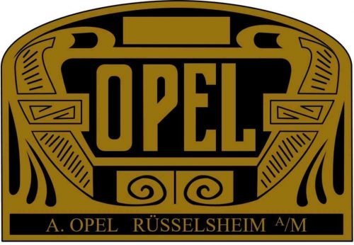
In 1906 Opel gets a completely different logo, which looks sleek and fancy, resembling an art-deco panel. The emblem is executed in gold and black, with “Opel” surrounded by elegant columns with curves and smooth lines. The logo stayed with the company for three years.
1909 – 1910
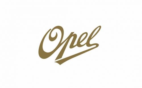
The logo from 1909 was a simple script wordmark in gold. The “Opel” nameplate was placed slightly diagonally and had the letter’s “L” tail elongated, underlining the whole word.
1910 – 1937
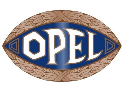
The rugby shapes come back to the Opel visual identity in 1910 and stay for almost 30 years. Now the style of the emblem resembles Ancient Greece and its unique recognizable lettering. The color palette consists of blue and light gold for the medallion and white for the inscription. The framing features laurel leaves pattern.
1921 – 1928
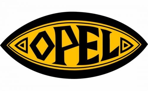
In 1921 the color scheme was changed to yellow and black, and all the small elements were removed, so the logo became cleaner and slightly brutal. The Greek mood remains the main theme of visual identity.
1928
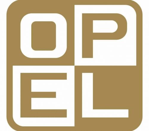
An alternative version was created in 1928 — white and cold square with rounded angles, consisting of four smaller squares, where the “Opel” letters were placed. It was cool and very stylish but didn’t stay for long.
1928 – 1930
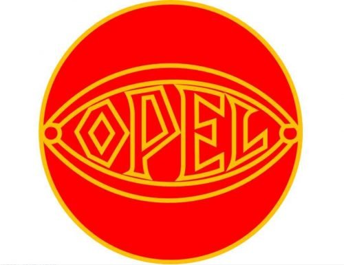
At the end of 1928, the Greek “eye” emblem was put inside a circle and the color palette was switched to bright red with yellow outlines. A year after, in 1929, Opel becomes a part of General Motors company but keeps this logo until 1930.
1930
A bright yellow and black badge was introduced by the company in 1930. It was a yellow badge drawn in the shape of rugby, with geometric interior framing, composed of several solid triangles. In the very center of the badge, there was a custom stylized “Blitz Rad” lettering in bold black uppercase. The badge looked modern and cool, evoking a friendly sense and being very progressive for its time.
1930 – 1937
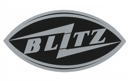
In 1930 Opel starts manufacturing its Blitz trucks and designs a special logo for them — the eye shape remains, but now it has the “Blitz” lettering with two shape Lightning’s coming out of it in two directions. The color scheme of the new emblem is black and silver.
1936
The logo from 1936 featured a one-line “Opel Blitz” logotype, written in the uppercase and executed in a modern smooth sans-serif typeface with massive black letters and softened contours. Both parts of the wordmark were connected by a Z-like flash-like sign, which started from the first “O” and finished at the last “Z”, cutting the logotype along its length.
1936 – 1937
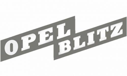
In 1936 the Blitz logo was redrawn and simplified. The emblem was replaced by a diagonally placed wordmark set in two levels and executed in white. The background of the inscription was light gray.
1937

A light gray and white rocket first appeared on the Opel logo in 1937. It was placed horizontally over a medium-weight gray ring on a white background. The rocket was directed to the left and looked very modern, having even a resemblance with an art-deco column. Cool and stylish concept, which has been returning to the Opel visual identity from time to time.
1937 – 1950
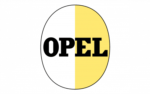
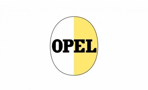
Another logo created in 1937 was composed of a yellow and white oval (vertically split into two equal segments) with a bold black “Opel” lettering written over it. The inscription was set in the uppercase of an extra thick serif typeface with massive serifs.
1937 – 1947
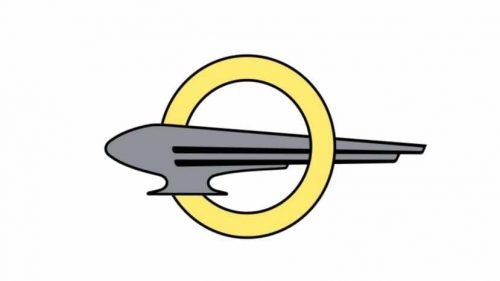
A completely new design was created in 1937 and featured a gray rocket horizontally flying out of the yellow ring. It was something interesting and unusual for Opel. No wordmark was added.
1938 – 1947
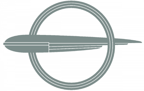
The gray Rocket with a ring was redrawn in 1938. Less white elements made the image look heavier yet more powerful. The tail of the rocket became thinner and sharper, which added speed and determination to the feelings evoked by the new logo. This version stayed with Opel for almost ten years.
1947 – 1954
The contours and color palette of the previous logo were refined in 1947. Thinner lines and light gray with a white combination made it look extremely stylish and elegant.
1950 – 1951
The yellow color comes back to the Opel visual identity in 1950. The new logo was composed of a vertically placed oval, split into two parts — white and yellow. The oval featured a thin black outline and bold “Opel” lettering in black capitals.
1951

Another rocket logo was introduced in 1951 — a minimalistic rocket was horizontally divided into two equal parts, gray and white, and gained a triangular gray wing at its top part, with three rounded lines, standing for speed and freedom. The gray ring turned into a double one, with thin gray lines placed on a narrow white space between each other.
1952 – 1954
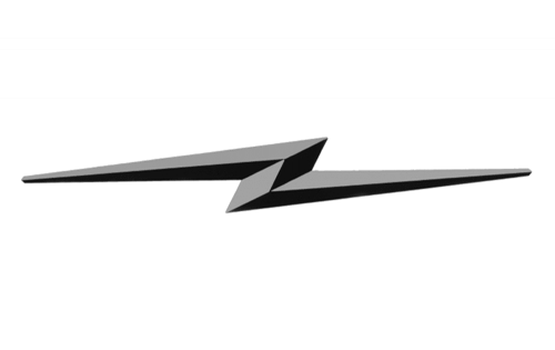
The Blitz symbol returned to the Opel visual identity in 1952. The flashlight in gray gradients was the only element of the new logo. Placed on a plain background with no additional letterings or framing, it looked modern and sharp, evoking a sense of growth and progress.
1953

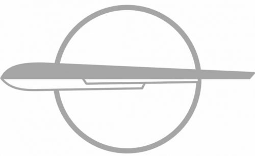
The winged rocket was redrawn again in 1953. This time it was all gray again, with only thin white lines, which added light and air to the badge. The horizontally oriented body was divided into two parts by a thin white line.
1954 – 1959
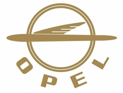
The rocket is back, but now it has wings and is executed in gold, with a white background. Now the wordmark is added, it is written under the image, arched around the ring.
1956
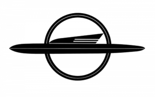
The rocket emblem became black and white in 1956. The shapes became bolder and more massive and white lines, complementing the rocket and the ring were now almost invisible.
1956 – 1957
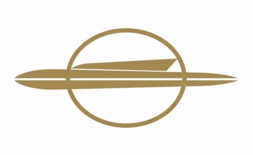
In 1956 the rocket was horizontally stretched, which made it thinner and longer. The badge became more elegant and modern, even though there was no lettering on this logo, it was very recognizable and became truly iconic all over the world, looking great on the Opel cars.
1957 – 1959
More white color and striped were added both to the upper part of the winged Opel rocket and the ring frame. The emblem started looking like an art-deco decoration, sleek and expensive. With the timeless and classy black and white color palette, this minimalist badge was truly exquisite and excellent.
1959 – 1963
The logo gets a more modern look in 1959z the rocket image is cleaned and modernized and the wordmark is removed again. This minimalistic design looks great on the Opel cars.
1963 – 1964
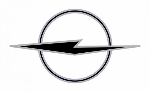
The sleek and smooth rocket’s shape is replaced by an abstract sharp figure, reminding of the original concept but with a completely different mood. The logo is executed in black and silver, a combination that adds power and brutality to the image.
1964 – 1970

The logo created in 1964 depicted a white square badge in a thin black frame, with the uppercase Opel logotype executed in an extra-bold sans-serif typeface with slightly narrowed solid letters, placed above the iconic flashlight sign in a black ring. This is when the legendary Opel symbol first appeared on the official logo.
1964 – 1970
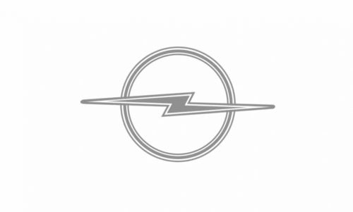
The iconic Opel “blitz” emblem was created in 1964. A bolt of light gray lightning, resembling a horizontally stretched letter “Z”, featured a thin double outline in white and gray and was placed over a gray and white circle.
1968
Light gray and white Z-flash in a ring replaced the official Opel logo in 1968. Gray was the main color of the visual identity and white was used for thin interior framing of both the flashlight and the circular framing. The lines of the flash were elongated and sharp, evoking a sense of speed and power.
1970 – 1978
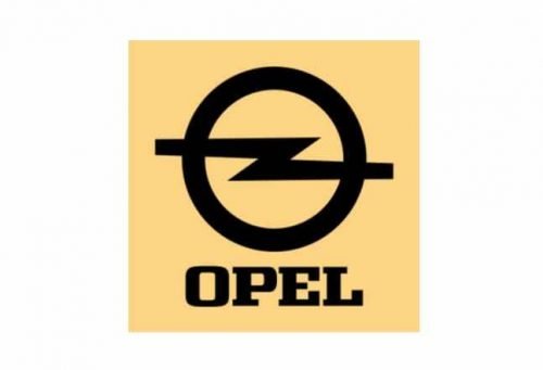
In 1979 the emblem is drawn in bold black lines and placed on a pale yellow background with an elegant yet solid and strong black “Opel” wordmark under it. The lettering is executed in a classy serif font with wide lines and massive serifs.
1978 – 1987
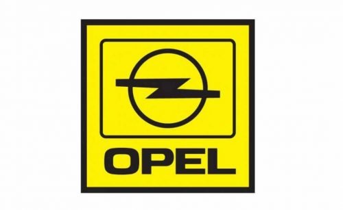
The yellow becomes brighter in 1978. Another change about the emblem is the black outline of the square. The lightning on the circle is now also enclosed in a frame, which is a rectangle with rounded angles. As for the wordmark, it is enlarged and written in a contemporary and smooth sans-serif typeface.
1987
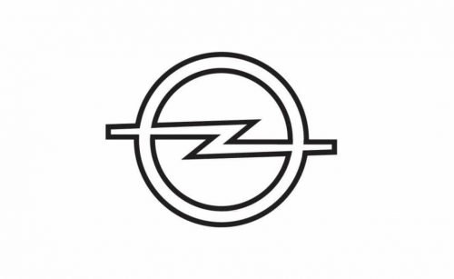
For less than a year Opel uses a super minimalist version of the emblem — outlines in black lightning and the ring around it. Simplicity and style.
1987 – 2002
The pale yellow color comes back to the automaker’s visual identity in 1987 and stays until the beginning of the 2000s. The blitz badge is placed on a yellow background and enclosed in a white square with a thin black outline. The inscription is executed in the same style and font as on the 1978 logo, but the letters are bigger now.
1991 – 1995
The whole blitz and a thin ring are placed inside a solid black circle in 1991. It was a very powerful and masculine emblem, reflecting the company’s progress and authority.
1995 – 2002
The colors are switched and the emblem becomes black, while the background turns white. Now there is an “Opel” lettering placed under the brand’s iconic symbol. It is still written in the same traditional and clean sans-serif font.
2002 – 2007
The emblem becomes three-dimensional in 2002. Executed in light silver metal, it is accompanied by a bright yellow wordmark under it. The new color combination makes the visual identity fresh and crispy, evoking a sense of loyalty and happiness.
2007 – 2009
In 2007 the emblem and the wordmark get more volume, and the color scheme is slightly modified — the silver badge gets some green and purple shades, while the yellow of the nameplate is more intense and gradient now. The inscription gets a delicate shadow, which adds dynamics to the logo.
2009 – 2017
The Opel logo from 2009 was also three-dimensional, but more minimalist and elegant than the previous one. It was just an iconic “Z” sign in a circle, executed in silver gray with some black accents, adding volume and motion. As for the wordmark, now it was placed on the upper part of the circle in delicate black lines.
2016
A three-dimensional silver badge was used by the German automaker in 2016. The small yet bold sans-serif logotype in the uppercase was placed on a circular frame of the logo, on its upper part, above the elegant and sophisticated Z-flash with slightly shortened lines.
2017 – 2020
The next redesign was held by Opel in 2017 after it was acquired by the PSA Group. The new logo is a simple black blitz in a circle, placed on a white background. No additions, the lettering is removed. The simplicity of the Opel logo and its iconic symbol shows the company as progressive and innovative, the one that values traditions and legacy, yet aims to grow in new directions.
2020 – 2023
The redesign of 2020 made the elements of the Opel emblem thinner and more delicate. Another important change was about the composition in general — the uppercase sans-serif logotype was written under the emblem in a fancy custom typeface with a diagonal cut of the “L” horizontal bar.
2023 – now
The iconic Opel logo was redesigned again in 2023, making up a stronger and more edgy image for the brand. The Z-like bolt got cut into two parts, and outlined in a thinner circle, accenting the central part of the badge. The lines of the lighting bolt were elongated, and the ends of the elements gained diagonal cuts. The lettering remained almost untouched.
Font and color
The bold uppercase lettering from the Opel logo is set in a modern sans-serif typeface with distinctive contours of the capital characters. The closest fonts to the one, used in this insignia, are probably, Verbatim Wide Bold, or Hanley Pro Sans Wide Extra, with some small modifications of the contours.
As for the color palette of the Opel visual identity, the official version of the logo is set in monochrome, while when placed on the bonnet of the brand’s cars, the emblem turns glossy silver.


