OneDrive is a Microsoft platform for hosting and synchronizing files. The service was designed in 2007 and today is available in more than 100 languages and has users all over the globe.
Meaning and history
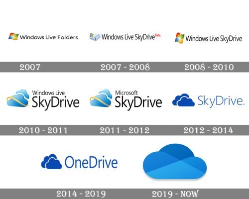
The OneDrive visual identity was changed many times, as well as the product’s name. However, all the modifications that have taken place after 2010 were quite subtle.
2007
The very first OneDrive logo was a simple “Windows Live Folders” wordmark with a famous Windows waving the flag, executed in four colors.
2007 — 2008
The same year the logo was changed, as the program got a new name — SkyDrive. Now the “Windows Live SkyDrive” inscription was complimented by a device picture with the Windows flag above it.
2008 — 2010
In 2008 the emblem was replaced by a Windows flag from the original version. This logo stayed with the software for two years.
2010 — 2011
In 2010 the cloud emblem was designed. Composed of two overlapping light blue clouds with a golden-yellow ribbon around one of them, the icon looked friendly and fresh. The logo was three-dimensional and looks really modern and friendly.
2011 — 2012
The version of 2010 contained a “Windows Live SkyDrive” lettering, which was changed to “Microsoft SkyDrive” in 2011.
2012 — 2014
In 2012 Microsoft simplified the SkyDrive logo design. Now it’s a flat image of two overlapping clouds and a laconic “SkyDrive” wordmark. All the elements are executed in a bright blue and placed on a white background.
2014 — 2019
In 2014 Microsoft had to change its product’s name to OneDrive, so the logo was also changed. But the color palette and style remained the same, only the nameplate was replaced.
2019 — Today
The redesign of 2019 brought a more modern and even more laconic OneDrive logo. Now it is composed of a single two-dimensional cloud, which is drawn in three different shades of blue, with the lighted at the base and the darkest at the top of it.


