Olive Garden today is not just a chain of restaurants, but a whole culture, that represents the American style of dining, even though the restaurants of the chain specialize in Italian cuisine. Established in 1982, today the chain manages more than 900 locations on different continents.
Meaning and history
Olive Garden is a brand, owned by Darden Restaurants, the American corporation, which manages nine chains of restaurants in the fine dining and casual dining categories. Despite the number of brands under one company, Olive Garden is hard to beat in its success, hence it is the leading chain of Darden.
The brand was established in 1982 in Florida, under the wing of General Mills company. In the middle of the 1990s, General Mills decided to detach its restaurant unit into a separate brand, and this is how Darden Restaurants appeared. The new branch was named after Bill Darden, the founder of the Red Lobster chain, the second most popular brand of the corporation.
As for the menu of Olive Garden restaurants, it is Italian, but in the American way. The traditional portions are bigger, and the dishes are fattier and sweeter than in Italy, but this is why the restaurant chain is so beloved by Americans. It is mainly Olive Garden, where the locals always celebrate birthdays, and meet relatives and friends.
Olive Garden restaurants are always crowded, so they try to optimize everything they can. Orders are placed through tablets, which you also use for entertainment while you wait for your food.
What is Olive Garden?
Olive Garden is the name of one of the most famous restaurant chains in the United States, It was established at the beginning of the 1980s, and today has almost a thousand locations in different countries of the world. The chain is specialized in Italian cuisine and is based on the concept of casual dining.
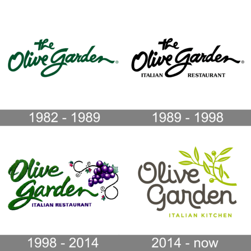
In terms of visual identity, Olive Garden chooses simplicity and has its logo based on smooth lettering with small decorative elements, executed in a calm green color palette, which points to the name of the chain. The logo of the brand was modernized seven times throughout its history
1982 – 1989
The original Olive Garden logo, designed in 1982, was the most laconic of all versions. It was a dark-green cursive inscription written against a plain white background, with “The” in the lowercase placed above the “Olive Garden”, which was slightly larger in size.
1989 – 1998
The redesign of 1989 has added the “Italian Restaurant” tagline to the main part. The additional lettering was set in the uppercase of a classic serif typeface, which balanced the smooth contours of “The Olive Garden”. The logo could be seen both in green and in black palettes.
1998 – 2014
In 1998 the Olive Garden logo was significantly modified. The typeface was changed to a more elegant one, with the green shade of the letters lightened up, and the graphical part appeared on the right from the wordmark. It was a purple grape, with elongated curved details, balanced by the purple tagline.
2014 – Today
The redesign of 2014 resulted in a more modern and minimalistic badge. The font was switched to a more futuristic cursive, while the color of the lettering is now gray. The fancy inscription is accompanied by a delicate green olive branch, with the leaves decorated by thin white lines, which add finesse and lightness to the composition.
Font and color
The elegant yet progressive lettering from the Olive Garden logo, designed in 2014, is set in a custom typeface, which has something in common with such fonts as Personalitype Bold, or Confiteria Medium, but with some significant modifications of the characters.
As for the color palette of the Olive Garden visual identity, it looks fresh and vivid, showing the restaurants of the chain as warm, welcoming, and easy. The shade of green, used in this badge, differs a lot from the green in the original logo, which shows the development of the company.


