

![]() Dunkin Donuts Logo PNG
Dunkin Donuts Logo PNG
The global donut company and coffeehouse Dunkin’ Donuts adopted its first logo in 1950, the same year it was founded. It was a dark red wordmark in a cursive script very similar to handwriting.
Meaning and history
![]()
The company’s mascot, called Dunkie, appeared on the Dunkin Donuts logo in 1955. The dancing Dunkie’s body was made of a mug, while his hands, legs, and head were made of donuts. Over the mug, the 1950 script logo could be seen. This version was registered in 1961.
1950 – 1967
![]()
The oldest Dunkin’ Donuts logo on our list bore nothing in common with the current one. Both the brown color and the handwritten script were so much unlike the cheerful and plump letters we are used to.
1967 – 1976
![]()
Here, we see the familiar candy shade of pink – it has remained on the emblem ever since. The type used for the company name is different, though. The cup is a symbolic way to say the company sells coffee, while the way the brand name is given represents a donut.
1976 – 2019
![]()
The pictorial part was dismissed and replaced by the words “Dunkin’ Donuts” in orange and pink. The friendly type looked edible, and there was a candy feel about the colors.
2002 – 2007
![]()
A steaming styrofoam coffee cup appeared to the left of the company name. This move made the logo better reflect the range of products offered to the clients.
2007 – 2019
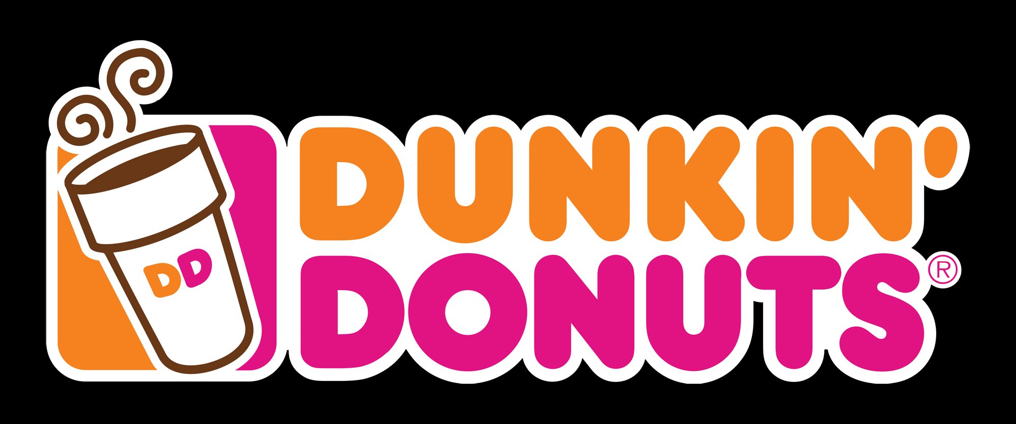
![]()
Brown outline and details were added to the cup, resulting in a more contrast look. A half of the rectangle behind the cup was colored orange and the “DD” abbreviation appeared on the cup.
2019 – 2022
![]()
The company changed its name and logo to better fit the range of products the company offers. While the old version said: “donuts and coffee” (in the language of symbols), the current Dunkin’ logo does not give any details and therefore allows a broader interpretation.
2022 – Today
![]()
Although the current logo was designed half a century ago, it looked relevant even today. The designers, though, gave the orange color a pumpkin shade. The apostrophe was no longer a bright pink color. Its darker color reminded of the brown logo the brand had originally.
Evolution of the symbol
In 1960, the hot pink color made its debut on the logo. The symbol itself depicted a stylized coffee cup with the words “Dunkin’ Donuts” given as a circle.
In 1976, the orange color appeared on the emblem. The updated logotype consisted only of the company’s name.
Emblem

In addition to the pink-and-orange wordmark, the current version, which was adopted in 2006, includes a steaming coffee cup outlined in brown with a “DD” monogram.
Font
![]()
The typeface looks very similar to the Frankfurter and Debussy fonts. The letters look plump and round to the point of being appetizing, which seems perfectly natural for a company specializing in donuts.
Color
![]()
The combination of magenta and orange on the white background creates a cheerful, happy mood.
What does the Dunkin Donuts logo mean?
The bright and lively badge of Dunkin Donuts means nothing but the direct purpose of the brand — the production and distribution of donuts and coffee. Although the color palette of the badge makes all the elements look very warm and kind and looking at the logo you can literally feel the sweetness of the chain’s products, and the bright shades of the donuts’ glazing.
Why did Dunkin Donuts change its logo?
The Dunkin Donut brand’s logo was changed five times throughout the years, as the company has always been trying to follow the moving company told, and its latest trends, in both marketing and design. The last redesign of the brand’s badge was held in 2019, to create a more minimalistic and progressive image of the company.
Why is the Dunkin Donuts logo pink and orange?
The color palette of the Dunkin Donuts visual identity was adopted by Lucia DeRespinis, a graphical designer from the Sangren & Murtha agency, responsible for the creation of the logo concept. The designer took two favorite colors of her daughter, pink and orange, as a basis of the badge, creating a super happy and sweet mood for the whole composition.
Who designed the Dunkin Donuts logo?
The friendly and delightful Dunkin Donuts badge was designed by Lucia DeRespinis from the Sangren & Murtha design bureau. In her concept Lucia used the favorite colors of her daughter, pink and orange, which look delightful and friendly, evoking positive feelings and showing the brand as a tender and joyful one.


