

![]() Popeyes Logo PNG
Popeyes Logo PNG
For more than forty years the company from New Orleans, Louisiana, has been struggling to win its dominant way as a fried chicken chain. The result is that it has swept not only the USA, but also the world. At present the company offers careers to approximately 60,000 employees in different countries. Such a success was due to a lot of factors, one of them being the company’s symbol.
Meaning and history
![]()
Popeyes is one of the fastest-growing restaurant brands in the United States. It was founded in Louisiana in 1972 under the name Chicken on the Run. Owner Al Copeland wanted to compete with KFC, but his restaurant failed after just a few months.
Four days later, the entrepreneur relaunched with a new menu and a new sign, Popeyes Mighty Good Chicken. Things got better, and in 1976, the company began expansion in the form of a franchise.
As of now, this particular restaurant chain is the second highest in sales and earnings among restaurants that specialize in chicken. The first place has been held by the KFC chain for a number of years.
It is now a subsidiary of Restaurant Brands International. Popeyes has more than 3,800 restaurants in the U.S., Puerto Rico, and 30 countries. Most of the restaurants are franchised. It’s worth noting, that some of the chain’s restaurants are even Michelin-starred, which is not very typical for the fast-food industry.
The chain’s menu features such hits as the iconic Chicken Sandwich (which accounts for 40% of all sales), spicy chicken, fried shrimp, and various regional specialties. When cooking, the company uses only proprietary seasonings and recipes developed by its own culinary team of chefs.
What is Popeyes?
Popeyes is the name of an American fast-food restaurant chain that was founded in 1972 in New Orleans. Authentic food has allowed Eat has become one of the world’s largest companies with 3,900 fast-food restaurants in 30 countries, a number of which are Michelin-starred.
1972 – 2001
![]()
The Popeyes logo history started in 1972. That year Alvin C. Copeland set up a restaurant. In its early days it was called “Chicken on the Run”. A bit later the owner renamed it, inspired by the main character Jimmy “Popeye” Doyle from the detective movie “The French Connection”.
Unlike the names of other fast food chains, there is no apostrophe in “Popeyes”. The founder used to joke about it saying he was “too poor” to afford one when he started his business.
The brand’s first signature mark was a simplified image of a house with the word “Popeyes” in white against the background of a red roof. There was also the lettering “Famous Fried Chicken & Biscuits” in the logo. Besides red and white, the color palette included orange and yellow.
![]()
Some time later the brand utilized the “dancing” wordmark logo. It consisted of the word “Popeyes” in red with a blue trimming and the blue “Chicken & Biscuits” below it on a yellow ribbon. The emblem was colorful and amusing.
![]()
2001 – 2008
![]()
The redesign of the Popeyes logo from 2001 was all about the color palette. Though the lines of the friendly bold letters were slightly refined and cleaned, the change of the shade from bright pink to dark red was the most noticeable refinement. In the new shade, which was close to burgundy, the logo started looking more professional and fundamental.
2008 – 2019
![]()
In 2008 the chicken chain underwent an all-round brand transformation. In fact, it was a whole range of initiatives aimed at refreshing the brand and the Popeyes menu. The brand needed a more contemporary logo design that would appeal to a younger generation.
They placed significant emphasis on the brand’s Louisiana heritage, which was a distinctive feature of the campaign. The design company Pentagram Design from Austin was in charge of creating a new visual brand identity, including the logo. Soon Popeyes said goodbye to its old blue-and-red logo and introduced a new one.
![]()
It was that year that the company acquired its full brand name ‒ Popeyes Louisiana Kitchen, Inc.
2019 – Today
![]()
At present Popeyes uses three logos:
- the Popeyes horizontal dancing letters logo (the primary one);
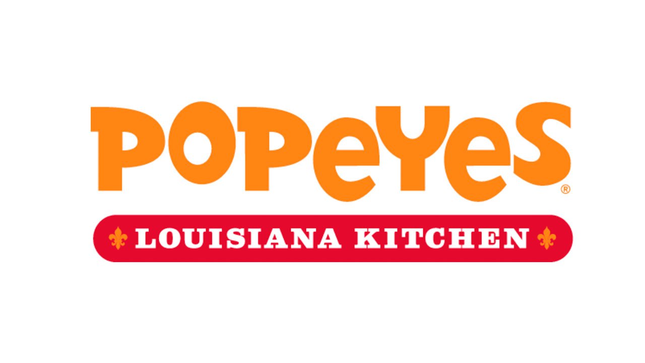
- the horizontal Popeyes Louisiana Kitchen logo with the fleur-de-lis symbols;
- the Popeyes Louisiana Kitchen seal (a circle containing the fleur-de-lis symbols and the dancing “P” icon).
The fleurs-de-lis symbolize New Orleans, the brand’s hometown, and are a reminder of its heritage. Any Popeyes vector logo looks great on the facade.
Font

To achieve the friendly, playful look, Popeyes again chose “dancing letters” for the revamp of 2008. The custom font had been in use for several years and had become well-known. Of course, this time the company updated it so as to express the brand’s youthful personality. The basic shapes of the letters are the same but they are straight.
Colors
![]()
The colors found in the logo ‒ red, orange and white ‒ repeat the original design of the restaurants. They also give a hint of the seasonings in which many products the Popeyes menu is famous for are marinated.
The eye-popping color scheme has not failed to justify the hopes set on it ‒ it makes the brand’s visual identity look optimistic, inviting, and therefore, appealing.
Interestingly enough, in 2011 Popeyes logo was featured among 15 most successful brand refreshes in the past few years.
Besides the visual identity, the company resorts to other ways of attracting customers. Thus, their pricing strategies include discounts, Popeyes coupons and Pay Day deals.
Why did Popeyes change their logo?
Popeyes has changed its logo several times throughout the years, but the latest redesign, held in 2019, aimed to represent the company’s seriousness and stability, to show its international expansion and the ability to follow the growing and changing needs of its audience. The jumping letters of the logotype now stand straight and evoke a sense of confidence and professionalism.
Did Popeyes change their logo?
The Popeyes company has has four versions of the logo created for its brand throughout the years, with the latest redesign held in 2019. Although, all of the badges, used by the company look pretty similar — a bold sans-serif inscription in the uppercase with heavy characters executed in a warm and bright color.
What is the Popeyes tagline?
The slogan of the fast-food restaurants chain Popeyes is “Love That Chicken”. It was introduced in 1980, and since then has never left the company’s identity. However, throughout the years, the chain has used other taglines as well. Some of them were: “So fast, you get your chicken before you get your change”, “Party with Popeye’s” and “Louisiana Fast”.
Can I order Popeyes online?
The pandemic of 2019 made the delivery and online ordering easy and fast as never before. Even the companies, who never practices it before have joined the stream. And Popeyes is not an exception. You can order the food from your favorite restaurant online via website or a mobile application, with an option to pick up your order, or to have it delivered.
What does the Popeyes logo symbolize?
The Popeyes logo symbolizes energy and friendliness with its bright orange color, and stability and professionalism of the company by the style and dispositions of the characters in the wordmark. The badge is very simple and laconic, although it is still instantly recognizable by millions of people. The color makes it look playful and welcoming, promising tasty food and great mood.
What does Popeyes name mean?
The original name of the Popeyes was “Chicken on the Run”, and even though the concept remained pretty much the same, the name was changed by the company’s founder, Alvin C. Copeland. The “Popeyes” came up as an association with the fictional character from The French Connection movie, released in 1971, Jimmy “Popeye” Doyle, a detective.
Why is Popeyes named after Popeye Doyle?
There is no 100% explanation why the founder of the Popeyes chain, Alvin C. Copeland chose this name for his business, although the chain was surely named after the character from The French Connection movie, not the funny cartoonish sailor. The movie was released in 1971, and Copeland enjoyed it and loved the style of the detective, Jimmy “Popeye” Doyle, so everything seems to be pretty simple.
What is Popeyes mascot?
The mascot of the Popeyes fast-food chain is Poppy the rooster. It is both a tribute to the original name of the company , Chicken on the Run, and the menu of its restaurants, based mostly on chicken. Poppy is usually drawn in orange color on a plain white background and enclosed into a circular frame of the same shade of orange. The current mascot was introduced in 2012, replacing the previous symbol of the company; Popeye the Sailor Man.
When did Popeyes logo change?
The latest redesign of the Popeye logo was held by the company in 2019. As for the graphical emblem with the brand’s mascot, it was changed in 2012, after the rights of the company on the Popeye the sailor man image have expired.
What was the old Popeyes slogan?
Actually, the old Popeyes slogan is still used by the company. It is the “Love That Chicken” tagline, which was first introduced by the brand in the beginning of the 1980s, and has never left any of the campaigns of the chain.


