Whatever changes Subway logo has gone through, it has always retained its distinctive feature: the arrows at the ends of the letters “S” and “Y”.
Meaning and history
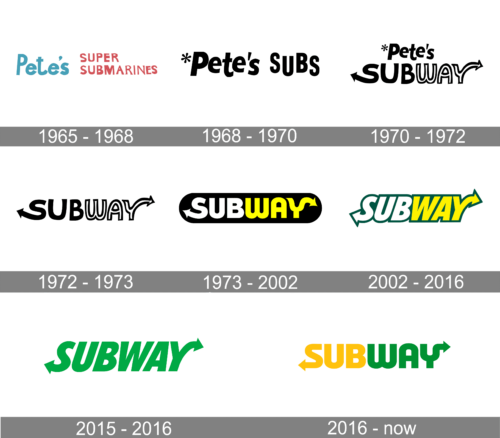
The Subway visual identity as we know it today was set in 1968, and got only slightly modernized by now, though there was also an original version, designed for the company in 1965 when it was founded under the name “Pete’s Super Submarines”.
What is Subway?
Subway is the world’s largest chain of fast-food restaurants, which was established in the United States in 1965, and by today has opened almost 37 locations in more than 100 countries worldwide. The chain has sandwiches and wraps as the basis of its menu, but also serves salads and beverages.
1965 – 1968
The very first banner for the brand was composed of bright and vivid lettering in light blue and red, placed on a white background. The left part of the emblem comprised an enlarged “Pete’s” in a traditional and bold sans-serif typeface, while the right part was set in two levels with its capitalized red inscription executed in a handwritten font with clean lines and distinct edges.
1968 – 1970
1970 – 1972
1972 – 1973
With the rename of the brand into Subway in 1972, the new logo was introduced. This time it was a stylized yellow “Subway” inscription executed in a smooth and modern sans-serif typeface with the tails of “S” and “Y” elongated and curved, having thin and delicate arrow-heads in their ends. All the following versions of the Subway visual identity will be based on this emblem, which only was in use for one year.
1973 – 2002
In 1969 the lines of the logotype were thickened and the color palette was changed to white and yellow, visually splitting the brand’s name into two parts. The new inscription was placed in a solid black banner which was horizontally stretched and had its sides rounded. A bit later the company introduced two more color scheme options for the badge: white and yellow wordmark on a green background, and green and yellow lettering set in white.
2002 – 2016
The redesign of 2002 changes the typeface of the Subway logotype to a bold and italicized sans-serif with its letters glued to teach others. The wordmark was still executed in white and yellow, but now instead of a dark background, the letters gained a thin yet confident green outline.
2015 – 2016
The version, created for the brand in 2015 featured the same style of the typeface as on the previous logo, but with its letters in green having their lines thinner and gaining some space between the symbols. It was a friendly and bright image evoking a sense of joy and happiness.
2016 – Today
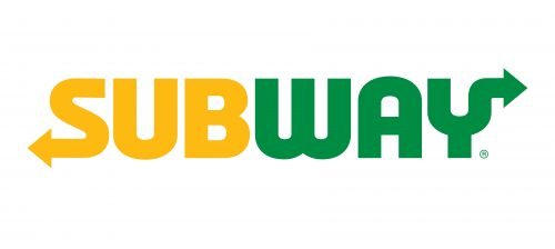
The logo, designed for Subway in 2016, is a modernized version of all the previous emblems, where the inscription is set in a bold and rounded sans-serif typeface with its left part in solid yellow, and the right one — is green. The arrows on the ends of “S” and “Y” became a bit more massive and sharp, which added some progressiveness and strength to the overall image of the company.
Font
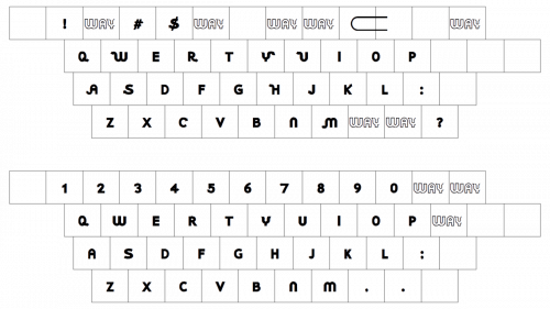
Since 1965, numerous amendments have been made to the shape and proportions of the letters. In addition to “Y” and “S”, one of the most characteristic letters in the wordmark is “W”. For most of the company’s history, the letter had somewhat unusual curvy lines. The sharp angled version was in use from 2002 to 2017.
Color
The Subway logo, in its current appearance, is a combination of yellow and green. Although the colors are rather vivid, we cannot say that they are excessively bright or intrusive.


