Each of the dots on the Domino’s logo symbolizes one of the first three stores the restaurant chain had in 1965, when the emblem was created.
What is the symbol of Domino’s Pizza?
The symbol of Domino’s Pizza is a blue and red domino with three solid white dots, which symbolize the three restaurants, from which the history of the company started. Located diagonally on the left of the logotype, the symbol has one dot drawn over its upper red half, and two dots — on the bottom blue one.
Meaning and history
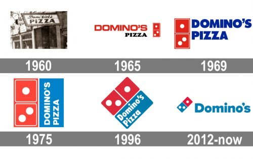
Since the rename of the DomiNick’s Pizza into Domino’s in 1965, the visual identity of the company has always had a domino image in it. For the first years, it was a red and white composition, which started using blue in the 1970s, and this traditional tricolor scheme became the main chain’s signifier.
1960 – 1965

The original banner of the company featured a monochrome banner with the “DomiNick’s” lettering in cursive placed above the “Pizza” in bold capitals of a modern sans-serif font. The black inscriptions were placed on a white background and enclosed in a thick black angular frame.
1965 – 1969
The company was renamed Domino’s in 1965 and the need for the new logo appeared. This is when the new visual identity concept was introduced: a red wordmark with a bold black “Pizza” tagline was placed on the left from the red and white emblem, depicting a domino with solid white dots. This version of the logo stayed with the brand for four years.
1969 – 1975
The redesign of 1969 brought a new color to Domino’s palette — a bright blue. And for the first years, Blue was used only for the lettering, which was executed in an extra-bold sans-serif and placed on the right from a red and white domino emblem.
1975 – 1996
In 1975 the blue of the company’s palette gained a lighter and calmer shade, make the whole composition look fresher and crispier. The new composition featured a square with its left part replaced by a red and white domino figure, and the right half in light blue with the white inscription placed on it vertically. The lettering was executed in a slightly extended font with clean and strict lines and edges.
1996 – 2012
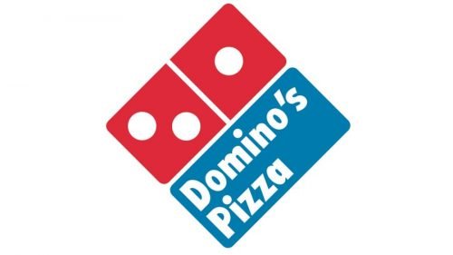
The emblem got inclined to the right and turned into a rhombus in 1996. The contours of all the elements were redrawn and modernized, making the angles smoother and the letters — simpler. The color palette remained unchanged, but the red in this version was a bit darker and more intense than on the previous ones.
2012 – Today
The redesign of 2012 placed the light blue “Domino’s” wordmark on the right from a diagonally located red and blue rectangular emblem with three white dots — two on the blue part, and one — on the red.
Font

The typeface featured in the 1996 logo looks very much like Futura Condensed ExtraBold, while the current wordmark uses a version of the Pluto Sans Heavy type created by Hannes von Dohren.
Color
The color scheme has stayed basically the same since 1960, with a couple of shifts in the shades. The eye-catching combination of red, white and blue colors is highly noticeable in itself, yet the shades used in the current Dominos Pizza logo are rather discreet.
What does the Domino’s logo mean?
The bright geometric logo of the Domino’s Pizza chain depicts a domino in a blue and red color palette with three white dots, which symbolize three first restaurants that were opened by the franchise in 1965. As for the color palette, it was chosen by the owners as the most attractive and appealing for customers.
Why does the Domino’s logo have three dots?
The three dots were placed on the original Domino’s Pizza logo in the 1960s, to show the three restaurants of the brand, and at that time the founders of the chain had a very creative idea — to add a white dot for each opened restaurant. But the idea never worked, as no one ever expected the chain to start growing that fast. Today the company has more than 17 thousand restaurants across the globe. Can you imagine how the logo would look like, if the initial idea of the owners was still working?
How many dice are there on the Domino’s logo?
The red and blue domino knuckle from the primary badge of the Domino’s Pizza chain has three white circles on it. This is the number of the restaurants, the chain owned in 1965, when the logo was designed.
What does the Domino’s logo symbolize?
Apart from a depiction of the chain’s name, the logo of Domino’s also symbolizes the history of the company , with the three white fonts standing for the first three restaurants of the fast-food chain, opened in 1965, when the first logo was created. The initial idea of the restaurants’ owners was to add one white dot to the logo with each new location opened. However, as we can see, it didn’t work out, as by today the company already has more than 17 thousand restaurants worldwide, and there are still only three dots on the badge.
Why is Domino’s called dominoes?
The history of the today famous chain of fast food restaurants began from its original owner, Dominick DeVarti, who opened his first restaurant under the name DomiNick’s. The restaurant was acquired by Tom and James Monaghan, and who decided to keep the legacy, but still slightly change it, adding a new sense to the name, and creating an iconic visual identity, which today is instantly recognizable all over the globe.
Why is the Domino’s logo two and one?
Two and one is the amount of white dots in the iconic Domino’s logo. These dots stand for the initial number of the chain’s restaurants. The three locations were a start to the global empire, which today counts more than 17 thousand soots worldwide. The Monaghan brothers, who bought the brand in 1965, were planning to add more dots to the badge — for each new location opened, but they failed in it, as the chain started growing with an extreme speed.
Why is Domino’s logo red and blue?
The red, blue and white color palette was adopted by the Domino’s logo designers since the very first days of the company. This bright combination has always worked perfect for attracting customers and representing the company as a strong and confident one. Blue is a commonly known color of reliability and trustworthiness, while red stands for passion, and can also be associated with tomato paste, used in every pizza, served in the Domino’s restaurants.


