

![]() Little Caesars Logo PNG
Little Caesars Logo PNG
Little Caesars is one of the leading American fast-food restaurant chains, specializing in pizza. The company, established in Michigan at the end of the 1950s, has grown into one of the most famous global players, with over 5 thousand locations across the world today.
Meaning and history
![]()
Little Caesars was founded in 1959 by a married couple, Miriana and Mike Ilitch. The latter also owned the Detroit Red Wings hockey club and the Detroit Tigers basketball team. Little Caesars is headquartered in Detroit, Michigan, in the Fox Theater building, downtown. Little Caesar Enterprises, Inc. is a company owned by Ilitch Holdings.
According to U.S. industry magazine PMQ Pizza Magazine, it was the third-largest pizza chain in the United States in 2019 ($3.77 billion) behind Domino’s and Pizza Hut ($7 billion and $5.58 billion, respectively). Its pizzerias are now open in 27 countries: in the U.S. and internationally in Asia, the Middle East, Canada, Latin America, and the Caribbean.
What is Little Caesars?
Little Caesars is the name of an American pizza chain founded in 1959. According to statistics for 2020, Little Caesars is the third largest pizza chain in the U.S. in terms of sales after Pizza Hut and Domino’s Pizza. Today the company has nearly 5,5 thousand restaurants in 27 countries across the globe.
In terms of visual identity, the company has been loyal to the image, designed for it in 1971, when the “Little Caesars Pizza Treat” chain was renamed to “Little Caesars”. Since then the emblem of the brand was been only slightly modified, keeping its recognizability and style.
1959 – 1971
![]()
The very first logo for the company was designed in 1959 when the name of the chain was “Little Caesars Pizza Treat”. It was a simple rectangular banner with a two-leveled inscription on it. The top, “Little Caesars” line was set in an elegant cursive, while the bottom, “Pizza Treat”, — was in a bold uppercase sans-serif font.
1971 – 2000
![]()
After the rename of the company, which happened in 1971, the logo of the chain was also changed. The badge, introduced at the beginning of the 1970s, can still be seen in some of the chain’s locations. It was a roundel with a caricature of Caesar in an orange tunic, eating an orange slice of pizza. The roundel was placed above a bold title case inscription in black, with the name of the company executed in an elegant old-style typeface.
2000 – 2017
![]()
In 2000 the Little Caesars logo was modified. The roundel has changed its shape and moved to the left from the enlarged inscription. It was now a square with an arched top side, where only the upper part of Caesar’s figure was drawn. As for the lettering, its typeface was only slightly refined, getting a bit softer and bolder. The style and the color palette of the logo remained untouched.
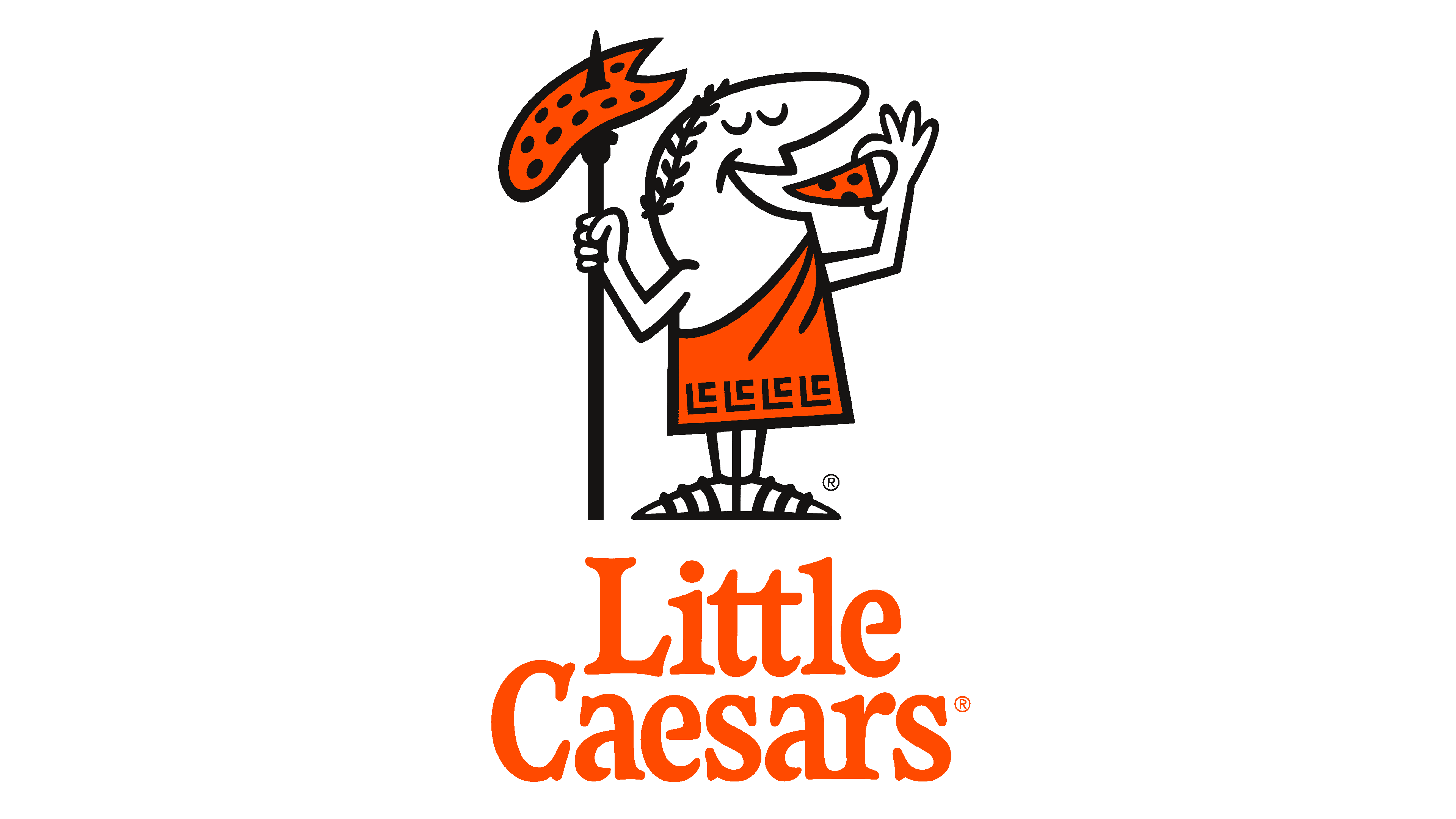
2017 – Today
![]()
The redesign of 2017 has brought back the composition from 1971, placing the full figure of Caesar above the lettering, but the circular frame of the emblem was removed. As for the wordmark, it was rewritten as “Little Caesars Pizza”, using the same typeface as on the previous versions, but with the characters slightly narrowed.
Font and color
The bold yet elegant lettering from the Little Caesar logo is set in the title case of a smooth serif typeface, with rounded contours of the slightly narrowed characters. The closest fonts to the one, used in this insignia, are, probably, Waverly RR ExtraBold Condensed, or Sabre Medium, with some small modifications of the contours.
As for the color palette of Little Caesar visual identity, it is based on the combination of orange, black and white, which represents the strength, energy, and confidence of the globally-known company, and makes it look dynamic and strong.


