Old Navy is an affordable fashion label from the USA, managed by GAP. The brand has its retail stores across the globe but is extremely popular in America and Mexico.
Meaning and history
Old Navy is Gap’s inexpensive line of children’s and adult clothing. The clothing brand appeared in 1994 when Gap decided to start attracting new customers who could not afford expensive clothes.
Originally, the brand was called Gap Warehouse, and its stores offered goods at prices comparable to wholesale. Gap Warehouse clothes were 20-30% cheaper than branded Gap items. A few years later this budget line became extremely popular among Americans. So Gap decided to change the name of the label and borrowed it from one of the Parisian cafes.
Today the Old Navy stores are located in dozens of countries worldwide, offering clothes and accessories for the whole family.
What is Old Navy?
Old Navy is a casual clothing American brand, established in the middle of the 1990s, and owned by Gap. The brand is known for its affordable collections of clothing and accessories for men and women, as well as kids.
1994 – 1998
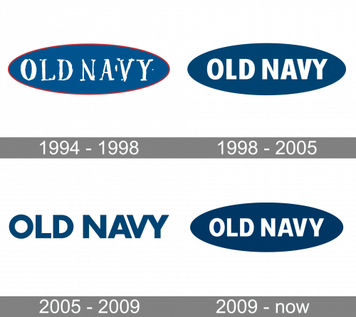
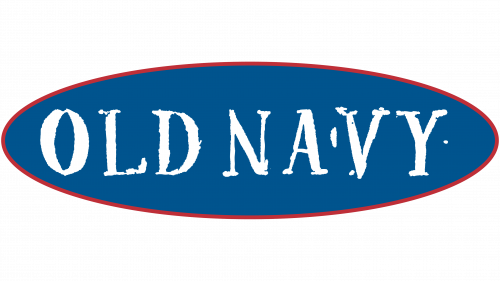
The very first Old Navy logo was introduced in 1994 and stayed with the brand for four years. It was actually a predecessor of the badge we all can see today but executed in a more amateurish and colorful way. The solid blue oval was stretched horizontally and outlined in red, with the white uneven lettering in the uppercase of a stable serif typeface written across it.
1998 – 2005
The brand Old Navy was established in 1994 and got its name after the famous Parisian cafe. The brand’s visual identity is minimalist yet bright, due to the use of intense color contrast.
2005 – 2009

The Old Navy logo is composed of a wordmark, placed inside a horizontally located oval.
The wordmark uses all capital letters and a bold geometric sans-serif typeface. The font is similar to Futura Condensed Bold, which was created by Paul Renner. It features strong and confident lines, which are clean and neat.
The white lettering of the wordmark looks bright and powerful on a navy-blue oval background. The same color palette is used by GAP, the company, which owns Old Navy.
This dark shade of blue is a symbol of confidence and stability, it also evokes a sense of trust and loyalty. While white adds a pure and light feeling.
The Old Navy logo is simple yet bold and memorable, the main accent here is on the color contrast, yet the oval shape makes it stand out from the list of other fashion brands.
2009 — Today
The redesign of 2009 has brought back the solid blue oval from the end of the 1990s, but has darkened up the shade of blue, and refined the white uppercase lettering, making it more delicate in size and more stable and modern in shape. The badge looks very simple yet bright and professional.
Font and color
The bold white lettering from the official Old Navy logo is set in the uppercase of a modern and heavy sans-serif typeface, with distinctive contours of the glyphs and clean angles. The closest fonts to the one, used in this insignia, are, probably, Core Sans NR 87 Cond Heavy and Trade Gothic Display Pro 1 Base.
As for the color palette of the Old Navy’s visual identity, it is balancing the name of the brand, using the navy shade of blue as the main color in the scheme. With the addition of white, the badge looks fresh and modern, evoking a sense of quality and professionalism


